Page 39 of 76
Posted: 19 Mar 2015, 07:38
by seebart
I did not know that. I guess that's not a piece of history that IBM is celebrating. Anyway to nicer things, pictures courtesy of
pyrelink:
- pyrelink1.jpg (120.91 KiB) Viewed 4270 times
- pyrelink2.jpg (114.51 KiB) Viewed 4270 times
Posted: 28 Mar 2015, 15:58
by mr_a500
How about some cleavage?
Imagination Station.jpg
(ironically, the computer she's typing on is called the "Imagination Station")
Edit: actually, it's the APF "Imagination
Machine" (not "Station") from 1979.
Re: Post your deskthority header images here
Posted: 28 Mar 2015, 16:14
by seebart
I'm sure Mu will pass that one immediately! :p Great name for a keyboard too. I can "imagine" the rest of that marketing.
Posted: 28 Mar 2015, 16:37
by ramnes
mr_a500, that's awesome. I want this one.
Re: Post your deskthority header images here
Posted: 28 Mar 2015, 16:41
by seebart
ramnes wrote:mr_a500, that's awesome. I want this one.
oh boy here we go again. Another weekend cheese /sleaze header happening? This time I'm in on the game.
Posted: 28 Mar 2015, 18:57
by Muirium
Nah, I don't like this one. Too cropped.
Re: Post your deskthority header images here
Posted: 28 Mar 2015, 19:43
by seebart
Less cropping on the cleavage please mr__a500! :p
Posted: 30 Mar 2015, 01:15
by idollar
Do you like this one ?
Posted: 30 Mar 2015, 01:20
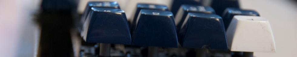
by idollar
And this one ?
Posted: 30 Mar 2015, 01:20
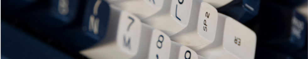
by idollar
Both are cuts of the IBM 107 case
Posted: 30 Mar 2015, 09:23
by matt3o
they are both great pictures, but a little too cryptic maybe
Posted: 30 Mar 2015, 09:26
by seebart
matt3o wrote: they are both great pictures, but a little too cryptic maybe
I like the first one better. Minimalistic.
Posted: 30 Mar 2015, 09:39
by idollar
seebart wrote: matt3o wrote: they are both great pictures, but a little too cryptic maybe
I like the first one better. Minimalistic.
The users of the forum should be able to decrypt them. If not, it is a good opportunity to learn more as I did with other pictures

Posted: 30 Mar 2015, 09:43
by seebart
both shots might not really be recognizable as keyboards. I like that. Not sure if that's important.
Posted: 30 Mar 2015, 10:11
by idollar
seebart wrote: both shots might not really be recognizable as keyboards. I like that. Not sure if that's important.
The fact that you like them is very important, at least to me

Posted: 30 Mar 2015, 10:50
by seebart
idollar wrote: seebart wrote: both shots might not really be recognizable as keyboards. I like that. Not sure if that's important.
The fact that you like them is very important, at least to me
We have 7349 members at DT idollar!

Posted: 30 Mar 2015, 11:00
by idollar
seebart wrote: idollar wrote: seebart wrote: both shots might not really be recognizable as keyboards. I like that. Not sure if that's important.
The fact that you like them is very important, at least to me
We have 7349 members at DT idollar!
I never said that I do not care about the other 7347

Posted: 30 Mar 2015, 18:16
by Muirium
Who said this was a democracy? Not me! Headers are far too important to leave to the plebs.
I like the first one. The second, not so much. Fancy writing about them (and other cryptic header shots you know about) in
the wiki?
Such vicious punishment!
Posted: 30 Mar 2015, 20:03
by Madhias
The second one is way too abstract!
Posted: 30 Mar 2015, 23:25
by idollar
Muirium wrote: Who said this was a democracy? Not me! Headers are far too important to leave to the plebs.
I like the first one. The second, not so much. Fancy writing about them (and other cryptic header shots you know about) in
the wiki?
Such vicious punishment!
jajajaja. Muririum someone should write your adventures in the Olympus.
Posted: 02 Apr 2015, 18:26
by 7bit
.
Re: Post your deskthority header images here
Posted: 02 Apr 2015, 20:05
by seebart
Oh nice cap header 7bit. It's gonna have the logo issue again though. Yes the second one is better. First one is too bright.
Posted: 02 Apr 2015, 20:08
by Madhias
Nice, I like the first one very much!
Posted: 02 Apr 2015, 20:12
by scottc
The first one looks nicer to me, but I think the second works better as a header. The darkness contrasts better with the logo.
Posted: 03 Apr 2015, 10:00
by idollar
Does anyone like this one ?
Posted: 03 Apr 2015, 10:31
by ramnes
I do like it.
Posted: 04 Apr 2015, 21:00
by idollar
Should I understand from the missing answers that the pictures are not accepted ?
I may post a couple of additional attempts
Posted: 05 Apr 2015, 00:19
by Muirium
I like it. (Although alternate versions are always appreciated.) I'm just on holiday! Eating sushi.
Posted: 05 Apr 2015, 21:19
by 7bit
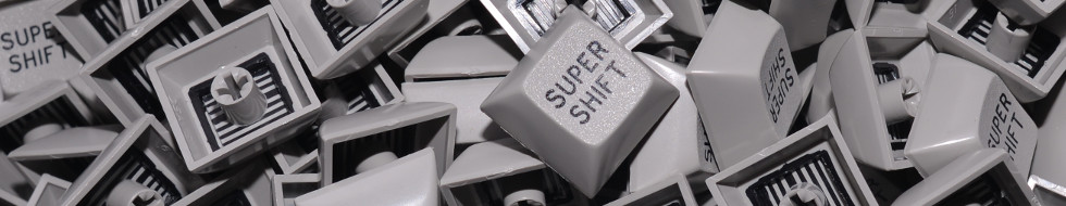
- DSA_GN_SUPERSHIFT_980x190a.jpg (60.28 KiB) Viewed 3724 times
Posted: 05 Apr 2015, 21:20
by scottc
SUPER SHIFT!