Posted: 05 Jul 2012, 07:29
Define uses this.GH1391401 wrote:do you care if anyone uses this?hashbaz wrote:
mechanical keyboard authority
https://ns1.deskthority.net/
Define uses this.GH1391401 wrote:do you care if anyone uses this?hashbaz wrote:
'borrow'hashbaz wrote:Define uses this.GH1391401 wrote:do you care if anyone uses this?hashbaz wrote:
Thank you kind sir!cool photo 486!!!
*bites* Actually, logically, seeing how night is pretty much black, a white background is quite jarring, while a black background fades into the surroundings, allowing the white text to be the focal point, instead of the white background.486 wrote: I find that white is better for forums because logically if the forum is black it is hard to read at night
You’re right. I’ve shamed myself by not using a terminal for 12 years longer than I’ve been alive. Of course, it’s not possible that the reason green|amber|white-on-black was used is because of technical limitations at the time, or choices made to save on costs. Just because something was done in the past doesn’t mean it was done because it was the One True Way — often it’s because it was the least-crappy way at that time.kalrykh wrote:Koralatov, using terminals since 2011...I think you missed the last 40 years where it was predominantly white or green text on a black background.
Evidently the designers of these and many other sites have never thought to consult our resident UI\UX geniuses here. Shame on them for this oversight.webwit wrote:^ Turns up monitor's brightness and contrast so it causes eye strain. Complains about eye strain.
Strangely never this discussion at facebook, google, reddit, cnn, bbc, etc.
That is beautiful, hashbaz. But I am wondering, what would we do if we use a lighter color scheme this time? What colors would look good, and still maintain the geekhack feel?hashbaz wrote:
Thanks! I think keeping the dark keys on a light theme would't be terrible. Or go orange on darkish grey instead of back.Glissant wrote:That is beautiful, hashbaz. But I am wondering, what would we do if we use a lighter color scheme this time? What colors would look good, and still maintain the geekhack feel?hashbaz wrote:
yeah I prefer dark keys on a lighter coloured forum, becasue they stand out more, and at the end of the day you want the forum and site name to be visable and clearhashbaz wrote:Thanks! I think keeping the dark keys on a light theme would't be terrible. Or go orange on darkish grey instead of back.Glissant wrote:That is beautiful, hashbaz. But I am wondering, what would we do if we use a lighter color scheme this time? What colors would look good, and still maintain the geekhack feel?hashbaz wrote:
I dig it. The geekhack set.emptythecache wrote:side note: when we have the cherry font available, we should get that DS set made. Maybe with black on orange modifiers.
Great sth! I'll be in touch with you in the next few days.sth wrote:I can help with graphics and CSS as well.
our eyes adjust to the surroundings so at night time when it is dark and when white text comes up on a page it is very hard to focus on that because there is little light coming from whatever is on the page in white (text). This is not the case for white backgrounds because the page is light and the light from the screen actually allows the black text to be absorbed rather than reflected.off wrote:*bites* Actually, logically, seeing how night is pretty much black, a white background is quite jarring, while a black background fades into the surroundings, allowing the white text to be the focal point, instead of the white background.486 wrote: I find that white is better for forums because logically if the forum is black it is hard to read at night
Should I be worried?DanGWanG wrote:Great sth! I'll be in touch with you in the next few days.sth wrote:I can help with graphics and CSS as well.
BTW, I miss your Fresh Prince avatar...

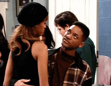
Aaaand when he turned around....ripster wrote:
And THIS is Xsphat! I am NOT kidding!

Why would you be worried? This is design for GH! Not DTwebwit wrote:Should I be worried?
DanGWanG wrote:
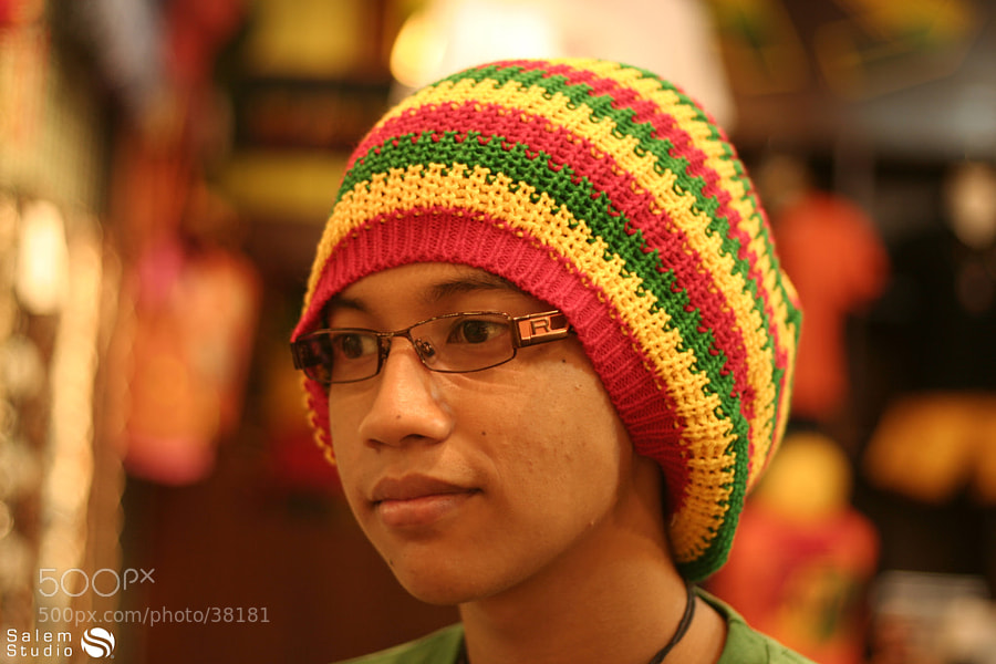
Now if someone could find me a pic of an Asian Rastafarian...
In our designs. I already gave up though, I'm a coder not a designer. I want something clean and something that does not follow the overdone forum standard layouts we've become accustomed to with VB/etc.hashbaz wrote:Define uses this.
Ah, well then yeah of course. People using it in their mock-ups and designs was the idea of posting it.GH1391401 wrote:In our designs. I already gave up though, I'm a coder not a designer. I want something clean and something that does not follow the overdone forum standard layouts we've become accustomed to with VB/etc.
