Page 48 of 76
Posted: 24 Jul 2015, 00:41
by chzel
Nah, I should have been a Scot I think, or an Austrian.
I'm quite white, so I singe, and heal and singe again, and come September I acquire a bit of a tan.
Not really fond of the beach either!
Today I went for a swim, the first of the summer!
Posted: 24 Jul 2015, 00:52
by Prelim
portuguese tan FTW! high contrast with your old doubleshots, double the pleasure! (and lets end the whity geeky nerd cliché

)

Posted: 24 Jul 2015, 01:03
by Muirium
Hirsute nerds unite! Mine's blond though, so doesn't show up nearly as much in pictures. That's what beards are for you see.
Posted: 24 Jul 2015, 01:08
by Prelim
hahaha, it's all about the age... ohh boy I miss my twenties, once you pass the thirties you become a monkey man @@
Posted: 24 Jul 2015, 01:13
by chzel
I am in my thirties and that didn't fix anything!
Posted: 24 Jul 2015, 01:27
by Muirium
I got the whole package at age 12. Big low voice, a fur coat, allergies, and you get the picture! Not the ideal time for all that. We could really use some control over these things as a species.
Posted: 28 Jul 2015, 22:49
by Muirium
All right, some crops from recent submissions to the
Cappening thread…
Facet's MX 8200:

- Facet.jpg (42.58 KiB) Viewed 4224 times
Madhias' NovaTouch I presume?

- Numono.jpg (28.16 KiB) Viewed 4224 times

- Numono 2.jpg (33.47 KiB) Viewed 4222 times

- Numono 3.jpg (30.56 KiB) Viewed 4214 times

- Numono 4.jpg (30.78 KiB) Viewed 4214 times
I should make a light setup like that…
Posted: 28 Jul 2015, 22:56
by chzel
The first crop from Madhias' NT works nicely, but we need a black logo...

Could the logo change colour (between black and white, nothing stupid!) depending on the displayed header?
Something like <if header=dashboard189.jpg then logo=black else logo=white>?
Posted: 28 Jul 2015, 22:57
by Muirium
NEVER!
The answer isn't a shitty logo. The answer is crop better. Which I have yet to do in this case…
Posted: 28 Jul 2015, 23:03
by seebart
Facet's MX 8200 works well.
Posted: 28 Jul 2015, 23:14
by Muirium
Yup, I added it to the list.
Madhias' shots are excellent, but I'm struggling to make a single good header out of them. His background is so light, and all those white caps aren't header friendly. It's a skill you know!
Posted: 28 Jul 2015, 23:16
by seebart
Yeah that looks like a though one. I might give my new super colorful Micro Switch sphericals a shot at a header.
Posted: 28 Jul 2015, 23:17
by Muirium
Go on then, I'm beat!
Posted: 28 Jul 2015, 23:30
by seebart
MICRO SWITCH SW-10876:

- microswitchcolors.jpg (190.42 KiB) Viewed 4182 times
Posted: 28 Jul 2015, 23:31
by Muirium
Got any in natural light? It's a bit sterile, and those colours should really sing.
Posted: 28 Jul 2015, 23:34
by seebart
Yeah I got plenty of shots. I'll try some more tomorrow.
Posted: 28 Jul 2015, 23:36
by Muirium
Good stuff. I really need some honest daylight to work with to shoot a bunch of my own. You saw my "Topre nights"…
 http://deskthority.net/post245200.html#p245200
Shot in mid bloody afternoon! Scottish summer is dark, dark summer. Wet too.
Posted: 30 Jul 2015, 10:03
by klikkyklik
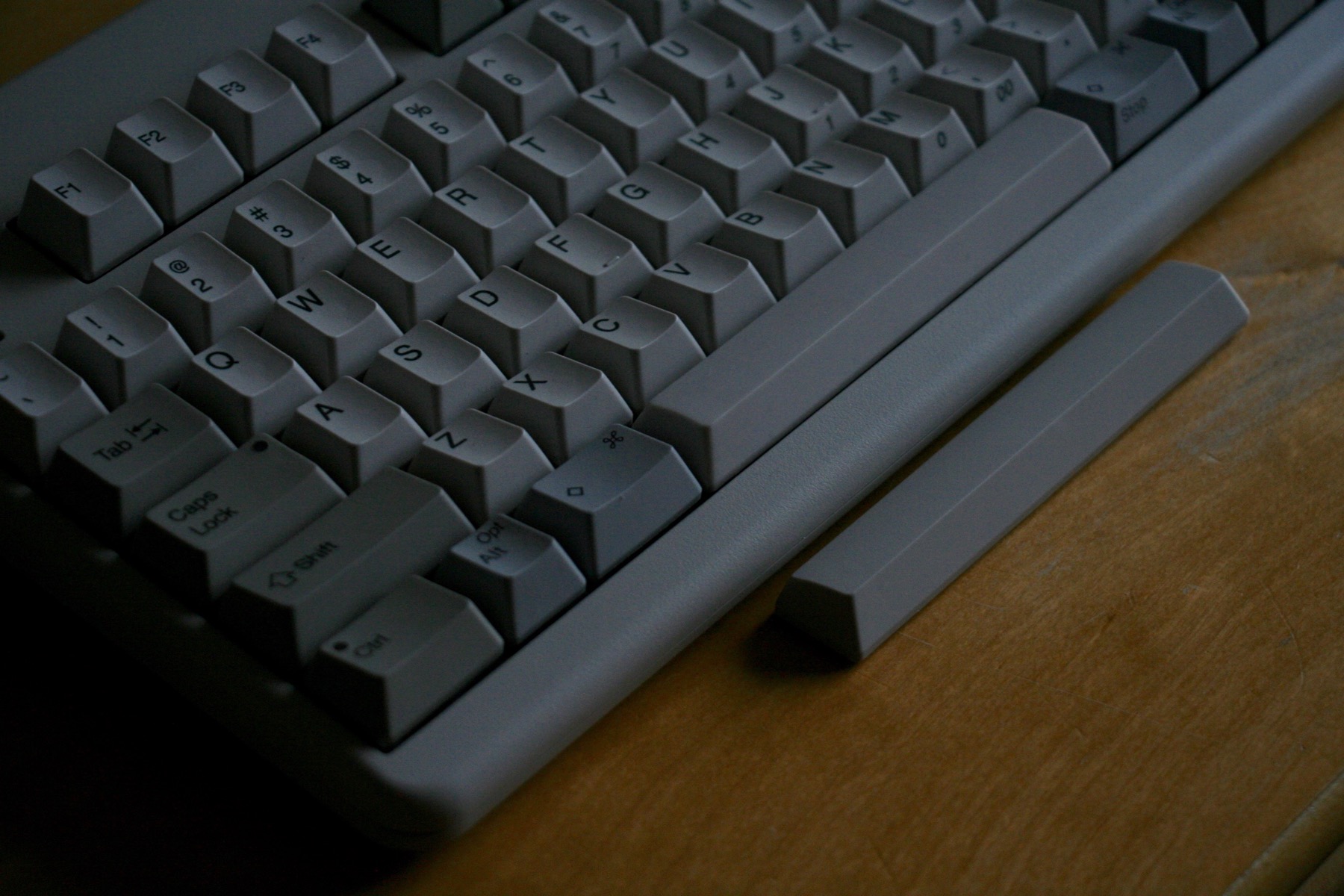
I really like this pic, but perhaps the areas indicated could be cleaned up w/software? Is it grime?

- g.jpg (31.45 KiB) Viewed 4120 times
Posted: 30 Jul 2015, 10:11
by seebart
Our secretary in charge does not tolerate image manipulation on the headers. And he has a point. If you start to open that door...
anyway yes it looks like grime. Who's header is that? Dirtbag!

Posted: 30 Jul 2015, 10:16
by klikkyklik
Oops - I did not realize that. I would rather see the little bits of grime than have that pic go away, so please ignore my post and carry on.

Posted: 30 Jul 2015, 10:22
by seebart
No you're right. That does not look so great. Thanks for pointing it out. Nothing wrong with that.

Posted: 30 Jul 2015, 10:30
by andrewjoy
Muirium wrote: Good stuff. I really need some honest daylight to work with to shoot a bunch of my own. You saw my "Topre nights"…
http://deskthority.net/post245200.html#p245200
Shot in mid bloody afternoon! Scottish summer is dark, dark summer. Wet too.
nice !
Now throw that shitty ABS spacebar away! Seen nicer spacebars on rubber domes.
Posted: 30 Jul 2015, 10:41
by Muirium
For an ABS spacebar, it's not bad. The PBT replacements are quite hard to tell apart from it just by texture. But the richer thock sound gives them away. Even on my HHKB Type-S.
Re: The Royal Inquest on Grime.
Image manipulation is not forbidden. *Shitty* image manipulation is forbidden!
So if someone really wants to have a go at it, sure, see if you can meet my stringent standards. It might take a few attempts! Deleting images from the active plus inactive header rota is a surprisingly tricky pain in the arse so I'll be picky all right.
Thanks for speaking up. The worst we'll do is discuss! And thanks for those red arrows on your screencap. All I could see without those was AAARGH THE PIXELLATION AND THE KERNING!! on the browser rendered navigation labels. I don't know how my fellow perfectionists can live like that.
Posted: 30 Jul 2015, 10:44
by seebart
Muirium wrote: age manipulation is not forbidden. *Shitty* image manipulation is forbidden!
Ahh well this opens up new dimensions for me....

Posted: 30 Jul 2015, 10:49
by Muirium
Well, you can imagine where my definition of shitty lies.
I've used a tiny bit of microscopic clone stamp in some of my pictures when a fleck of dust ruins symmetry. And there are a handful of horizontally flipped headers that I do hover over frequently, considering the Deactivate button. But other than that the editing I actually encourage is cropping, duh, including rotation for better framing (like that crazy angled shot we're talking about) and LEVELS of course, which is crucial up here with my old gear.
Posted: 30 Jul 2015, 10:52
by seebart
We shall see if you or anyone will even be able to make out my manipulations...
Posted: 30 Jul 2015, 11:11
by Muirium
Now you're getting it.
See if you can widen those secretarial shots from last week or two. They're too tightly cropped but to go any further back, we need artful cheating on both sides.
Posted: 30 Jul 2015, 11:19
by seebart
You mean those Xerox pics? Those do not have much more width in the picutre itself. I found them to be unusable, but I might be able to stretch them without looking shitty. Did you like them that much? You want the retro chicks right?
Posted: 30 Jul 2015, 11:31
by Muirium
Always with the retro chicks! For the purposes of headers, I'm also pro retro dudes!
Stretching isn't what we want. Well, you know what I mean. You need to magically create more width, without spoiling the centre of the image. I'm useless at that myself. But I've seen some good work in many of the retro photo headers here. Mine are always simple crops instead, like the NSA typist.
Posted: 30 Jul 2015, 11:35
by seebart
Yeah I was joking about all that image manipulation of course. 90% of the time that will not work out. We got plenty of headers anyway right? Like I said I'll give my Micro Switch colors another shot soon and we'll see.