Page 6 of 41
Posted: 08 Mar 2011, 02:27
by espritsc
Is there any way to get a notification if someone have "replied" to (quoted) your posts? It's just a bit hard to have to look at the threads you have previously posted on to see if someone have specifically replied to you. Just a thought.
Also, would it be possible to maybe increase the size of the Report/Reply/Top icons a little? I love the minimalistic design but I think increasing the size of those icons a little wouldn't hurt.
Posted: 08 Mar 2011, 02:31
by Nask
I hadn't see yet the multi-quote button.
It could be a great thing to click on the '+' button and make a multiple quotation post. =]
Posted: 08 Mar 2011, 02:54
by webwit
espritsc wrote:Is there any way to get a notification if someone have "replied" to (quoted) your posts?
Yes, see the Subscribe icon with the green + next to the font size icon at the top right of each page.
espritsc wrote:Also, would it be possible to maybe increase the size of the Report/Reply/Top icons a little? I love the minimalistic design but I think increasing the size of those icons a little wouldn't hurt.
nask wrote:I hadn't see yet the multi-quote button.
It could be a great thing to click on the '+' button and make a multiple quotation post. =]
These are both tickets in our development todo list. Not sure if the multi-quote can be done easily (it's not a standard phpbb feature). Also note that the todo list is not short, we might not get to it straight away.
Posted: 08 Mar 2011, 03:16
by webwit
Ekaros wrote:Umm can I close thread on marketplace? If I thread starter?
Very likely got rid of my Xkeys, so thread isn't needed anymore and deleting it seems wrong as history is always good to have to find out prices...
I think phpbb only allows moderators to lock topics.
Posted: 08 Mar 2011, 16:55
by keyb_gr
For those who need it, here's how to make the text for the buttons under posts reappear (site stylesheet for Stylish etc.):
Code: Select all
ul.profile-icons li {
        width: auto !important;
}
ul.profile-icons li span {
  display: block !important;
  margin-left: 20px !important;
 }
Much easier to hit and identify than the teeny tiny icons alone. (And I'm not even on a trackpoint...)
Nothing wrong with simplicity, but if it comes at the cost of usability I'm not a fan.
And no, I did not intend to make anyone blind with my choice of colors further up in this thread. :p These were some proven pastel tones which I consider pretty nice on the eyes and quite homely (certainly more so than plain white).
Posted: 09 Mar 2011, 21:43
by keyb_gr
Oh, and, err ... guys, someone relied too much on font sizes here:
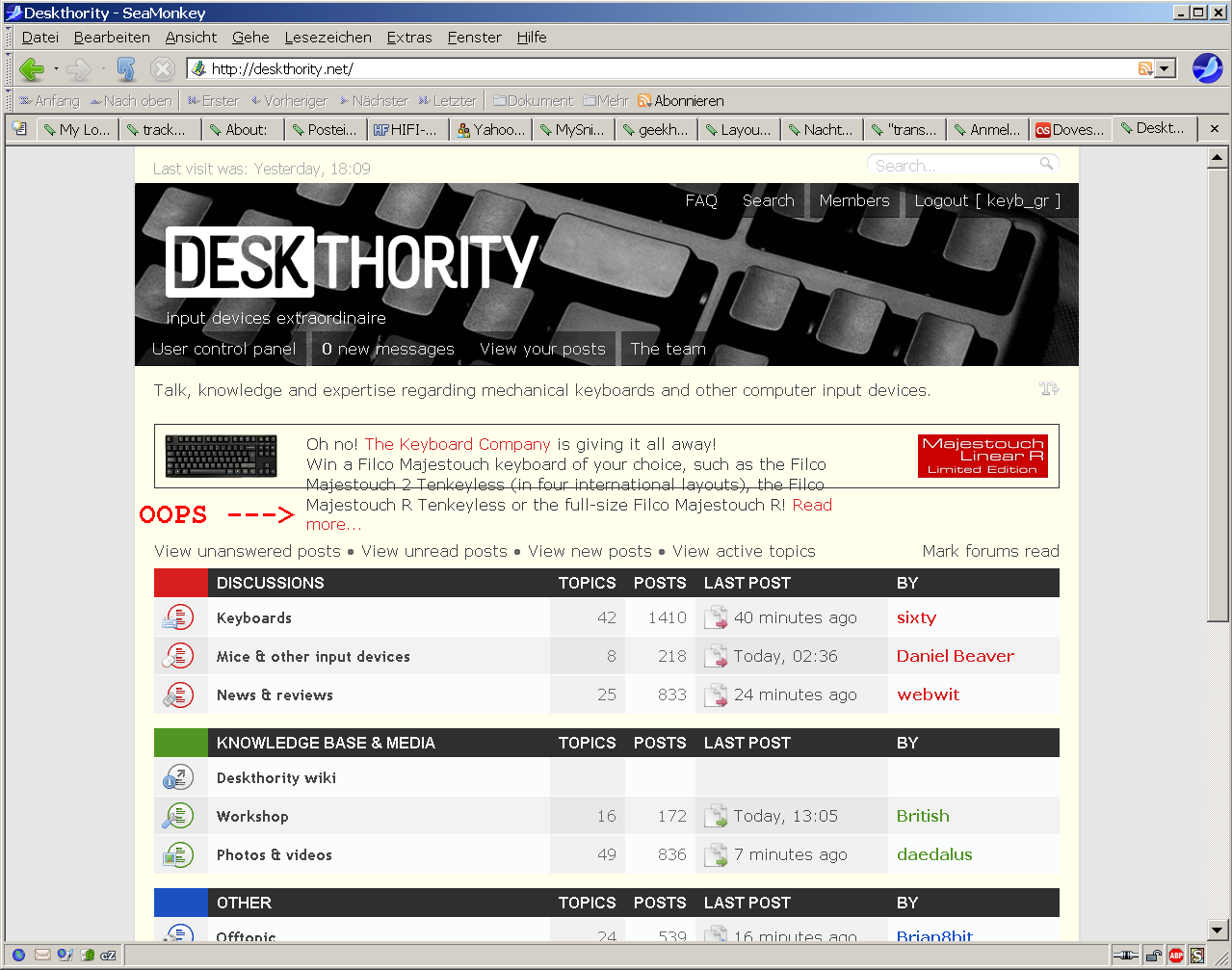
- Min font size conflict
- deskthority-oops-2.png (222.02 KiB) Viewed 7405 times
Guess that text is floating or somesuch?
Posted: 10 Mar 2011, 08:58
by Nask
Another suggestion:
Possibility to choose the view of private messages.
Example: List, like it's already set.
Or ... Conversation. ;D
I know that the plugin exists on almost all forums platforms.
It could be great to see private message as a conversation sorting by title.
Posted: 10 Mar 2011, 09:19
by British
Also, it might be of some use to have two "keyboard you"re using" fields.
"Home" and "Office", for instance.
Posted: 10 Mar 2011, 09:50
by Nask
British wrote:Also, it might be of some use to have two "keyboard you"re using" fields.
"Home" and "Office", for instance.
Or ... making a "My system" keyboard oriented plugin that we could see on profile.
Posted: 10 Mar 2011, 09:56
by British
Yep, "My keyboards", or better yet "My inputs" (notice the emphasis on plural).
Posted: 10 Mar 2011, 10:09
by Nask
British wrote:Yep, "My keyboards", or better yet "My inputs" (notice the emphasis on plural).
=]
Good idea. I'm in.
Posted: 14 Mar 2011, 13:20
by British
Also, the "last post" link is fine, but I'd prefer a "new posts" much more (so it brings me to the first unread message, instead of the last page of last posts... when it goes beyond current page, obviously).
Posted: 14 Mar 2011, 14:40
by xbb
keyb_gr wrote:Oh, and, err ... guys, someone relied too much on font sizes here:
deskthority-oops-2.png
Guess that text is floating or somesuch?
There is something wrong with your browser. Looks like the standard font size in your case is not 16px but something like 24px. Check the preferences.
Posted: 15 Mar 2011, 01:19
by Minskleip
Suggestion: when you click on a user to see his profile thingie, you should be able to click anywhere to close the box, not just the X.
Posted: 15 Mar 2011, 01:33
by webwit
It has been irritating myself

Posted: 16 Mar 2011, 16:49
by nathanscribe
Two things:
1) I've been seeing erratic behaviour on the icons at the left of topics. Sometimes there aren't any, yesterday they were twice normal size and only showed in part. I'm using Safari 5.0.4 if that's any assistance.
2) For the Wiki - could we have some info on materials used for key caps? I keep seeing abbreviations for different plastics, and some introductory info on the practical differences and implications (for example, DIY dye jobs, oredering new caps to match from various manufacturers, etc) would be nice.
3) Any chance of a list of current manufacturers of key caps in a few countries? I know Singanture Plastics gets mentioned a lot, and have heard of a place called Devlin here in the UK.
That's three things. Sigh.
Posted: 16 Mar 2011, 16:54
by webwit
1. Clean your cache or reload weird looking pages. There were some changes to the code, your browser may be caching old versions.
Posted: 16 Mar 2011, 20:28
by xbb
webwit wrote:1. Clean your cache or reload weird looking pages. There were some changes to the code, your browser may be caching old versions.
You can use fake versioning when you include css like file.css?v1.1 to force clients to reload them
Posted: 17 Mar 2011, 01:39
by nathanscribe
webwit wrote:1. Clean your cache or reload weird looking pages
Yep, that worked.
Posted: 17 Mar 2011, 09:41
by British
Moar suggestion: in the news & reviews section, color the headers when it's [Review] or [Product News], just like how it's done in the Deskthority related subforum with [Bug] and [Solved].
Maybe even do it for other subforums, for better readability ([Photos], [Video]...).
Posted: 17 Mar 2011, 09:47
by sixty
I thought about that too, but its not that easy to pick universal colors. Any suggestions?
Posted: 17 Mar 2011, 09:52
by British
Er... not right now.
Probably not red anyway, as it's good for [Bug] or bad stuff, but that's probably all it's good for.
Posted: 17 Mar 2011, 11:40
by webwit
I'm not sure about giving bright colors to prefixes, because they take focus of the more important title. I might actually downplay them at some point to a lighter gray or something like that.
Posted: 17 Mar 2011, 13:22
by British
Well, the idea is more about telling the prefixes apart from each other, rather than actually making them burn the retina.
That might be a side-effect, though.
Posted: 18 Mar 2011, 20:18
by sixty
British wrote:Well, the idea is more about telling the prefixes apart from each other, rather than actually making them burn the retina.
That might be a side-effect, though.
We can also use small icons for prefixes btw, but I'm not sure how effective that would be in telling them apart. I think it would lead to it blending into with the content. So probably no good.
Posted: 18 Mar 2011, 21:45
by webwit
I've been contemplating the same thing, it would also be nice to win horizontal space. In effect, they would be "topic icons", which is something I disabled earlier (mostly because it had mostly stupid smilies associated with it).
Posted: 19 Mar 2011, 19:53
by ripster
Stupid forum question. What's the difference placing the image "inline" and just attaching it without hitting the "Place Inline" button?
- NSFW.jpeg (46.67 KiB) Viewed 7237 times
Ooops. I figured it out. You can put text after the image.
Nvm.
Posted: 19 Mar 2011, 19:58
by webwit
Let me check with a random attachment.
Posted: 19 Mar 2011, 20:02
by ripster
Damn. I always thought it was the "One Child" policy that lowered the birth rate in China.
No WAY do Canadians have bigger penises. It's COLD up there.
Posted: 21 Mar 2011, 11:57
by British
Since it's not on the chart, I take it guys in countries in gray have no penis at all ?
