Page 7 of 43
Posted: 10 May 2016, 16:34
by andrewjoy
if you need a tester for the 3d printing i can print one of each profile on our up mini
Posted: 10 May 2016, 17:51
by matt3o
andrewjoy wrote: if you need a tester for the 3d printing i can print one of each profile on our up mini
thank! I'll keep that in mind when time comes!
Posted: 12 May 2016, 14:31
by ramnes
What are your plans for the first round? Something granit-esque?

Posted: 12 May 2016, 14:46
by matt3o
glad you asked! what's your take on color scheme, guys?
I wanted to use a more "retro" and possibly slightly bigger font than what I used on granite. For the colorway I was thinking a Model M like gray/beige with RGB add-on.
Posted: 12 May 2016, 15:04
by Muirium
Bigger glyphs give you less leeway for secondary legends. Granite did so well with those.
You know my fondness for red & white (Red Alert) and blue &'white (Olivetti) colour schemes. Preferably both! You can really mix and match that way. Black lengends, with blue or red secondaries…
Posted: 12 May 2016, 15:13
by photekq

The colour scheme of the originals :

And also something beige

Posted: 12 May 2016, 15:14
by seebart
Posted: 12 May 2016, 15:21
by derzemel
matt3o wrote: glad you asked! what's your take on color scheme, guys?
I wanted to use a more "retro" and possibly slightly bigger font than what I used on granite. For the colorway I was thinking a Model M like gray/beige with RGB add-on.
Add some blue caps, like the Industrial ssk?

Anyway, I am a fan of the IBM colorway, FC660C beige.
But I also think that stronger colors could work well, for example the Realforce anniversary edition with red Esc, Enter and Space and maybe a lighter gray.
Or Honeywell Terminal with red Enter and Esc (again, lighter gray), but this was done by 7Bit, so I do not know how doable it is.
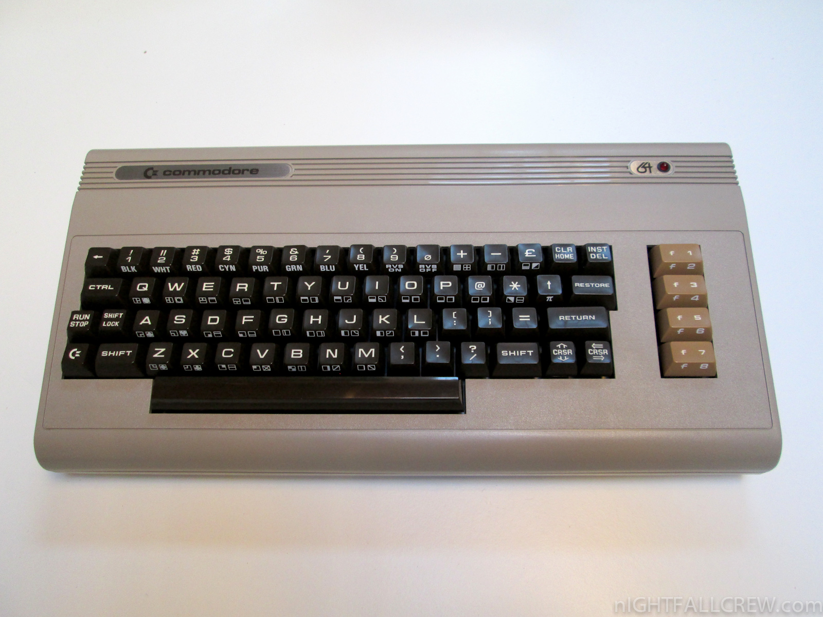
What kind of fonts will you be using? I think that Eurostile would look great, even on lighter DyeSub colors, for example, these Commodore keyboards:
Posted: 12 May 2016, 15:28
by snuci
l would choose a colour scheme that honours the original key caps. If you went with a beam spring key cap, I would go with a close colour scheme to the original so that could be sold that way. I am curious, which key caps did you choose to base these new key caps from? That would help choose the colour scheme, I think.
Posted: 12 May 2016, 15:29
by photekq
snuci wrote: I am curious, which key caps did you choose to base these new key caps from?
3278 beam spring
Posted: 12 May 2016, 16:05
by matt3o
guys. don't forget we are talking PBT here. we can't have white on black (or any dark color for the matter)
Posted: 12 May 2016, 16:18
by snuci
I do like the 3278 beam spring look with shiney white caps and black legends for the main alpha keys. I'd swap the black keycaps with white legends to light grey caps with black legends like the Granite colour scheme but make it all shiney, if possible. When key caps look like molars, that's what gives it the classic look to me. Just one opinion.
Posted: 12 May 2016, 16:37
by Muirium
matt3o wrote: guys. don't forget we are talking PBT here. we can't have white on black (or any dark color for the matter)
Precisely. Which is why white alphas and, say, blue or red mods are my suggestion. With black (primary) legends. Dyesub works best like that.
Posted: 12 May 2016, 17:18
by matt3o
my preference would be warm-gray (classic cherry or model-m) or medium/dark gray (a sort of HHKB effect but with a slightly lighter gray). For the mods we could add some color options of course. Dark gray+red mods for example would be definitely something.
Posted: 12 May 2016, 20:23
by niomosy
I may have missed it but would doubleshot be out of the question in the future? I realize dyesub is the focus but was curious about that. I have a feeling that while there's a solid chance I'll jump in on a dyesub set, I'll end up more interested in lighter legends that can only come from doubleshots in the future.
Posted: 12 May 2016, 20:48
by Muirium
Red mods liven up any keyboard just the ticket. White alphas are my preference, though. Beige doesn't play quite so well with others.
Posted: 12 May 2016, 22:56
by zslane
I like the idea of there being another manufacturer out there of custom high profile spherical keycaps with sculptured rows. And PBT is an awesome way to compete with Signature Plastics. However, the (legend) color limitations of dye sublimation takes me right out of this whole thing. It's double-shot or go home, IMO.
It's 2016 for f**k's sake; making high profile, double-shot PBT keycaps with spherical tops shouldn't be that challenging. There are flags on the bloody moon, but no PBT keycaps to compete with SA? That's just embarrassing for the human race if you ask me.
Posted: 12 May 2016, 23:16
by ramnes
Then do it, "for f**k's sake". Meanwhile, I'll be glad to use dye-sublimated keycaps.

matt3o, I'm so in for a classic set in classic Cherry tones! Maybe with a red Esc or something like, but not more.
seebart's Microswitch keyboard could be a great inspiration too, if orange on light grey is doable:

Posted: 13 May 2016, 00:08
by zslane
If you want to experiment with colors, go into Photoshop, make a gray field and then type some orange text on a layer above the gray field. Set the text layer to the Darken blend mode. Play with various shades of orange to see what dyesub will basically give you in the end.
Posted: 13 May 2016, 00:18
by niomosy
I think dyesub can handle a fair number of people and isn't a bad way to start. It's more that I was seeing if there were plans for these beyond dyesub as I do have a preference for doubleshots given I tend to like lighter legends.
Posted: 13 May 2016, 02:44
by Muirium
I'm very fond of dyesub, actually. Yes: for PBT. But also because of the greater possibilities in multiple legend colours. The fact it forces sensible colourways is a bonus. There's a lot of downright fugly doubleshots out there.
zslane wrote: It's 2016 for f**k's sake… There are flags on the bloody moon…
And yet not a single man has been there
since 1972. No one has even left low earth orbit in my entire lifetime!
You picked a great analogy for the keyboard world. We struggle today to achieve what our recent ancestors accomplished.
Posted: 13 May 2016, 02:45
by photekq
ramnes wrote:
seebart's Microswitch keyboard could be a great inspiration too, if orange on light grey is doable:
I absolutely adore this colour scheme. WOULD BUY.
Posted: 13 May 2016, 02:53
by zslane
Dye sub is not a substitute for triple-shotting. Sure, Granite alphas look "neat" with the colored co-legends, but to my mind that is mostly just a case of Matt3o making the most of a compromised printing method. To me, that isn't a selling point of dye sublimation but a kind of consolation prize.
In any medium there is the potential for fugly aesthetics. That includes dye-sub, maybe even moreso because the entire world of awful typefaces is available to the taste-challenged designer. At the end of the day this is not a problem peculiar to double-shots, and ultimately it isn't a method problem, it is a designer problem.
Posted: 13 May 2016, 02:58
by Muirium
True. But I will point out that dyesub does a better job at faithfully reproducing type. You know doubleshot's limitations. The fonts most often used with it are goofy round edged childish types, like everything by SP, and yes IBM's Selectric and Beamspring caps too. I much prefer the legends on great dyesubs. Granite and the
Helvetica über alles of classic IBM and Topre.
Posted: 13 May 2016, 03:02
by photekq
zslane, I think you underestimate the complexities and expenses of doubleshotting. Never mind PBT doubleshotting and tripleshotting.
It's astounding that matt3o is able to have these custom profiles and keycaps mass produced as PBT dyesubs. While it's nice to aim for the sky, you should understand that a small market such as ours has its limitations.
Posted: 13 May 2016, 03:34
by zslane
I look at old double-shots from any era pre-1981 and I find them to be quite beautiful and elegant. I sort of feel that today's double-shots harken back to when Detroit still cared, so to speak. Dyesub is great at producing a crisp look I find acceptable, but not preferable.
As for the complexities and expenses of double-shotting PBT, I can't help but think that if Vortex has managed to scale that summit with cylindrical caps of medium-height, that we as a species can't be far from making the same strides with high-profile sphericals.
Posted: 13 May 2016, 03:36
by photekq
Vortex are in China. We, as a community, are not. It's harder to establish manufacturing contacts there when outside of the continent. They also likely have their own prototyping resources and machines, which makes testing doubleshots infinitely cheaper and easier.
Also, I'd rather high quality dyesub to Vortex quality doubleshots
Posted: 13 May 2016, 03:52
by zslane
Isn't/wasn't Matt3o pursuing a relationship with a keycap manufacturer in China?
It seems that when it comes to manufacturing of just about anything these days, all roads lead to China...
Posted: 13 May 2016, 04:10
by niomosy
photekq wrote: Vortex are in China. We are not. It's harder to establish manufacturing contacts there when outside of the continent. They also likely have their own prototyping resources and machines, which makes testing doubleshots infinitely cheaper and easier.
Also, I'd rather high quality dyesub to Vortex quality doubleshots
I'd say look more at Vortex as a beginning. Things can potentially get better from there for those looking to step up.
Personally, if it ends up with having to do doubleshot caps in ABS, so be it. It would still be nice to have the option of doubleshot ABS deep dish sphericals. Though I would love doubleshot PBT.
Posted: 13 May 2016, 07:36
by matt3o
The quality, definition and flexibility of dye-sub legends widely outweigh the vanity of having light on dark legends of double-shot.
With dye-sub we can have:
- as many languages we want
- change/update font and legends at any time at no additional cost (we did that with granite a lot)
- novelty keys aplenty
- higher definition legends and complete design freedom
- weird key sizes support (need 1u return? you got it)
- 1/2 the production cost, 1/100 the development cost
Do you have any idea how much would cost to manufacture the molds for each legend? Do you want 1.75u right shift? Sure, pay for a new mold and one mold (even in China) is hundreds of dollars.
The development phase is also incredibly complex. For the Topre PBT spacebar I believe I have at least 20 iterations, and it's 1 keys. This is in part due to the cultural and language barrier we have with China and in part with their low average skill level. Each and every key has to be checked, if something goes wrong it takes 2-4 weeks to make a change, wait for shipment, check again and repeat. It is a very frustrating process.
It is humanly impossible to make a complex high quality set from scratch in double-shot PBT (let alone thriple-shot). And even if you could make it, nobody would buy it because it would cost an arm and both legs.
Collaboration with Vortex is a possibility, but: 1) they require incredibly high quantities, 2) quality is so-so, 3) we would lose all the flexibility we want (ANSI+ISO UK and that's it)
Hope I made things clear now, I probably never talked about these things, I would do double shot PBT in a heart beat if I could, but it's not really an option. (please also consider that this is not my job, people might thing that I'm getting rich on these things but it's still an hobby)

