Page 7 of 15
Posted: 23 Aug 2015, 17:49
by cookie
I actually never understood the pro's of an apple style keyboard layout, I totally hate it.
Every time I am working on a Mac I look like a retard who isn't capable of the most simple task

Posted: 23 Aug 2015, 18:14
by Muirium
Habit.
seebart wrote: Yeah I never understood Topre's approach either. No official distribution outisde Japan? Am I missing something here?
They're Japanese. Japan (rivalled I suppose by Korea) has to be the smallest "big country" in the world. American firms like MassDrop forget all about the 96% of the world that doesn't live in the United States. Makes sense for them, as America is the lion' share of their interested market in any case. Japanese companies often behave the same way. Back when I first got into anime, and BitTorrent wasn't invented yet, I discovered this the hard way. Buying Japanese products outside Japan was costly and complex way beyond reason. Why would foreigners want their stuff? And why should they be shipped to? Ugh.
Topre has EK and Keyboardco as regional distributors, so they're not the worst. But they sure don't help with the reputation that forever hovers around them: overpriced, incompatible, rubberdomes for rich kids. Topre is the Apple of the keyboard world for sure. Without the stores or mass success with new lines.
Posted: 23 Aug 2015, 18:29
by seebart
In that way Topre could learn a bit of German attitude. Were the export champion of the World. Or better yet giants like VW simply open the factories in the countries they sell well like China. But But these are very different proportions of course. Topre seems like a really settled conservative old school tech company to me, even compared to Cherry. If they went for real sales and promotion in the EU they could do quite well IMO. The good stuff like the HiPro are constantly out of stock at the PriceyKeyboard Company.

Gimme gimme gimme....drooooooool....
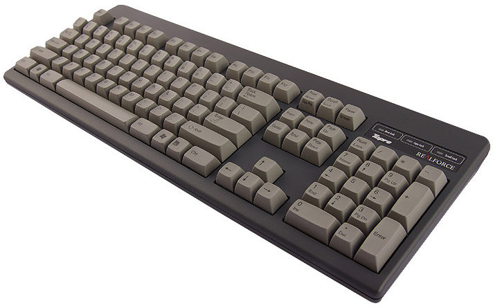
- topre_hipro_capacitance_keyboard_large_2.jpg (57.85 KiB) Viewed 5200 times
Posted: 23 Aug 2015, 18:33
by guk
Keyboards are way too niche a market to make much of an impact, sadly. Otherwise the prices for e.g. GMK weren't that ridiculous.
Posted: 23 Aug 2015, 18:44
by Muirium
Yup. Many orders of magnitude off being mainstream. Or any possibility of being so. We enthusiasts are a very slim minority that's not growing nearly fast enough to change that fact in our lifetimes. Forget about it.
Meanwhile, Topre could still do much better here, but just like Cherry they're a company that's not mostly about making keyboards anyway.
Posted: 23 Aug 2015, 19:43
by vinzbe
matt3o wrote: one last...

Looks identical (color wise) to the
Realforce 108UW-HiPro 30th Anniversary Edition without a vertical red enter and ... the bag. Not that there is anything wrong with that

Posted: 23 Aug 2015, 20:50
by cookie
If I had to choose a font, it would be the centered one definately!
I am even concidering to put some printed caps on my keyboard at home so my Girlfriend could use it, she struggles quite a bit with blank caps.
I'd like to try those HiPros actually but I think I wouldn't like the feel.
Posted: 23 Aug 2015, 22:35
by Hypersphere
My preference is for the letters to be in the upper-left rather than in the center of the key cap.
Regarding matt3o's centered design, is there any reason for the characters to be smaller when centered than they are when placed in the upper-left?
Posted: 24 Aug 2015, 11:43
by matt3o
Hypersphere wrote: Regarding matt3o's centered design, is there any reason for the characters to be smaller when centered than they are when placed in the upper-left?
Just experimenting.
Posted: 26 Aug 2015, 09:49
by matt3o
Reducing options.
All designs need some work with the legends (alignment and sizing mostly). There are 3 fonts there. Of course we can use any font with any color. The gray/yellow one has a more "modern" typeface. The white/red has a narrow font. The others are very close to Helvetica, but all fix the original funky RF legends.
Personally I prefer the icon modifiers, but I'm okay with text. I will probably add a fifth option, possibly more "traditional", not that any of the options so far are incredibly extravagant.


Re: Designing the next Topre keycap set
Posted: 26 Aug 2015, 10:19
by ShivaYash
Congrats. I'm late to the party on this. I really like topre hi tops but they aren't available as an spare set.
Posted: 26 Aug 2015, 14:57
by potatowire
I love all of these, with Honeywell-esque as my favorite and the red & white a distant fourth place. I would (will) buy any of them.
Posted: 26 Aug 2015, 15:06
by Muirium
I like the red and the Honeywell. The others aren't really for me. But I'd love those icon mods!
Could you use Helvetica Neue for the alphas on an icon mod Honeywell set? I want to see if my individual preferences amount to much!
Something I'm thinking about is how well these designs might mix with a current set of Realforce caps…
Posted: 26 Aug 2015, 15:34
by chzel
The Honeywell is the best in my eyes!
The text mods look fine! I seriously dislike full icon mods!
Posted: 26 Aug 2015, 16:00
by Khers
I vote Honeywell as well and the Helvetica-like font, with text mods.
Posted: 26 Aug 2015, 16:08
by matt3o
personally I would go gray/yellow or green/beige with icon mods... but I guess white/black is the easiest to the eye.
Posted: 26 Aug 2015, 16:37
by Muirium
So, the BIG question: are we designing ONE set, or can we squeeze in two?
Because if it's just the one, I'd go with Honeywell style with Helvetica Neue text mods. That seems to be the direction we're gravitating.
If its two, then I want icon mods! And I could live with deep coloured alphas if I can use the mods elsewhere.
Posted: 26 Aug 2015, 16:45
by 7bit
Posted: 26 Aug 2015, 16:52
by KRKS
Bummer, you just had to remove the ones I like...
Anyway, from those four I'd take the third one with
Helvetica Staaandaaa... I mean Helvetica-like font and icon mods
Posted: 26 Aug 2015, 17:49
by Muirium
Blech. Keep your Cherry-SP-dancing legends out of this, 7bit. They're tacky compared to Granite. Like MX switches next to Topre. Blech!
Besides, that's your design for your future Alps set, right? (Which I intend to avoid, mwaha!)
Posted: 26 Aug 2015, 18:34
by Halvar
Matteo, did they ask you to support JIS layout, too? Or other language layouts?
Posted: 26 Aug 2015, 19:02
by 7bit
Muirium wrote: Blech. Keep your Cherry-SP-dancing legends out of this, 7bit. They're tacky compared to Granite. Like MX switches next to Topre. Blech!
Besides, that's your design for your future Alps set, right? (Which I intend to avoid, mwaha!)
Maybe you are right. Conventional discoordinated legends are good enough for the rubber domes.

Posted: 26 Aug 2015, 19:02
by matt3o
Halvar wrote: Matteo, did they ask you to support JIS layout, too? Or other language layouts?
not at this time. but I will ask
Posted: 26 Aug 2015, 19:38
by zslane
Honeywell colorway is my favorite by far. Don't need my keyboard to look like Bumblebee, despite liking black/yellow in other contexts. A large, centered Helv Neue font would be my pick, and while I adore the Granite icon mods, text mods would probably connect with the widest audience. Besides, fewer icon mods everywhere would help keep Granite somewhat special... (dearly wish I had a set...alas, that GB was before my time).
Posted: 26 Aug 2015, 20:31
by Halvar
matt3o wrote: Halvar wrote: Matteo, did they ask you to support JIS layout, too? Or other language layouts?
not at this time. but I will ask
Thanks!
Colour-wise, I'd go for the "more traditonal" option. CCnG or Honeywell are ok, too.
Posted: 26 Aug 2015, 20:35
by Muirium
If we go text mods, which seems likely, can we swap that menu key legend for the lined one? It's already a busy icon, nestled in our text mods!
Posted: 26 Aug 2015, 20:38
by matt3o
I kinda like the little arrow-menu
Posted: 26 Aug 2015, 20:41
by Muirium
I hope you're kidding. Or I'm going to have to sell some of my stock!
Posted: 27 Aug 2015, 03:31
by 002
Have you showed Topre any of the WIP designs yet, Matt? If so, have they given any indication on what they like or would prefer to do? Still want the red alert set myself but don't know if Topre can even pull that off with the problems they apparently had trying to do that before (red turning out pink).
Posted: 27 Aug 2015, 07:59
by matt3o
still waiting for feedback from Topre. It will be a loooong process. You know what I'm talking about, right?


