Page 8 of 15
Posted: 27 Aug 2015, 13:49
by Muirium
002 wrote: Have you showed Topre any of the WIP designs yet, Matt? If so, have they given any indication on what they like or would prefer to do? Still want the red alert set myself but don't know if Topre can even pull that off with the problems they apparently had trying to do that before (red turning out pink).
I could live with Pink Alert, so long as the mods match the alpha legends! But yes, red is its own reward. If that troubles them, Honeywell is safer.
matt3o wrote: still waiting for feedback from Topre. It will be a loooong process. You know what I'm talking about, right?
2016… 2017… so long as it ships before Round 6!
Posted: 27 Aug 2015, 15:23
by Hypersphere
+ Honeywell
+ Icon mods
Posted: 27 Aug 2015, 16:51
by Muirium
Honeywell with icon mods would sure make a handsome set. I'd go for a paler grey for the mods, though. More like Granite than the fairly dark GPA (in SP speak) of Round 5.
Dyesub will work better on a lighter grey. Crucial, if we get secondary legends! Like those Alt/Command and Win/Option keys…
Tell Topre they can sell Realforces to all those snooty Mac users out there if they include the right legends!
Posted: 27 Aug 2015, 16:59
by Hypersphere
@Mu: Agreed. Per my earlier posts, if the mods are so dark that the legends are difficult or virtually impossible to read, I would prefer one of two options: (1) blank mods or (2) a lighter background color so that legends would be legible.
Posted: 27 Aug 2015, 17:03
by Muirium
I'd like:
Option 2. Lighter mods.
End of list.
Mixing blanks into a layout is as unacceptable to my eye as mixing profiles is to my fingers. Just can't stand it. Though I know this is personal taste
Posted: 27 Aug 2015, 17:05
by matt3o
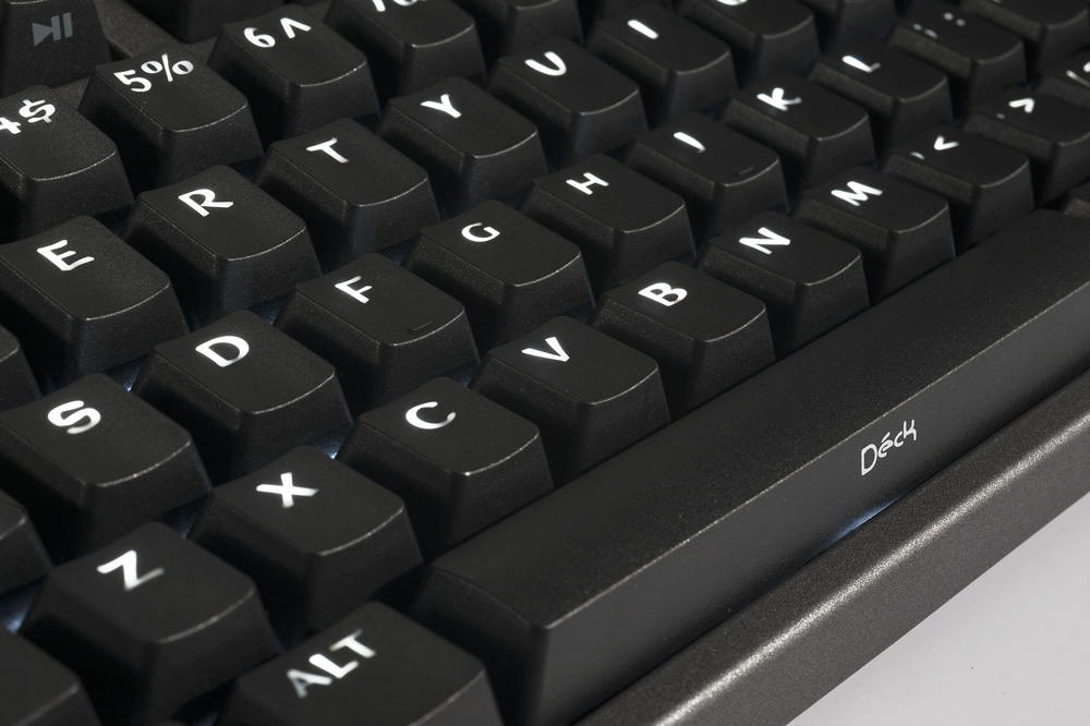
just FYI, the gray is lighter than current HHKB black.
Posted: 27 Aug 2015, 17:18
by Muirium
You know my thoughts about the black HHKB's idiotic I Can't Believe They're! legends. That's exactly what I'm trying to avoid!
Posted: 27 Aug 2015, 17:26
by Hypersphere
Muirium wrote: I'd like:
Option 2. Lighter mods.
End of list.
Mixing blanks into a layout is as unacceptable to my eye as mixing profiles is to my fingers. Just can't stand it. Though I know this is personal taste
I agree about mixing profiles: bad to my eye and well as my fingers. However, I like the appearance of blank mods with printed alphas, but I don't like the reverse (printed mods with blank alphas). Yes, yet another matter of personal taste. I wonder, Are there any objective truths when it comes to keyboard parameters?
Posted: 27 Aug 2015, 17:28
by matt3o
Hypersphere wrote: Yes, yet another matter of personal taste. I wonder, Are there any objective truths when it comes to
keyboard parameters anything?
fixed that for you
Posted: 27 Aug 2015, 17:36
by Hypersphere
Posted: 28 Aug 2015, 08:55
by matt3o
Got feedback from Topre. Good news or bad news... depends on how you see it.
They want to do something "different", something they never did before. I used very simple typefaces because I thought they didn't want to go too far from the current designs, but it seems they want more.
So basically, no Helvetica or close-by. They like the font I used in the yellow/gray layout, but I got the feeling they would like to dare even more. For the same reason, they are not impressed by the "honeywell" layout. So I guess it's a no-go.
I'll now work on these new inputs and produce some more designs.
Posted: 28 Aug 2015, 09:35
by Muirium
Shit. They want GAMERFONT.
Posted: 28 Aug 2015, 09:54
by sth
Posted: 28 Aug 2015, 10:58
by Madhias
Oh my. Imagine the most normal looking cases like a white/beige Realforce case, with fancy gamer caps! Or will there be then also a new keyboard from Topre?
Posted: 28 Aug 2015, 11:06
by matt3o
nobody talked about gaming caps, c'mon guys. The most extreme font I used is pretty sober anyway.
Posted: 28 Aug 2015, 11:45
by Muirium
Trouble is any other font besides Helvetica won't mix well with existing caps. Clashing fonts are horrendous.
And that means I can't even mix my way out of one of the colours, using my own alphas for instance. So if they're garish (yes, grey and yellow etc. is much too garish for white keyboards) then I'm out.
Topre really shot my unicorn.
Posted: 28 Aug 2015, 12:04
by sth
I'm still really just hoping for blanks as an option -- printed legends don't do much for me most of the time and ANY printing will clash when it comes time for me to kitbash keysets.
Other than that I really have no opinion when it comes to the legends that get picked but there are a couple that I've always liked. One is on older apple keyboards - Univers 57 Condensed Oblique is the font IIRC (although it doesn't look quite the same on a screen without some slight modification). The other is the "Original" Red Alert set that OTD ran (i think in conjunction with DT/sixty) - it's a bit 'scifi' without being tacky.The font is called ISOTHERM and you can see it on page 2 this old SP spec sheet:
http://keycapsdirect.com/pdfs/LineFont.pdf
Posted: 28 Aug 2015, 12:10
by Muirium
Ah, SP's alt fonts. Isotherm looks good there, but it may just be the "stand between two hideously ugly people" effect!
I'd rather blanks than clashing fonts, too. Which isn't saying much, as I've protested against them here before! Topre does them on the HHKB, at least. In *elegant* colours! Definitely rules out a lot of buyers though. Far from everyone is so confident a typist.
But I've got a bad feeling about this. I think Topre is chasing the mass (or rather China's idea of a gamer) market. Hope I'm wrong, because that will undermine every decision.
Posted: 28 Aug 2015, 12:25
by sth
Here's a shot of Isotherm on the alt-num row kit (I don't think they did alphas in that font):


i would consider using an entire boards' worth of legended caps in that font, depending on the alphas/mods.
i also love the mid-alignment on those number keys.
Posted: 28 Aug 2015, 12:31
by vinzbe
Just to understand the limitations, the keycaps will have the same material, profile and printing method as usual, right?
Posted: 28 Aug 2015, 12:31
by Muirium
I dig centred numbers too. Granite did it ten times nicer, mind:
Granite is really what I'm always thinking about. This is Matteo! And Topre does dyesub like no one else out there. We have the ingredients for something spectacular!
Or did.
Posted: 28 Aug 2015, 14:04
by andrewjoy
Granite is nice but i prefer my IMSTO cherry set, simple, no fuss yet awesome!
Posted: 28 Aug 2015, 14:06
by sth
heh, that'd go over well.
matt3o: "so we've decided that we'd like to use this particular font."
topre rep: "that looks familiar... where is it from?"
matt3o:

Posted: 28 Aug 2015, 14:16
by Muirium
Topre's likely never heard of Granite, or Imsto! They're not exactly engaged in the keyboard scene. Which is both a great hope (forget the dumb trends!) and a potential disaster (no! Really, Razer is a turd and CM isn't famed for elegance either, forget the dumb trends!).
We want their taste to be informed by us. That's a chance you never get from keyboard manufacturers, and is the reason we group buy so many caps. Don't fail us now, Topre! Don't think for yourselves. Listen to Matteo.
So I'm reading your joke with Helvetica! They can recognise that one. Little do they know how daring they'd be to keep using it. While everyone else is losing their minds.
Posted: 28 Aug 2015, 14:21
by klikkyklik
I find the green and beige combo to be refreshingly different, relatively reserved, and visually attractive.
Posted: 28 Aug 2015, 14:29
by Muirium
Cream cheese 'n green, as they say.
If anyone can do a sterling job with it, Matteo is the man. But Topre's got ideas…
Posted: 28 Aug 2015, 14:34
by andrewjoy
Muirium wrote: But Topre's got ideas…
comic sans ?
Posted: 28 Aug 2015, 14:36
by Muirium
"No. We need more edge. What is the font from the big movie right now? The one with Schwarzenegger in it?"
Edit: I meant last year's
Expendables III: If I Had Been Born in America I Would Be President by Now, But Instead You Reduce Me to This? Assholes! But apparently he is the lead in
something this year. With a serif title font! The horror…
Posted: 28 Aug 2015, 14:54
by sth
Muirium wrote: Topre's likely never heard of Granite, or Imsto! They're not exactly engaged in the keyboard scene. Which is both a great hope (forget the dumb trends!) and a potential disaster (no! Really, Razer is a turd and CM isn't famed for elegance either, forget the dumb trends!).
We want their taste to be informed by us. That's a chance you never get from keyboard manufacturers, and is the reason we group buy so many caps. Don't fail us now, Topre! Don't think for yourselves. Listen to Matteo.
So I'm reading your joke with Helvetica! They can recognise that one. Little do they know how daring they'd be to keep using it. While everyone else is losing their minds.
I wasn't referring to Imsto -- more that Imsto uses (at least a very close-to-original) version of the Cherry font

Posted: 28 Aug 2015, 14:55
by Muirium
It honestly wouldn't surprise me if Topre has no idea what the Cherry font is any more, and can't tell it apart from Helvetica anyway!
Note: I can. Look at that G. And shake, in anxiety…