Page 9 of 15
Posted: 28 Aug 2015, 15:00
by cswanic
matt3o wrote: They want to do something "different", something they never did before. They like the font I used in the yellow/gray layout
We need more input. Might I request you list the font type faces that specifically interest them. There are lots of great people on DT (of course) and GH that could really work with you on pulling from the type face style once that style type is known.

matt3o wrote: they are not impressed by the "honeywell" layout
We need more input. Did you feel for their impressions on alphas one color, modifiers another color? From the layouts you did, I didn't see any novelty keys. At this point it can't hurt to suggest some designs. I'm not thinking Granite novelty. I'm thinking creators like Lyqu1d, Haan (he had an idea with Otaku Kiibodo for the home cluster) and other creative keysetter pros.

matt3o wrote: I'll now work on these new inputs and produce some more designs.
What about theme keyboards. Remember back in the day when "WinAmp" came out and there was a whole bunch of people that designed a theme around the entire player? Think Nature, Space, Science, Home. Maybe its time we pull out PETSCI again?

This is where I leave it up to you all that are way more smarter than I am. I'm just "on the outside looking in"

Posted: 28 Aug 2015, 15:05
by Muirium
Seeing as
I'm on a Topre rip, I reckon that is pretty much to-the-word the entirety of the feedback they gave Matteo. Designers have to put up with this kind of thing from clients all the time. "Uh, I don't like it. Needs a bit less, I don't know, old man in polyester. Yeah? It's got to have 'it', know what I mean? And you don't know 'it' until you see 'it'. Dig? And 'it' ain't here. Bring it to me!"
Honestly, I'd expect the same kind of terse feedback from any company, not just Topre. But in Japan there is a business culture of saying less than is really necessary, too. Which just adds to the fun.
Posted: 28 Aug 2015, 15:10
by cswanic
Definitely its a "designer's world" out there when it comes to design. That's part why I parsed out Matt3o's comment in pieces. It helps to find the clues in the "it" speak so we can find out what we need to get this done right and, with any luck, add in a thing or two that makes it Matt3o's product from the community.
Posted: 28 Aug 2015, 15:15
by Muirium
Just as an experiment, Matteo could show them Granite (without mentioning it already exists in MX) to see what they think. I like the colours and adore the Gotham font. I do wonder what Topre's reaction would be.
Posted: 28 Aug 2015, 15:17
by Hypersphere
Disappointing news. I had thought they would want a keycap set for the ages. Now it seems that prefer hypeface to typeface and fads rather than classics. It would appear that the challenge for us is to come up with a design that seems avant-garde yet one that will not seem hopelessly dated within a short time.
Posted: 28 Aug 2015, 15:26
by cswanic
Granite maybe. I have a feeling though that they've seen the other themes from keypuller though. Granite was popular, no question, but I would say the Novelty idea is getting them interested in what we can do with colors tied to font style tied to theme. PETSCI, VIM, and the commodore feel. Keyboards from Japan from back in the day (ask HaaTaa or just go to his Flickr for inspiration and look at keyboards made in Japan. Think Retro, it hasn't really been done or at least in quite a while.
 https://www.flickr.com/photos/triplehaata/albums
We can still get classics. We just need to look more eastern hemisphere focused and perhaps less on what's already been done for the west.

Posted: 28 Aug 2015, 15:33
by sth
I have a feeling though that they've seen the other themes from keypuller though.
yeah... maaaaaybe. i'm not sure though - topre hasn't seemed to be on top of the game when it comes to their own creations in quite a while. their wackier looking boards have been commissions from other firms (i'm thinking of the ilovex specifically:
http://deskthority.net/wiki/Topre_Realforce_ilovex)
Posted: 28 Aug 2015, 16:22
by matt3o
Hypersphere wrote: It would appear that the challenge for us is to come up with a design that seems avant-garde yet one that will not seem hopelessly dated within a short time.
Exactly this!
Posted: 28 Aug 2015, 16:31
by cswanic
No offense, but if this goes back to the style and design of the NovaTouch special, then I'm out. If that's the case, we have two options.
Option 1: Matt3o says ###k it, here's your layout. Takes check. Apologizes to the community.
Option 2: Listens to the community. Rejection by Topre. Comes back another day and launches it anyway with Bunny and the gang.
Posted: 28 Aug 2015, 17:05
by Muirium
Option 3: Show them Granite. They refuse. Show them the previous designs. They refuse. Show them Granite. They refuse. Show them the previous designs. They hopefully begin to get the message.
Either that or let the orange and blue brigade win. Besides clown cars, those colours remind me of something tasty…
Posted: 28 Aug 2015, 17:07
by chzel
Yeah, brain-wash them all the way to Honeywell! Or Granite. Or Honeywell!
Posted: 28 Aug 2015, 17:29
by Hypersphere
Here is the Otaku Kibodo:
- UMtAtzD.png (545.94 KiB) Viewed 5660 times

- qHzAOmx.png (583.48 KiB) Viewed 5660 times
https://geekhack.org/index.php?topic=72086.0
There is a version with western/Roman legends, but I could not readily find it.
Posted: 28 Aug 2015, 18:07
by cookie
And that is the reason I like blank sets

I have the feeling that the unicorn brigade will win this time! BOHAHAHHAA but without HHKB support it's probably useless for me anyways

I have absolute faith in Matt3o!
The Otaku Kibodo is interesting, I even like the japanese font on it.
This set would freak everyone out if he has to type on my machine
Posted: 28 Aug 2015, 18:20
by 7bit
Would be great if the modifers would also be in Japanese.
Posted: 28 Aug 2015, 19:02
by Hypersphere
Yes, I rather like the Otaku Kibodo design.
In addition, I think it might be a good idea to follow up on the suggestion to make a design around a harmonious theme drawn from, e.g., nature, science, space, .... Perhaps something inspired by a painting by Hiroshige.
Posted: 28 Aug 2015, 19:33
by zslane
Since these are going to be OEM (i.e., cylindrical) caps, I'm out. Seems such a waste of matt3o's talent...

Now if we could only convince Topre to take the Granite design and apply it to SA-profile caps for a new RealForce board, then we might actually
have something (for the ages)!
Posted: 28 Aug 2015, 21:25
by cookie
I'd be super happy with a Otaku Kibodo to be honest
Posted: 28 Aug 2015, 23:32
by Hypersphere
Given that Topre wants to do something different, it would be nice if they could be convinced to allow a high-profile spherical-top set -- a profile like their "HiPro" or SA. Even OEM profile with spherical tops.
If they have definitely closed the door on high-profile sphericals, I could live with Topre profile and cylindrical tops as long as everyone can agree on legends and colorways that somehow combine contemporary razzle-dazzle with enduring dignity. Another apt term is "pizzazz", which has been defined as a combination of glamour and vitality.
But don't let's try dressing up our Topre boards as if they were Liberace going to his birthday party:

- liberace1.jpg (19.34 KiB) Viewed 5565 times
Posted: 29 Aug 2015, 00:00
by matt3o
they have technical difficulties with hi-pro, AFAIU
Posted: 29 Aug 2015, 01:57
by Air tree
Very much yes, I would be very happy with this set.

Posted: 29 Aug 2015, 18:29
by Hypersphere
The color scheme of the Topre 104UK HiPro is attractive:

- 104uk_2.jpg (87.47 KiB) Viewed 5526 times
Topre has obviously done this before, but this keyboard is geared to the Korean market; it is difficult to purchase elsewhere. I wonder if Topre would consider re-issuing this keycap design, but in Topre profile instead of HiPro (because they have already ruled out the HiPro profile)?
Posted: 29 Aug 2015, 18:41
by zslane
Yeah, I like the brown cast to the 104UK set as well. widebasket is a somewhat elusive seller though. Initial inquiry msg (on eBay) elicited a positive response; follow-up msg regarding pricing and delivery has thus far yielded crickets...
Posted: 29 Aug 2015, 19:05
by Muirium
If you get one of those HiPros I'll be most jealous. And you'd be the second person on DT that I know who does. Both of whose handles start with Z!
Posted: 04 Sep 2015, 11:57
by matt3o
I made some more tests but I didn't really find the deal breaker. I used the font Topre likes the most, but I'm still looking for an alternative. Since they want to do something different from what they already have I'd go icon mods and centered legends.
At the end I narrowed it down to Blazing and Glacial Sets both with colored alphas.


I'm not very fond of the Print screen and pause/break icons. Any suggestion welcome.
Posted: 04 Sep 2015, 12:14
by mtl
How about Futura?
Posted: 04 Sep 2015, 13:12
by scottc
Icons mods are beautiful as always matt3o. The coloured alphanum legends are a nice idea and really tie the set together.
The font is fine but nothing too interesting. I'm not really sure what Topre want from it though, so I don't have much to say.
Posted: 04 Sep 2015, 13:39
by Muirium
If they really can't stand to make the right choice, then yes, Futura isn't bad. Here's a wee gallery of good fonts I've thought of putting on boards before:
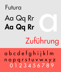


Futura gets extra credit as the Kubrick font — use it heavy and enjoy that question mark — but I like all three. They'd all lend quite a different character.
I'd also enlarge the centred legends quite a bit on the alphas. They look dwarfed when small. When going centre, go large.
Posted: 04 Sep 2015, 14:37
by cswanic
I don't know why, but to me this just seems so average. I would ask us why we are even going to the effort? Is this effort just so that Topre has a new keycap for a future board? Should that be the case, then it really doesn't matter what "we" (Matt) does.
I'm not trying to say, you need to change this. What I am saying is make something cool or tell us what Topre's intentions really are. For an average board with a "you can choose black keys with white lettering or white keys with black lettering" this model suits us.
Deep understanding, you must know what I am saying, but again this is not for me to decide, just that this is not an effort that warrants a 2 month design.
Posted: 04 Sep 2015, 14:53
by matt3o
I'll try Eurostyle, even though I'm not a fan.
The legends are already bigger than usual.
cswanic wrote: I don't know why, but to me this just seems so average. I would ask us why we are even going to the effort? Is this effort just so that Topre has a new keycap for a future board? Should that be the case, then it really doesn't matter what "we" (Matt) does.
I'm not trying to say, you need to change this. What I am saying is make something cool or tell us what Topre's intentions really are. For an average board with a "you can choose black keys with white lettering or white keys with black lettering" this model suits us.
Deep understanding, you must know what I am saying, but again this is not for me to decide, just that this is not an effort that warrants a 2 month design.
make a proposal!
Posted: 04 Sep 2015, 14:55
by Muirium
Try Futura first. I've seen Eurostile on keyboards, and it works great on the case but seems troublesome to get right on the caps.
cswanic wrote: I don't know why, but to me this just seems so average. I would ask us why we are even going to the effort? … just that this is not an effort that warrants a 2 month design.
Yeah, ever since they turned down our best designs and said something about appealing to gamers, the thrill is gone.