Page 9 of 30
Posted: 22 Jul 2011, 00:09
by webwit
Looks good!
Quite some activity in the wiki. In general no one has to be afraid of doing it wrong. Most of us are wiki rookies, and the new stuff can be refined later if needed, either by yourself or others.
Posted: 22 Jul 2011, 00:17
by agor
That will do for today. Maybe I am going to do some pages at work tomorrow if I haven't got much to do there.
As my edited question is now on the page before I'll quote it here for anyone to answer

Few questions.
Where can I see all available Templates?
And how can we add all availablle Layouts to the Keyboard Template, I just tried how it would look at the Realforce page and the force linebreak seems awful.
Posted: 22 Jul 2011, 00:28
by webwit
You can see the templates here:
http://deskthority.net/w/index.php?titl ... mespace=10
Don't know about your second question, I'm not a template specialist

Posted: 22 Jul 2011, 01:24
by daedalus
In relation to templates - there's an infobox keyboard and switch template, and my own versions - dkeyboard and dswitch, which have more fields, and have different names in order to not break compatibility with other articles.
Posted: 22 Jul 2011, 01:57
by webwit
lal wrote:Sounds good, thanks for the explanation. I'm most worried about the content vanishing some day, so some way to mirror it would be appreciated.
There's already this:
http://deskthority.net/wiki/Special:Export
Posted: 22 Jul 2011, 02:29
by JBert
agor wrote:And how can we add all availablle Layouts to the Keyboard Template, I just tried how it would look at the Realforce page and the force linebreak seems awful.
Wait, you want to do what to which template? Your question is unclear to me.
daedalus wrote:In relation to templates - there's an infobox keyboard and switch template, and my own versions - dkeyboard and dswitch, which have more fields, and have different names in order to not break compatibility with other articles.
We could merge those if we got MediaWiki's
ParserFunctions extension installed. This extension adds #if and #ifeq tests which allow you to check if a label should be printed.
Posted: 22 Jul 2011, 07:50
by agor
JBert wrote:agor wrote:And how can we add all availablle Layouts to the Keyboard Template, I just tried how it would look at the Realforce page and the force linebreak seems awful.
Wait, you want to do what to which template? Your question is unclear to me.
http://deskthority.net/wiki/Template:Infobox_dkeyboard
There is a field for "Layouts"
But how should one add more than one Layout? Around ~3 Layouts the Box ends and the text is split into the next line, which doesn't look well imo.
edit: just looked at the IBM JX article and there it seems okay
edit2: also, we really should decide on a standard page layout to use for company profiles, too. And how the single keyboards should be implemented. I'd find it nice to have a separate page for each single keyboard (layouts aside) instead of just adding them to the company page. For these I would prefer the cherry/costar layout with the infobox.
What's your opinion on this?
Posted: 22 Jul 2011, 11:20
by Findecanor
agor wrote:edit2: also, we really should decide on a standard page layout to use for company profiles, too. And how the single keyboards should be implemented. I'd find it nice to have a separate page for each single keyboard (layouts aside) instead of just adding them to the company page. For these I would prefer the cherry/costar layout with the infobox.
What's your opinion on this?
I think that we should allow both. There are those manufacturers that make many different keyboards. Then there are smaller companies that have one signature product that is a keyboard and where the company name is forever associated with that signature keyboard. Examples of the latter are Truly Ergonomic and Maltron. In these cases, I think it would be better to write about the keyboard first and add some company information in a section below the keyboard's info.
I suppose that you are thinking about the page about Kinesis Corporation (that I wrote, and I saw that you edited). I agree that it is sort of on the edge between the two types of pages. They have a signature product that people call "The Kinesis" in normal conversation, but also several other products. However, I do think that all contoured variants should be presented on the same page.
Posted: 22 Jul 2011, 11:24
by agor
Well yes I thought about it while viewing your Kinesis page, but I only added a category to that
It's just that I'd find it nice to see every single board in here:
http://deskthority.net/wiki/Category:Keyboards
Posted: 22 Jul 2011, 15:13
by JBert
agor wrote:There is a field for "Layouts"
But how should one add more than one Layout? Around ~3 Layouts the Box ends and the text is split into the next line, which doesn't look well imo.
Ah, now I get it.
I would simply do it like Wikipedia does: add a <br/> between each layout to put them each on a new line (unless you want to list language variants). Expanding the infobox width would only break the rest of the page layout.
Posted: 22 Jul 2011, 15:37
by Spharx
I have to say that i don't really like the current keyboard template.
Why ? Here is a good example
wiki/Qtronix_QX-032
(nothing against the author)
It is not always needed to write a whole text about the keyboard. Because of this the short main information with the pictures of the keyboard is stretched on the right side in a far to thin place.
I think
my first try of putting main information in a centered and tabled layout is for the purpose of marking out more or less technical aspects better. If a specific model deserves some text it could be put beneath the main table.
Webwits article about the
IBM JX Keyboards is good but it is giving just information about the whole model group. There should be a subsite for each model that includes all of the necessarily Id's, used switchtypes, keycaps and so on.
Also I would like to know how big a jpg in terms of filesize should / could be. Not that the wiki is running out of space sometime.
Posted: 22 Jul 2011, 15:58
by 42.tar.gz
Why, hello there.

I also thought it'd look a bit silly with all that white space but I was too lazy and tired to do it properly when I created the article yesterday evening. Now I replaced that strip of pictures with with such a "gallery" thing webwit used in the IBM JX article. Looks much better now IMHO.
Posted: 22 Jul 2011, 16:20
by 7bit
42.tar.gz wrote:
Why, hello there.
I also thought it'd look a bit silly with all that white space but I was too lazy and tired to do it properly when I created the article yesterday evening. Now I replaced that strip of pictures with with such a "gallery" thing webwit used in the IBM JX article. Looks much better now IMHO.
Apropos pictures:
I prefer viewable pictures in the articles and not tiny thumbnails at the end. It would be great if we could keep them as large as possible (640px wide is not too large!) Even MW, if he would ever show up, had no problem with these!
Thanks!
Posted: 22 Jul 2011, 16:43
by agor
Also added a few pictures to my article, hope they are not too big (not exceeding 1MB each!

)
http://deskthority.net/wiki/Noppoo_Choc_Mini
Posted: 22 Jul 2011, 17:06
by JBert
IMHO, the point of a wiki is to be informative and not so much to show off different kinds of pictures one by one (something which slightly annoys me about the GH wikis). In articles relying on text I would therefore prefer if the pictures didn't disturb the text-flow, hence thumbnails make sense for a more efficient use of screen space.
If a particular section is
meant to show pictures (e.g.
wiki/Qtronix QX-032,
wiki/Noppoo Choc Mini or
wiki/G80-2510) a gallery is obviously better (the former two already make use of this). I could live with larger pictures (as they are meant to show the keyboard) but I always get an ugly horizontal scroll-bar on my current (rather constrained 1024x768) resolution.
A lot could be solved if we had a somewhat better gallery solution. The current built-in gallery has strange line breaking which is calculated server side (it uses a table layout!) and hence never looks pretty.
I guess I won't have time in the following days to try out some different extensions, but a lot of trouble could be saved if we found something which simply let the client browser do some of the heavy lifting.
Posted: 22 Jul 2011, 17:25
by 7bit
JBert wrote:IMHO, the point of a wiki is to be informative and not so much to show off different kinds of pictures one by one (something which slightly annoys me about the GH wikis). In articles relying on text I would therefore prefer if the pictures didn't disturb the text-flow, hence thumbnails make sense for a more efficient use of screen space.
If a particular section is
meant to show pictures (e.g.
wiki/Qtronix QX-032,
wiki/Noppoo Choc Mini or
wiki/G80-2510) a gallery is obviously better (the former two already make use of this). I could live with larger pictures (as they are meant to show the keyboard) but I always get an ugly horizontal scroll-bar on my current (rather constrained 1024x768) resolution.
My pictures are 640px wide, this should be sufficient for your monitor. Only the originals are 1280px wide.
I can continue reading, after looking at the picture shown in a reasonable size,
while with your approach,
I've got to stop and click,
and then look,
and then hit the back button,
and then I've fogotten where I stopped reading.
Also, there is not much text in most articles anyway.
JBert wrote:
A lot could be solved if we had a somewhat better gallery solution. The current built-in gallery has strange line breaking which is calculated server side (it uses a table layout!) and hence never looks pretty.
I guess I won't have time in the following days to try out some different extensions, but a lot of trouble could be saved if we found something which simply let the client browser do some of the heavy lifting.
Letting the browser scale the images is a bad idea, because the quality is worse than having the necessary sizes done before by the server.
Posted: 22 Jul 2011, 18:46
by webwit
I'm with JBert, for the simple reasons this style is a wiki standard and a standard set by early articles here from the likes of daedalus. I'm not gonna say one personal taste is better than another, just that I'm a big fan of consistency, while I would dislike it strongly if every page has a visual layout according to the personal preference of the author. However, I think we should be able to cater for both tastes. First of all, the horizontal thumbnail galleries should not be tables, but floating divs, so you don't get a horizontal scrollbar with small screens but just line wrap. Second, I see there's a user setting for "thumbnail size", which doesn't seem to be used much, but if we can use it for this it would allow one person to set it to 200px and another to 640px.
Posted: 22 Jul 2011, 18:53
by ripster
JBert wrote:IMHO, the point of a wiki is to be informative and not so much to show off different kinds of pictures one by one (something which slightly annoys me about the GH wikis). In articles relying on text I would therefore prefer if the pictures didn't disturb the text-flow, hence thumbnails make sense for a more efficient use of screen space.
Damn, you figured out my motivation for doing Wikis.
Posted: 22 Jul 2011, 19:39
by 7bit
webwit wrote:I'm with JBert, for the simple reasons this style is a wiki standard and a standard set by early articles here from the likes of daedalus. I'm not gonna say one personal taste is better than another, just that I'm a big fan of consistency,
Following bad traditions is bad!
The reason why I prefer larger images (they are suitable for 1024x768 CRT monitors from 1995!) is because I want to show them to the reader. It does not make sense to include them in a small format:
Look how much detail is still there! Can you read the text or the numbers? No? LOL!
French layout? Spanish? Blank? Is this a keyboard after all?
webwit wrote:
while I would dislike it strongly if every page has a visual layout according to the personal preference of the author. However, I think we should be able to cater for both tastes. First of all, the horizontal thumbnail galleries should not be tables, but floating divs, so you don't get a horizontal scrollbar with small screens but just line wrap. Second, I see there's a user setting for "thumbnail size", which doesn't seem to be used much, but if we can use it for this it would allow one person to set it to 200px and another to 640px.
[/quote]
^^^ I did not line the pictures up in a row, but one per line.
So this argument does not count here!
webwit wrote:
Second, I see there's a user setting for "thumbnail size", which doesn't seem to be used much, but if we can use it for this it would allow one person to set it to 200px and another to 640px.
So the images can be viewable without the need to click to enlarge?
Sample:
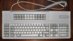
G80-2510 @ 150px
G80-2510 @ 640px
Posted: 22 Jul 2011, 19:59
by agor
Whats the problem to click to enlarge
Posted: 22 Jul 2011, 20:12
by 7bit
agor wrote:Whats the problem to click to enlarge
Distraction!

Posted: 22 Jul 2011, 20:14
by 7bit
7bit wrote:agor wrote:Whats the problem to click to enlarge
Distraction!
Edit: I've got masses of pictures to share, but if you want a text-only, stamps-collector's wiki, I will upload them as small as you want!

ps: These symbols drive me crazy!

Posted: 22 Jul 2011, 20:51
by agor
I didn't upload any small pictures by the way, the gallery resizes them down automatically to given size and shows you the big image if you click on it.
Posted: 22 Jul 2011, 21:17
by webwit
7bit wrote:Following bad traditions is bad!
That's preference. Let me repeat, what's bad if everybody follows his own preference for article layout. One guy prefers thumbnails, the other big pictures, the next shadowbox and who knows what. Those preferences should be automated by the engine based on user settings for appearance and skin.
Posted: 22 Jul 2011, 22:56
by webwit
I've been thinking some more to find a way to please everyone. Floating divs is not easy, all mediawiki stuff for this sucks especially if you want a user preference mixed in there.
We currently have two proposed solutions: the thumbnail and clickthrough way, and the big picture (and clickthrough) way. Another one would be the keep a limited number of thumbnails, and have a corresponding topic in the Photos & videos subforum with all pictures in big format. I'd like that for any discussions which can take place there, but the wiki would get kinda dry.
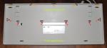
What about this one? For example take this page:
http://deskthority.net/wiki/G80-0778 . It would have the text and a gallery with thumbnails, and the gallery has a link to "Full size gallery" or something like that. This link would go to a G80-0778_Gallery page, which would look like the original page with the big images, with the captions but without the rest of the text. It would also get a Category:Gallery, so people could browse that category for photo browsing of all articles.
Posted: 22 Jul 2011, 23:12
by 7bit
webwit wrote:... That's preference. Let me repeat, what's bad if everybody follows his own preference for article layout. One guy prefers thumbnails, the other big pictures, the next shadowbox and who knows what. Those preferences should be automated by the engine based on user settings for appearance and skin.
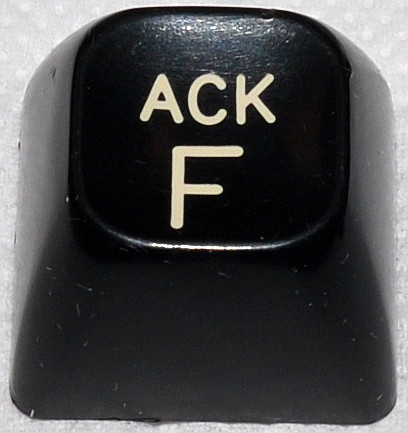
- ACK_F_001.jpg (45.49 KiB) Viewed 5014 times
webwit wrote:I've been thinking some more to find a way to please everyone. ...
What about this one? For example take this page:
http://deskthority.net/wiki/G80-0778 . It would have the text and a gallery with thumbnails, and the gallery has a link to "Full size gallery" or something like that. This link would go to a G80-0778_Gallery page, which would look like the original page with the big images, with the captions but without the rest of the text. It would also get a Category:Gallery, so people could browse that category for photo browsing of all articles.
The attachment NAK_U_001.jpg is no longer available
What about 2 wiki entries. Or better 2 different wiki-systems for each taste?
Sorry, but this is not acceptable! When there is a description about the keyboard layout (comming soon), there should be a viewable photo about the layout. When I describe how to open a keyboard, there should be a photo howing how to open it. etc.
Posted: 22 Jul 2011, 23:33
by webwit
Still preference. The standard of thumbnails in a wiki article is a more widespread preference. The idea is that you can look up the information you want, and go deeper if you want. Say you are -not- interested in opening the keyboard you are looking at. In fact you're browsing the article looking for a description of features such as usb ports. That's why I mentioned the Photos & videos subforum. A wiki is not a photo browser, it's an information browser. With, hopefully, lots and lots of photos, but that's not its primary function. Now this is all preference too, but I still like to use one instead of see many different layouts. So far you're the guy who starts doing it different, doesn't move, doesn't offer any solutions, and it must be total conformance to his way. Well, so far I like this guy, and let's presume I like his layout too. But what about the next guy? This is the crucial issue of this discussion, not the layout. I rather have a consistent layout which is 90% optimal than 10 of them of which one is perceived to be 100% optimal to me.
Posted: 22 Jul 2011, 23:35
by 7bit
webwit wrote:Still preference.
Just talking about keyboards is boring. I want to see how they look like.
Posted: 22 Jul 2011, 23:43
by webwit
Drama queen
The keyboards are not made invisible by the use of thumbnails, nor is the full size made unavailable, nor are we discussing women cup sizes.
Posted: 23 Jul 2011, 00:00
by lal
I'm for thumbnails by default. The purpose of a wiki is to provide information about things primarily. Go to flickr et al for pure picture galleries. Sandy55s pages or
wiki/IBM_Adjustable_Keyboard provide a good example of what we should aim at, IMHO. Basically Wikipedia style. They've gone through all this already. Why invent the wheel again. Average number of pics per article can and should be much higher, however.