Page 10 of 41
Re: deskthority - Suggestions and Changelog
Posted: 12 Mar 2012, 09:56
by Minskleip
Posted: 22 Mar 2012, 23:07
by webwit
I updated some stuff, please press reload or purge your cache if things look weird.
Posted: 22 Mar 2012, 23:36
by 002
Spy broken in IE now?
Graphical corruption of some sort...
Posted: 22 Mar 2012, 23:38
by ripster
Oh my. And I was complaining about Trebuchet MS being the second font choice.
Posted: 22 Mar 2012, 23:41
by webwit
Works OK in IE7-9 for me. Reloaded/emptied cache?
Posted: 22 Mar 2012, 23:44
by 002
Yep that fixed it.
Posted: 23 Mar 2012, 13:58
by ripster
TIL how to clear cache on an iPad.
Sent From Brother Ripster's iPad
Posted: 28 Mar 2012, 00:28
by webwit
With the last update deskthority supports 4 new interface languages (15 in total): Finnish, Swedish, Polish and Korean.
Full translations are now also supported. This includes our custom mods, forum names, subject prefixes, etc. This has already been done for a couple of languages (Dutch, German, Italian, French - thanks sixty, xbb and Gilgam). Some bits of the Korean version are still being worked on (it's a bootleg version based on a slightly older phpbb version), thanks Taeyoung for the help. Still not done are: Arabic, Indonesian, Spanish, Polish, Finnish, Swedish, Japanese and Mandarin Chinese. If you are interested to complete a translation for your language, pm me.
Posted: 28 Mar 2012, 00:37
by 002
Great work!
DT is on it's way to being the mecca for international keyboard enthusiasts

PM'ed btw
Posted: 28 Mar 2012, 00:49
by rodtang
I would never use it but I could do a Norwegian translation.
Posted: 28 Mar 2012, 00:52
by webwit
Strangely there's no
phpBB language pack for Norwegian.
Posted: 28 Mar 2012, 00:56
by rodtang
That is how it always is, no one speaks our superiour language.
Posted: 28 Mar 2012, 01:11
by webwit
phpBB is open source, so the Norwegians were just too lazy or didn't care to contribute a translation.

Posted: 28 Mar 2012, 01:13
by rodtang
webwit wrote:phpBB is open source, so the Norwegians were just too lazy or didn't care to contribute a translation.
Someone almost completed the
older version.
Posted: 28 Mar 2012, 01:21
by webwit
That might work, I'll check it out later. In a similar way, I found a Korean translation. If it works out, I'll bug you for our custom translations

The Arabic version is just weird. It's right to left text but it also does that to English posts and stuff. Also the Indonesian version can't be right, maybe this can be confirmed.
Lacks smilies.
Posted: 30 Mar 2012, 13:59
by off
Haven't checked if it's already been suggested somewhere, but:
how about a place (subforum of projects?) to keep all info regarding traced matrixes from different keybs/controllers?
Posted: 30 Mar 2012, 14:27
by Icarium
I say put it in the wiki.
Posted: 30 Mar 2012, 15:07
by off
yeah, i don't even
No seriously, the wiki.. Can't say I really understand it. Needs some other form of navigation I guess; geekhack's is pretty bad (norly) so you just google or get pointed at an island from some thread, and here it's about the same ?
Maybe it'll feel more logical once it starts getting more filled up, iunno
Posted: 30 Mar 2012, 15:32
by kbdfr
Don't know what you feel to need some other form of navigation or not to be logical there:
http://deskthority.net/wiki/Main_Page
Posted: 30 Mar 2012, 15:41
by 002
I suppose the difference for him (and probably most people) is that for wikipedia at least, 99% of people probably arrive at their article through a search engine and don't often use controls provided by wikipedia.
For Deskthority wiki articles, the link kbdfr has provided should really be your portal, as opposed to a search engine. Once you're used to this "workflow" you can easily find the information you want.
Geekhack wiki is just a chunderbucket and I have to prepare myself mentally before even attempting to get information from it.
Posted: 30 Mar 2012, 16:07
by Icarium
meh ...the mediawiki search has always sucked and still does and there are several articles about IBM keyboards that are not entirely consistent or well linked... I just know which one I'm looking for but I think he has a point
Why is there an article about the IBM enhanced keyboard and a different one about model Ms?
Let's just acknowledge that the wiki is a WIP.
Posted: 30 Mar 2012, 16:10
by kbdfr
Every page of the wiki shows the same sidebar on the left, where under the heading "Navigation" you can find a link "Main page". That really is not difficult to find.
The only thing I can imagine to make it even easier to understand would be to rename Navigation as "Wiki navigation" and/or "Main page" as "Wiki main page".
Or perhaps add to every page of the wiki a background sound file with instructions

Posted: 30 Mar 2012, 16:28
by off
Yeah I know that's the mainpage (and it is my startingpoint apart from searches), but still.. Might be the lack of info then, combined with the logic in titles/categories or something.
Take for instance the category/title Hacking; sounds like where I'd go to find out about repurposing controllers and other diy hackjobs- then I realize it's actually linking to hacker_keyboards (which is still aboslute horse$ no matter that there's actually keyboards being marketed as such, worse than gaming keyboards almost); and the fact that afaik all such 'hacking' keyboards would/should fall in the 'tenkeyless' category (seperate page/cat). And on that note, where does the CM Storm go, tkl? gaming? (*or are multiple cats for one page possible?*)
But I guess you're right 002, as in, if you can actually comfortably and quickly reach every page from the main start then it's just the lack of info

Ah, I kbdfr, I can point out at least something; look at main, how things are ordered (within each category block); on first sight it doesn't seem logical or quick to grasp, if you catch my drift- after you read each line I do see that the top one is most of the times an overview or introduction, but it somehow doesn't have quite the ease of overview. Don't know how to get that in there, maybe with more indentations or something.
Mostly just nitpicking I guess.
Anywho, started on
http://deskthority.net/wiki/Controller_matrix_traces which might be better without the _traces part; and I'm already out of time for now. Never worked on wiki's before, so takes a bit. How do you even upload images there? *!* and would it be too much load or just a bad idea to actually have hi-res scanned membranes there?
edit: yes that is a bad idea, traced matrix tables are way better, provided they are ordered the same as on the membranes themselves, i.e. from the connector to the last key in order per line
Seeing how I'm pretty slow in responding: just hitting 'main' is not the way to find everything neatly tidily organised, so far.
also, what IS this image: http://deskthority.net/wiki/Cherry_ML I mean, 'cherry ml switches with foam'- is that custom, or whats the context?
Posted: 30 Mar 2012, 16:58
by webwit
The wiki grows organically, so if there are bugs or inconsistencies in navigation and categorization, someone could choose to edit and fix that.
Posted: 30 Mar 2012, 17:40
by ripster
I always enjoy how my Wiki readers complain about their layout.
Posted: 30 Mar 2012, 18:49
by off
ripster wrote:I always enjoy how my Wiki readers complain about their layout.
As is evident from my previous post, I might not be the ideal person to create a nice, calming, informational layout
Posted: 10 Apr 2012, 03:37
by off
more content, less babble; so just a few suggestions:
1 A darker theme (for nighttime), should be a toggle button shown on the pages themselves (imho)- 'lightswitch'
2 Close marketplace/questionthread option, if not through plugin, then as a prefix like [solved] or [done], preferably thereby colouring the entire subject line font a lighter shade of gray.
Posted: 10 Apr 2012, 03:47
by webwit
A dark theme isn't too hard except for the icons. Needs dark versions of some 100 icons, which will probably involve hand editing. Any volunteers?
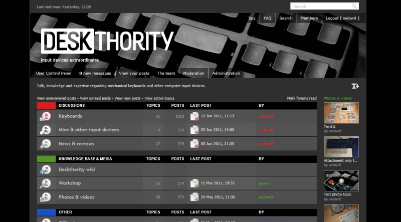
- dark.jpg (68.55 KiB) Viewed 4705 times
I'm planning an option so you can set [For sale] to [
For sale].
Posted: 10 Apr 2012, 04:18
by 002
Personally I wouldn't mind the white icons on dark background. Would be interested to see what a dark version might look like though.
Posted: 10 Apr 2012, 04:26
by webwit
You can't see it in the screenshot, but those light icons are simple gifs with anti-aliasing to a light background. So the edges are wrong.