Page 2 of 2
Re: Vintage looking 60% keyboard case
Posted: 24 Apr 2022, 02:33
by Shorle
no desoldering needed, probably can even pull the clicker without even pulling the stem - haven't tried that yet though.
Be advised, reverting linear SI to clicky is not as straight forward as some might have you believe.
Re: Vintage looking 60% keyboard case
Posted: 24 Apr 2022, 11:03
by Go-Kart
Not a 60 %, or a hotswap full size, but I found this
NCR80 a few days ago and fell in love. As far as vintage-inspired, modern customs go, I thought this looked particularly nice. Mine should arrive in a week or two.
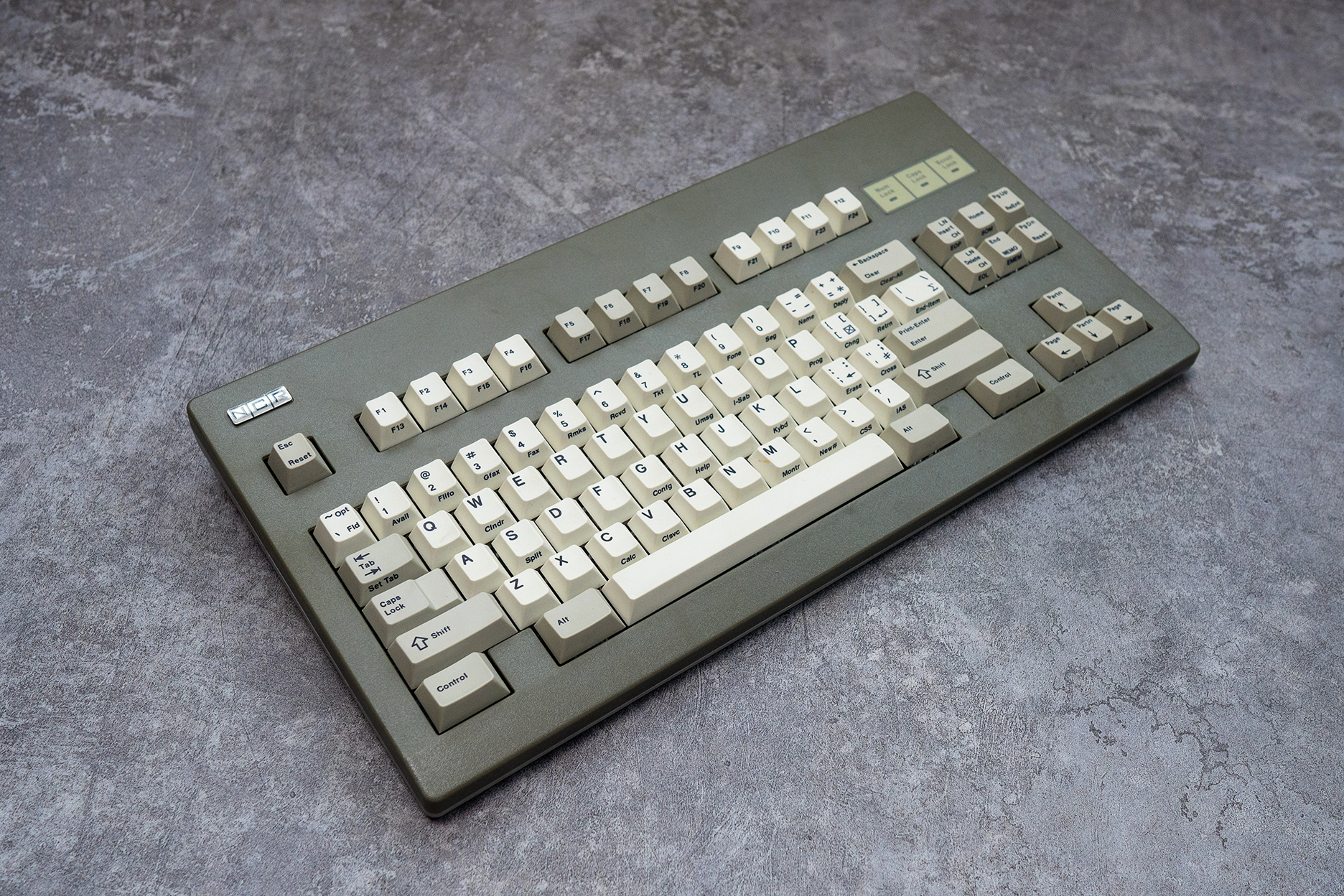
- NCR80 1.jpg (2.06 MiB) Viewed 3511 times
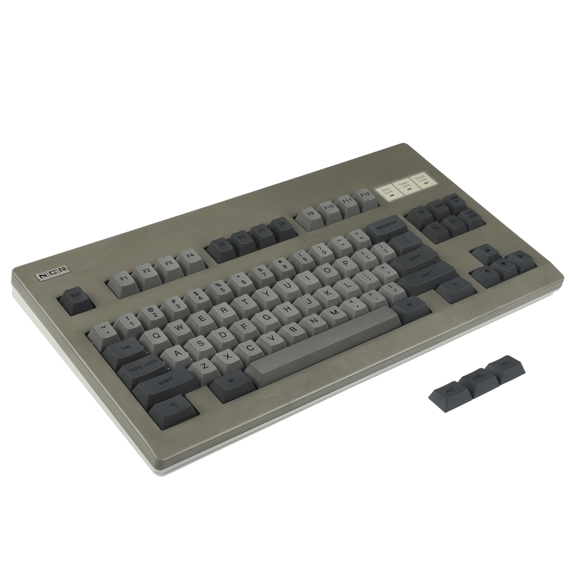
- NCR80 2.jpg (771.46 KiB) Viewed 3511 times
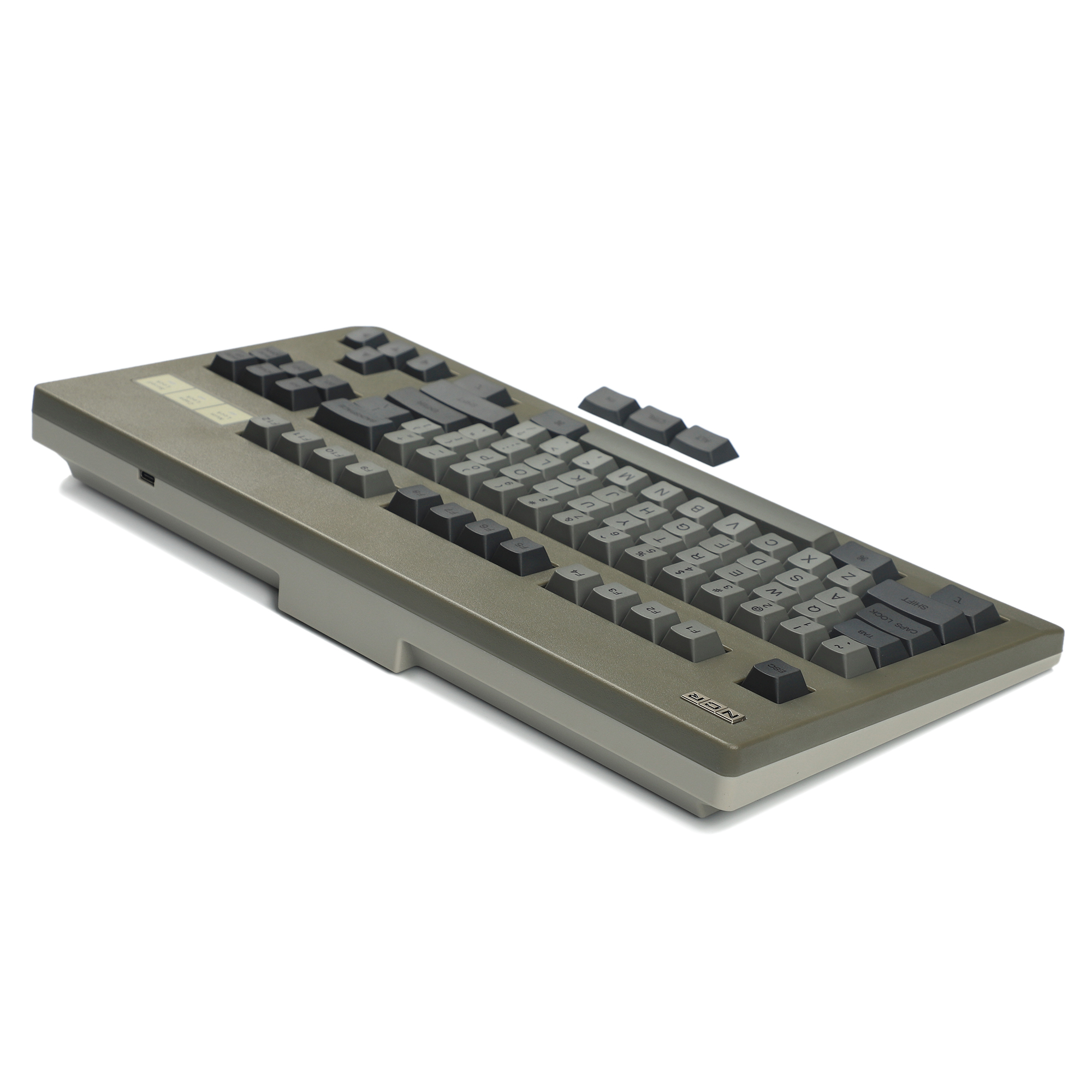
- NCR80 3.jpg (584.22 KiB) Viewed 3511 times
Re: Vintage looking 60% keyboard case
Posted: 24 Apr 2022, 11:12
by TNT
Yeah, that one looks very nice! Wasn't there a small repro gb here some time ago?
Re: Vintage looking 60% keyboard case
Posted: 24 Apr 2022, 12:19
by Muirium
Re: Vintage looking 60% keyboard case
Posted: 24 Apr 2022, 12:23
by Go-Kart
It appears so. I was tempted by the beige and the light grey. I had the latter in basket for a good hour, but pairing a cap set with one of them was the deciding factor for me. Or cap sets should I say...
Re: Vintage looking 60% keyboard case
Posted: 24 Apr 2022, 13:34
by Muirium
Money hole sighted!

It's a classy looking board in olive grey, and I'm still to try these modern, arguably superior Cherry clones, but getting the caps right would spell an open-ended project for me. Ch-ch-ching goes the National Cash Register.
Re: Vintage looking 60% keyboard case
Posted: 24 Apr 2022, 14:03
by Go-Kart
Indeed. I'm no photographer like some on here, but I think it's gonna be hard to make the set up I've ordered look anything less than beautiful.
Re: Vintage looking 60% keyboard case
Posted: 24 Apr 2022, 16:38
by Muirium
The two keys to photography: light and patience. Find the right, bright space to shoot your keyboard in. And do a lot of it: 50 pictures shot to 1 worth sharing. Any camera at all nowadays will do. It’s really all about basic technique and learning to suck less with practice.

Re: Vintage looking 60% keyboard case
Posted: 24 Apr 2022, 17:02
by TNT
Muirium wrote: 24 Apr 2022, 16:38
The two keys to photography: light and patience. Find the right, bright space to shoot your keyboard in. And do a lot of it: 50 pictures shot to 1 worth sharing. Any camera at all nowadays will do. It’s really all about basic technique and learning to suck less with practice.

50 pictures, are you nuts? That's more than two rolls of Kodak Ultramax! My pockets aren't that deep

Re: Vintage looking 60% keyboard case
Posted: 02 May 2022, 03:48
by TNT
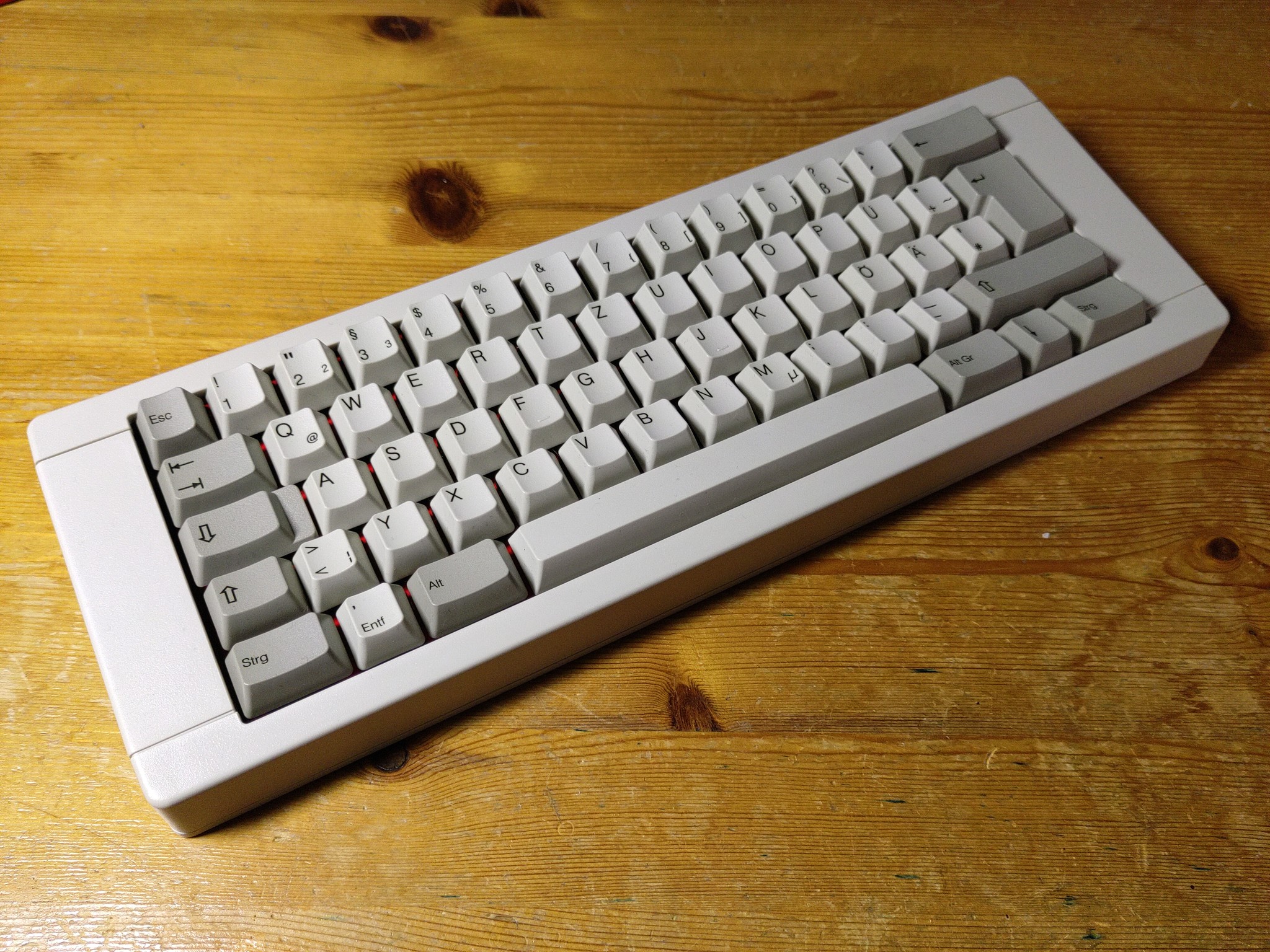
Anyways, so here are two of the very grainy and blurry 50 pictures I took of the finished Spaccboard-BBOX60-build.
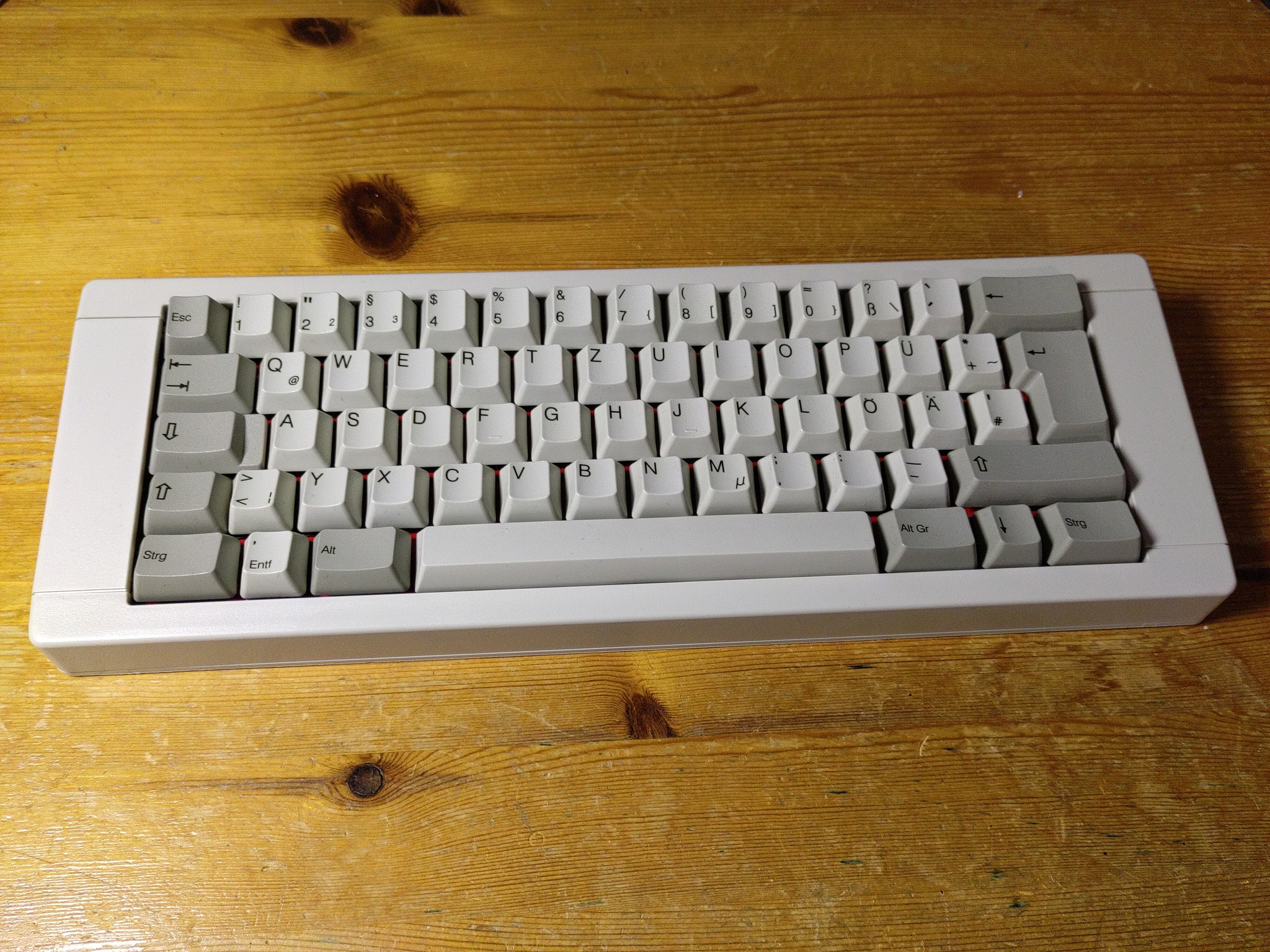
- 1_Easy-Resize.com.jpg (917.22 KiB) Viewed 3249 times
- 2_Easy-Resize.com.jpg (903.55 KiB) Viewed 3249 times
I can really recommend this case! It's a beaut, affordable and very easy to assemble.
Re: Vintage looking 60% keyboard case
Posted: 02 May 2022, 13:40
by Muirium
Looks THICC!

Re: Vintage looking 60% keyboard case
Posted: 02 May 2022, 14:13
by Go-Kart
Yup, pretty. Now if that'd had been in a HHKB layout, I'd be particularly jealous!
Re: Vintage looking 60% keyboard case
Posted: 02 May 2022, 19:02
by mmm
TNT wrote: 02 May 2022, 03:48
Anyways, so here are two of the very grainy and blurry 50 pictures I took of the finished Spaccboard-BBOX60-build.
Looks great, didn't even know it came in that color! How do you find typing on this compared to the original AT (layout aside).
Go-Kart wrote: 02 May 2022, 14:13
Yup, pretty. Now if that'd had been in a HHKB layout, I'd be particularly jealous!
In terms of split backspace/right shift or removal of left ctrl? While I can appreciate a good sub 40% layout, I don't understand why you would leave out a perfectly good working modifier key on a ~60%. Why do you enjoy HHKB layout? (Not that you shouldn't, I am genuinely curious)
Re: Vintage looking 60% keyboard case
Posted: 02 May 2022, 20:54
by Go-Kart
mmm wrote: 02 May 2022, 19:02
Go-Kart wrote: 02 May 2022, 14:13
Yup, pretty. Now if that'd had been in a HHKB layout, I'd be particularly jealous!
In terms of split backspace/right shift or removal of left ctrl? While I can appreciate a good sub 40% layout, I don't understand why you would leave out a perfectly good working modifier key on a ~60%. Why do you enjoy HHKB layout? (Not that you shouldn't, I am genuinely curious)
I'm not one for small form factor keyboards. I use arrow keys, F keys, PrtScr, etc., frequently. I can tolerate certain 65 % boards some times, if the layout is intuitive. Though, even some 75 % layouts irritate me. However, even though it seemed particularly alien to me when I first attempted to use it, I found the HHKB layout to be quite logical. The whole right hand nav cluster function layer makes sense to my hand. Plus, having control there feels quite natural too - one of the reasons I took to my F XT so quickly.
I initially got a HHKB for the key feel. I purchased a HASU so I could really customise the layout. However, in my eagerness to just use the thing and figure out the layout after the fact, I found that the stock layout made too much sense when using it in anger. I just now flip the dip switch to swap alt/super. I'd like to have a right ctrl sometimes but that's only real gripe with the layout.
If you set your hands flat on the keyboard, they both sit angled towards the centre. Having both bottom corners blank, moving ctrl up, that split right shift nav function layer, etc., all means that you don't have to contort your wrists outwards. This ergonomic layout wasn't a consideration of mine, but I think this is one of the reasons why I find the layout so natural to use.
Re: Vintage looking 60% keyboard case
Posted: 02 May 2022, 21:19
by TNT
mmm wrote: 02 May 2022, 19:02
Looks great, didn't even know it came in that color! How do you find typing on this compared to the original AT (layout aside).
Yes, it really looks like a true vintage thing. It's the standard Commodore version and it also came with some pretty stickers. Still left those off because stickers always look kinda cheap imo. The edges on the bottom are a little sharp for my taste. Also, I don't like the angle of the board, it's too flat for me. However, the issue doesn't lie with this case tho. I like my boards unreasonably steep and it's not that hard to install some feet or prop it up somehow. It sounds
a lot better than the AT! Less muted and deeper/thockier. Somehow, the switches even feel less scratchy, if that makes sense. Maybe it's the combination of the friction with the scratchy-plasticy sound in the AT chassis that amplifies it, which is missing in the BBox case. Might be only my imagination, but I really like it!
It's a shame the DEC-caps won't properly fit for this layout, but these ones also are very pretty!
Go-Kart wrote: 02 May 2022, 14:13
Yup, pretty. Now if that'd had been in a HHKB layout, I'd be particularly jealous!
The spaccboard PCB allows for some variation, don't know about HHKB tho

Re: Vintage looking 60% keyboard case
Posted: 03 May 2022, 16:10
by Muirium
Go-Kart wrote: 02 May 2022, 20:54
If you set your hands flat on the keyboard, they both sit angled towards the centre. Having both bottom corners blank, moving ctrl up, that split right shift nav function layer, etc., all means that you don't have to contort your wrists outwards. This ergonomic layout wasn't a consideration of mine, but I think this is one of the reasons why I find the layout so natural to use.
Quite right. I have Control left of A on all my keyboards. This renders the harder to reach corner Controls most of them also have a bit surplus to requirements. On the Kishsaver the bottom right Control key is of course its vital Fn, allowing everything. But elsewhere, they’re underused as I forget about the left and right Control keys, when the real one is so much closer to hand.
Re: Vintage looking 60% keyboard case
Posted: 04 May 2022, 23:47
by mmm
Go-Kart wrote: 02 May 2022, 20:54
I'm not one for small form factor keyboards. I use arrow keys, F keys, PrtScr, etc., frequently. I can tolerate certain 65 % boards some times, if the layout is intuitive. Though, even some 75 % layouts irritate me. However, even though it seemed particularly alien to me when I first attempted to use it, I found the HHKB layout to be quite logical. The whole right hand nav cluster function layer makes sense to my hand. Plus, having control there feels quite natural too - one of the reasons I took to my F XT so quickly.
I initially got a HHKB for the key feel. I purchased a HASU so I could really customise the layout. However, in my eagerness to just use the thing and figure out the layout after the fact, I found that the stock layout made too much sense when using it in anger. I just now flip the dip switch to swap alt/super. I'd like to have a right ctrl sometimes but that's only real gripe with the layout.
If you set your hands flat on the keyboard, they both sit angled towards the centre. Having both bottom corners blank, moving ctrl up, that split right shift nav function layer, etc., all means that you don't have to contort your wrists outwards. This ergonomic layout wasn't a consideration of mine, but I think this is one of the reasons why I find the layout so natural to use.
Thanks for the in-depth reply! Sounds quite nice with the angle, never considered that. I tend to use the caps-lock position as a layer key, which I've been incredibly accustomed to by now. If only you could somehow place every single modifier on that key

TNT wrote: 02 May 2022, 21:19
Yes, it really looks like a true vintage thing. It's the standard Commodore version and it also came with some pretty stickers. Still left those off because stickers always look kinda cheap imo. The edges on the bottom are a little sharp for my taste. Also, I don't like the angle of the board, it's too flat for me. However, the issue doesn't lie with this case tho. I like my boards unreasonably steep and it's not that hard to install some feet or prop it up somehow. It sounds
a lot better than the AT! Less muted and deeper/thockier. Somehow, the switches even feel less scratchy, if that makes sense. Maybe it's the combination of the friction with the scratchy-plasticy sound in the AT chassis that amplifies it, which is missing in the BBox case. Might be only my imagination, but I really like it!
It's a shame the DEC-caps won't properly fit for this layout, but these ones also are very pretty!
Good choice with the stickers, definitely! Surprised that it somehow filters all of the bad sounds away and enhances the good ones

Re: Vintage looking 60% keyboard case
Posted: 05 May 2022, 02:01
by TNT
mmm wrote: 04 May 2022, 23:47
Good choice with the stickers, definitely! Surprised that it somehow filters all of the bad sounds away and enhances the good ones

I guess it's mostly due to the fact the BBOX case is roomier, which amplifies the sound. The AT is quite neatly packed and very flat in comparison.
Re: Vintage looking 60% keyboard case
Posted: 08 Sep 2022, 17:35
by Grimble
TNT wrote: 24 Apr 2022, 02:02
My Bbox60 arrived, btw. Didn't have the chance to finish the innards yet, but I'm interested to listen to the sound of the final result. Will try clicky Space Invaders first and then linearize them. Do you have to actually desolder them to remove the click-lever thing?
Do clicky space invaders actually fit in cherry plates? I have a boatload of linears (white, 2-eyed) and they were too big to fit my cherry format plates.
Re: Vintage looking 60% keyboard case
Posted: 08 Sep 2022, 21:58
by TheInverseKey
Grimble wrote: 08 Sep 2022, 17:35
TNT wrote: 24 Apr 2022, 02:02
My Bbox60 arrived, btw. Didn't have the chance to finish the innards yet, but I'm interested to listen to the sound of the final result. Will try clicky Space Invaders first and then linearize them. Do you have to actually desolder them to remove the click-lever thing?
Do clicky space invaders actually fit in cherry plates? I have a boatload of linears (white, 2-eyed) and they were too big to fit my cherry format plates.
No they don't.