Page 2 of 5
Posted: 22 May 2013, 10:31
by BimboBB
rindorbrot wrote:Please offer also spacebars and capslock individualy ivan, I want an el cheapo moogle for my SAD set...
Yes, a complete moogle kit would be really cool. I would take a few.
Posted: 22 May 2013, 11:06
by LechnerDE
As I already wrote in the geekhack thread:
I'd take 5 white spacebars and would be interested in other moogle stuff as well. Maybe you can check with IMSTO whether he is willing to sell those keys separately?
Posted: 22 May 2013, 11:10
by Grond
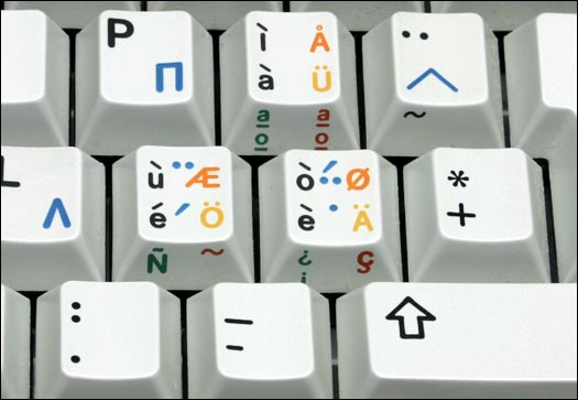
What about multicolor euro layout?
Posted: 22 May 2013, 11:17
by cookie
Blank ISO and I am IN!
Posted: 22 May 2013, 11:33
by BimboBB
they dont have an ISO enter mould.
Posted: 22 May 2013, 11:46
by kbdfr
Where to get a blank ISO Enter keycap:
http://www.wasdkeyboards.com/index.php/ ... eycap.html
Quote: "Available in multiple colors."
Posted: 22 May 2013, 11:57
by BimboBB
thats an idea, but....
- wrong profile
- wrong material
- most probably no matching colours
Posted: 22 May 2013, 14:03
by cookie
BimboBB wrote:thats an idea, but....
- wrong profile
- wrong material
- most probably no matching colours
That are exactely the problems :/
Posted: 22 May 2013, 16:53
by pasph
Qwerkeys:
"We only can offer Modifier Keycaps (Shift, Ctrl, Alt etc) in Minimum Order Quantities of 100 but will do our best to point you in the direction of group buys that are arranged on forums"
Maybe they can do a PBT blank iso enter in their mid gray color
Posted: 22 May 2013, 17:03
by Grond
But then you have the same problems than Wasd: different color, material and mold.
Posted: 22 May 2013, 17:09
by pasph
I have both Qwerkeys 1x1 abs sample cap and Imsto gray dyesub.
When i get home i can check profile and color.
For the material i was saying "if they have pbt", who knows?
Posted: 22 May 2013, 17:17
by IvanIvanovich
No other individual keys will be offered except maybe for some 1x1 B profile. ISO RGB won't happen this time, but I will fight to get it in the future. Can't make the EU parliment set because they refuse to dyesub sideprint as they say they have too much problems with the side getting deformed. I guess we can do that set with BSP eventually.
Posted: 22 May 2013, 18:54
by Acanthophis
IvanIvanovich wrote:No other individual keys will be offered except maybe for some 1x1 B profile.
Well, keep us posted

Posted: 22 May 2013, 23:10
by jean_popovitch
I would take one of those ural kits, if the mod (and function) keys were in black font only. The second color is supposed to show the alternative layout, so the colored symbols don't make sense to me.
Any chance of reconsidering that ?
Posted: 22 May 2013, 23:25
by IvanIvanovich
I'm tired of things always being some established boring banality. If it looks good, it is good, and damn the old conventions.
Posted: 23 May 2013, 02:44
by mbodrov
mintberryminuscrunch wrote:did they improve their printing? I had the impression letters were less sharp (from an earlier imto gb).
or does it depend on colour?
IvanIvanovich wrote:Dyesub will always have a bit of soft edge
As an illustration, here are a few high-resolution pictures of Cherry's different legend printing methods:
Lasered
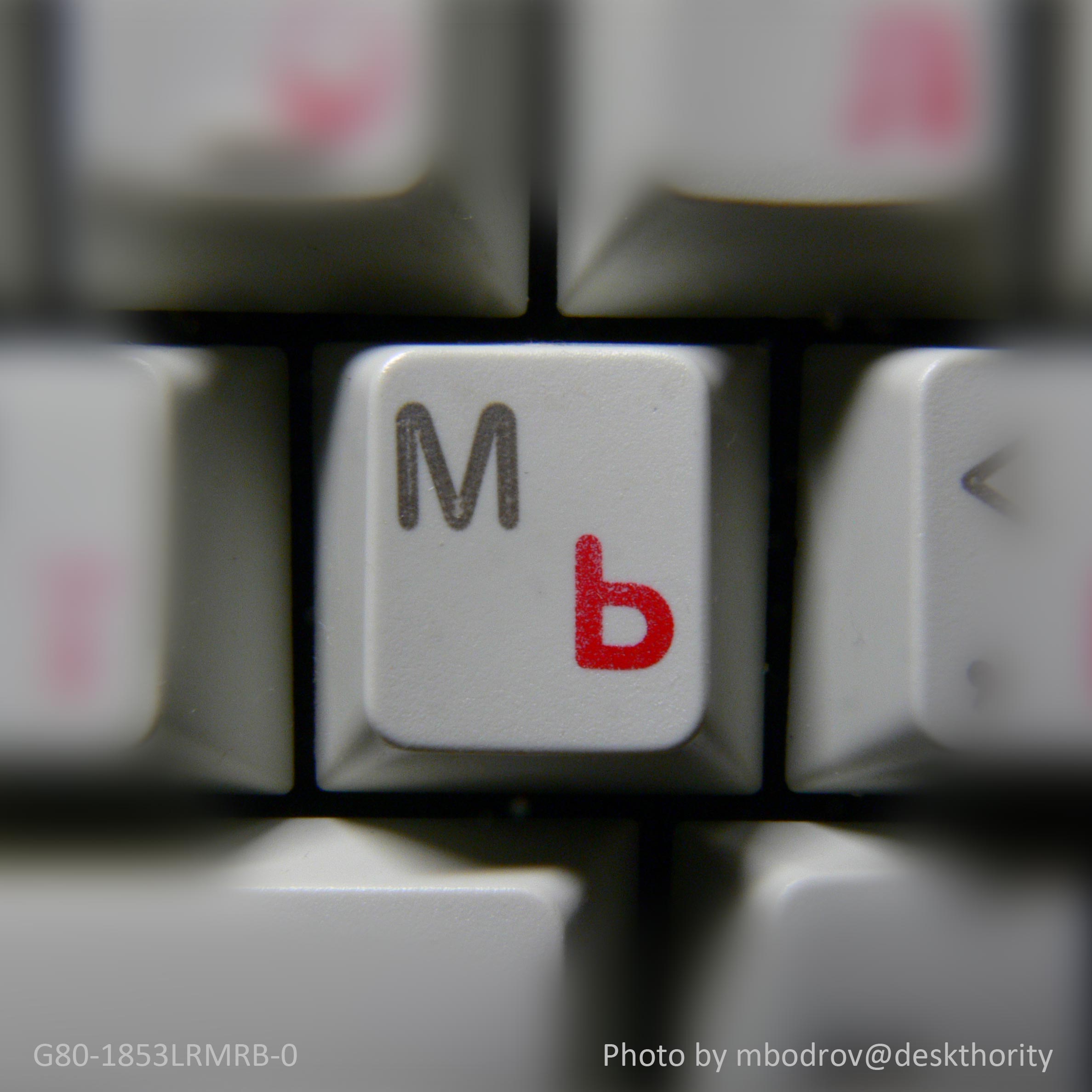
- Lasered / pad print
- M.jpg (268.7 KiB) Viewed 6774 times
Note the path traced by the laser. Also note the pad printing just beginning to wear off.
Doubleshot
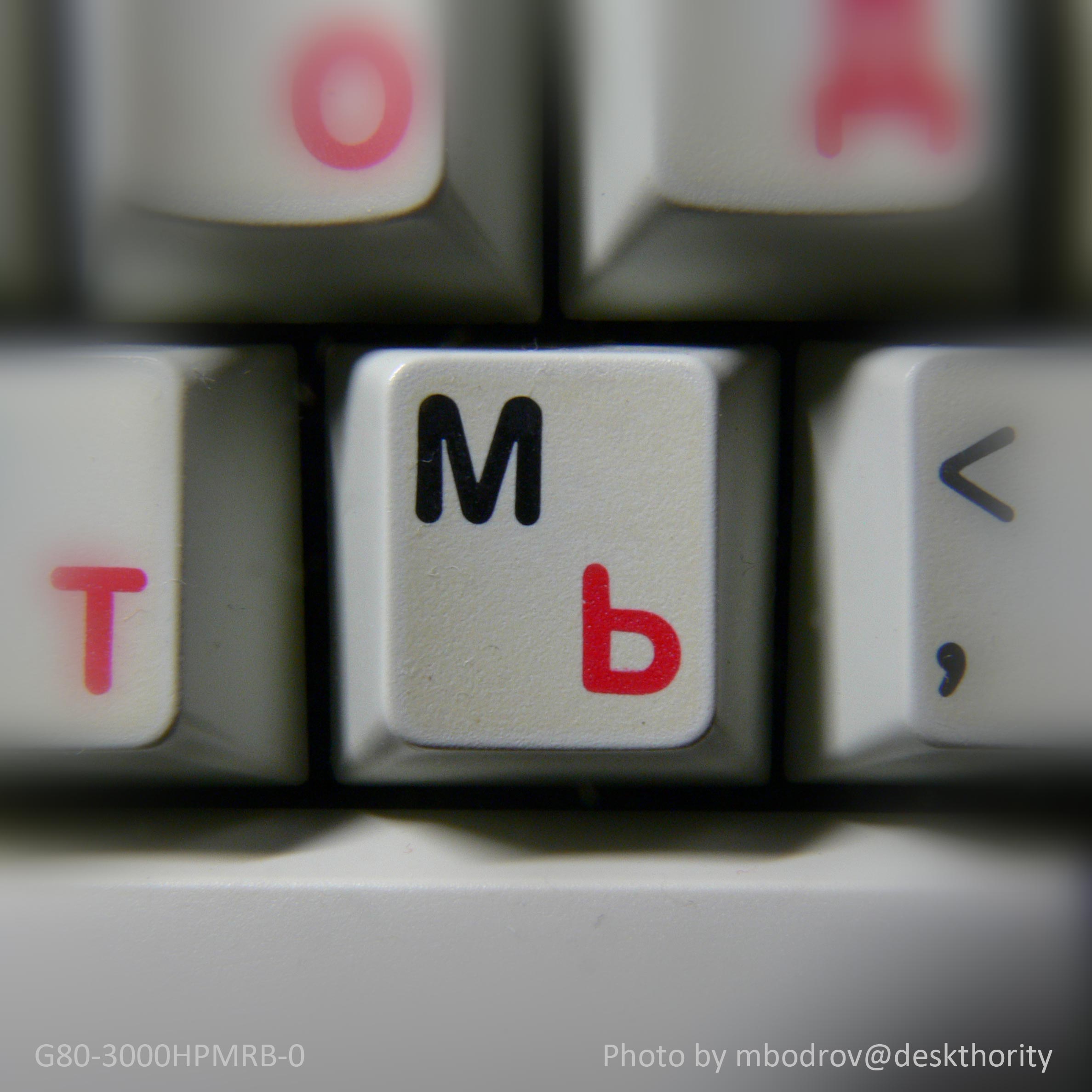
- Doubleshot / pad print
- M.jpg (289.01 KiB) Viewed 6774 times
Note the crisp edge of the doubleshot legend. Also note the yellowed (originally clear) protective overcoat which Cherry used with pad printing on their ABS keycaps, but not on PBT like the previous one.
Dyesub
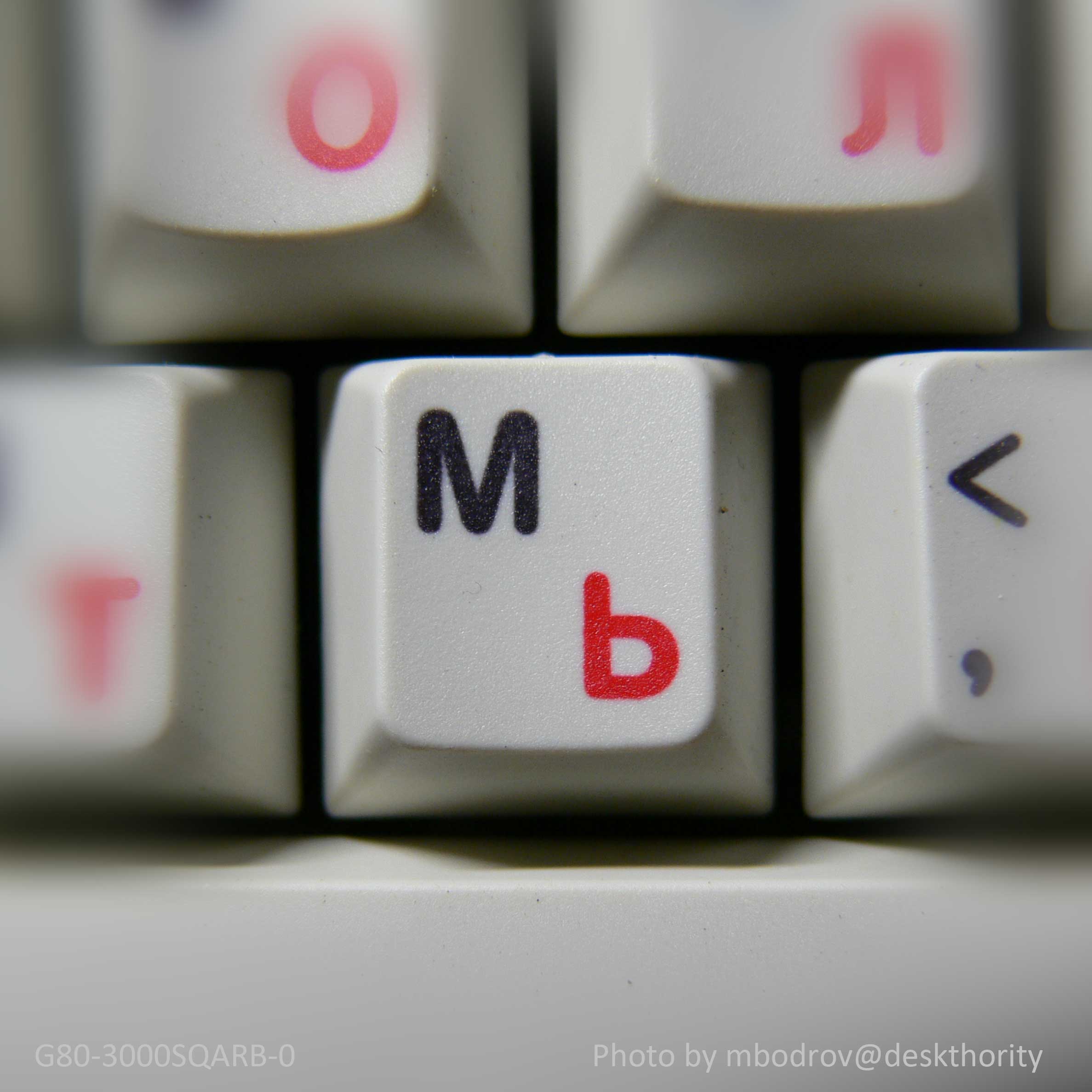
- Dyesub
- M.jpg (166.93 KiB) Viewed 6774 times
Note the soft edge.
Bonus - IBM dyesub
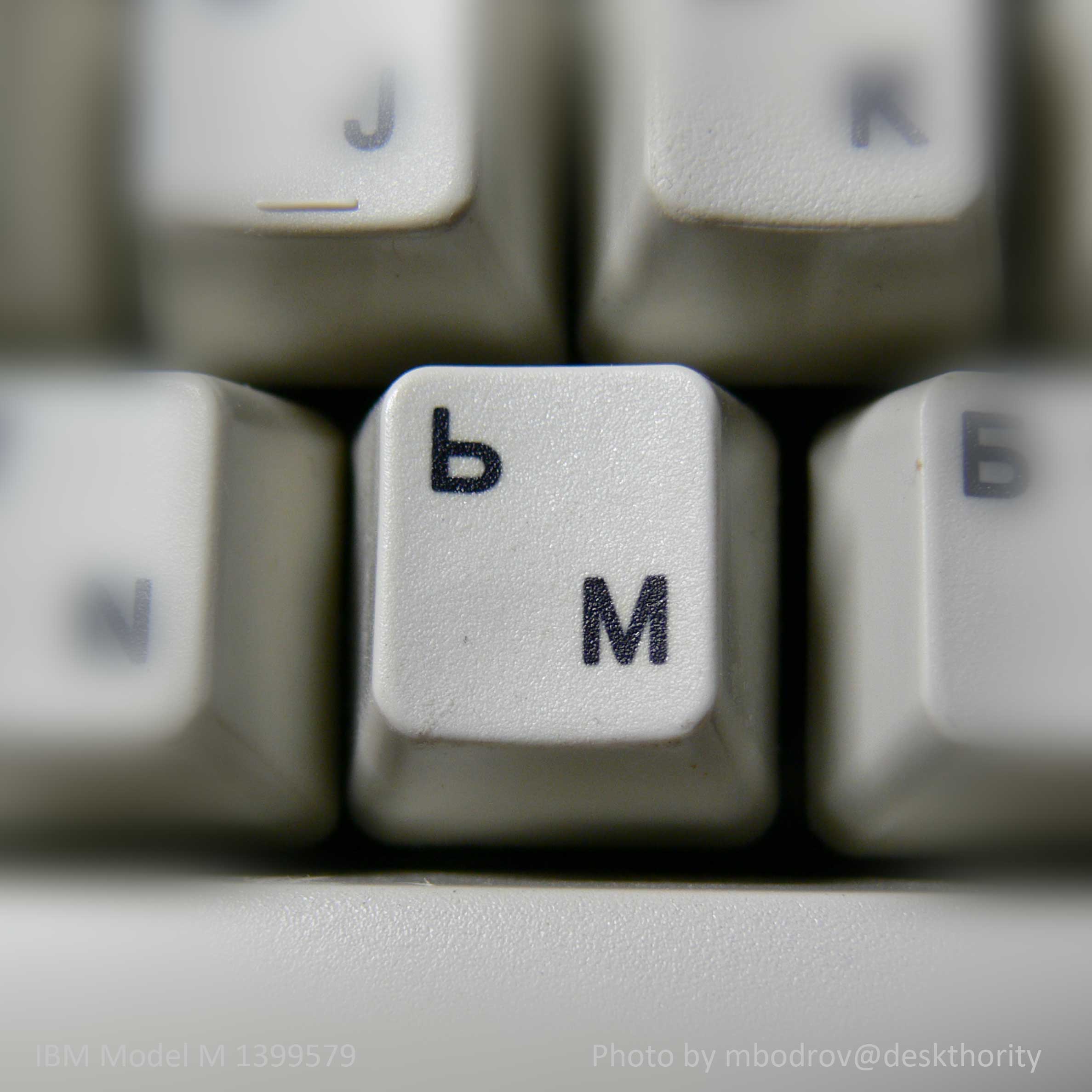
- IBM dyesub
- M.jpg (177.32 KiB) Viewed 6774 times
Included for comparison is a dyesub keycap from an IBM Model M. Note the 'cat's tongue' texture, much more aggressive than Cherry's, and notoriously hard both to clean and to keep clean for any length of time.
Posted: 23 May 2013, 07:49
by Halvar
What a great post with excellent photos! This shouldn't be hidden in the middle of a GB thread.
Posted: 23 May 2013, 17:40
by maxmalkav
Ivan, how can I modify my order?
(it's the kind of process I like to see described at the beginning of the thread

)
Posted: 23 May 2013, 17:51
by rindorbrot
after you submitted your first order, you got a link with which you can edit it.
You should have saved it
Posted: 24 May 2013, 02:38
by maxmalkav
rindorbrot wrote:after you submitted your first order, you got a link with which you can edit it.
You should have saved it
It went unnoticed to me, I (wrongly) assumed nothing else was of interest after submitting the form. IIRC, the mat3o form was quite straightforward to realise about the order code for any possible edit. I'll be watching much more carefuly during the next form submitting. Anyway, it's not a bad idea to reinforce that info which may not be that trivial for n00bs and awkard people like me
Posted: 24 May 2013, 10:43
by F u r u y á
mbodrov wrote:[insert awesome pictures here]
To make justice to the dyesub, it seems that the lightning conditions/setup are not the same as the doubleshot and the lasered. It is brighter, resulting in less contrast for the dyesub!
I say that because of the overall amount of brightness in the whole picture and because of the reflective grainy details of the keycap's surface due to the bigger amount of light (flash?).
On another note, what is that inner box of yellowish shade in the doubleshot? If I failed to describe, here is a picture:
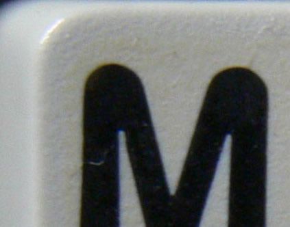
It looks like result of printing/sticker process (because it's well outlined), very weird.
Please don't be mad (I'm not trying to be a jerk), if your pictures were not beautiful I wouldn't be scrutinizing them like I am now
Posted: 24 May 2013, 11:18
by Jmneuv
Also note the yellowed (originally clear) protective overcoat
Overcoat to protect pad printing.
Posted: 24 May 2013, 12:48
by F u r u y á
Oh, you're right. I missed it in his post.
Posted: 24 May 2013, 13:51
by mbodrov
The photos were taken on the same table under the same lamp, but months apart. Still, the differences you noticed are not there due to lighting conditions, they are indeed present on the keycaps.
The L (lasered) and H (doubleshot) keycaps are from relatively modern keyboards (ca. 2000-2002) which use the modern Cherry albino grey color scheme (look up some pictures of a 3000HPMRB) like the one from IvanIvanovich's Round 1. The S (dyesub) keycap is from a 1990s keyboard when the vintage beige/white color scheme was still used, similar to the one in this Round 2. Hence the S keycap is a 'whiter white' than the L and H; in the photo it looks as if it was under brighter light. It is really just a brighter shade of white. The L and H are closer to grey, and the S is closer to ivory. When you try to combine keycaps from different sets on a keyboard, these subtle color differences become very visible, and it is a big problem.
As for the texture, the L keycap has lost a bit of its texture, being in daily use on my main keyboard, even though it is the hard-wearing PBT. On the H keycap the texture is covered and smoothed out by the overcoat. The S keycap, in near-new condition, shows the texture best.
Posted: 25 May 2013, 09:54
by F u r u y á
Nice, that explains. Thanks!
Posted: 02 Jun 2013, 20:31
by ilezia
In for a red us ansi.
Posted: 02 Jun 2013, 20:33
by jabar
Grond wrote:What about multicolor euro layout?
oh my that is awesome
Posted: 03 Jun 2013, 11:03
by cookie
Grond wrote:What about multicolor euro layout?
Is it just me or are this mixed language keys look like a bunch of angry faces to you?
Posted: 03 Jun 2013, 14:32
by maxmalkav
The guys of the Tower of Babel thought something similar

Posted: 03 Jun 2013, 15:25
by Halvar
Diaresis-wedge-Tilde guy is not impressed.
