Page 2 of 4
Posted: 23 Oct 2013, 06:00
by Dubsgalore
HoneyWell or Coffee & Cream (y)
Posted: 23 Oct 2013, 08:11
by tlt
HoneyWell is a nice color schema. How would the colors be distributed on the keyboard, mockup?
Posted: 23 Oct 2013, 09:50
by HzFaq
+1 for Honeywell, +1 for Dirge-set.
The Blaupunkt looks nice, but its kind of similar to the retro set that was done recently.
Posted: 23 Oct 2013, 10:13
by Muirium
tlt wrote:HoneyWell is a nice color schema. How would the colors be distributed on the keyboard, mockup?
Good point. Like everything before the IBM Extended, it's a strange keyboard:
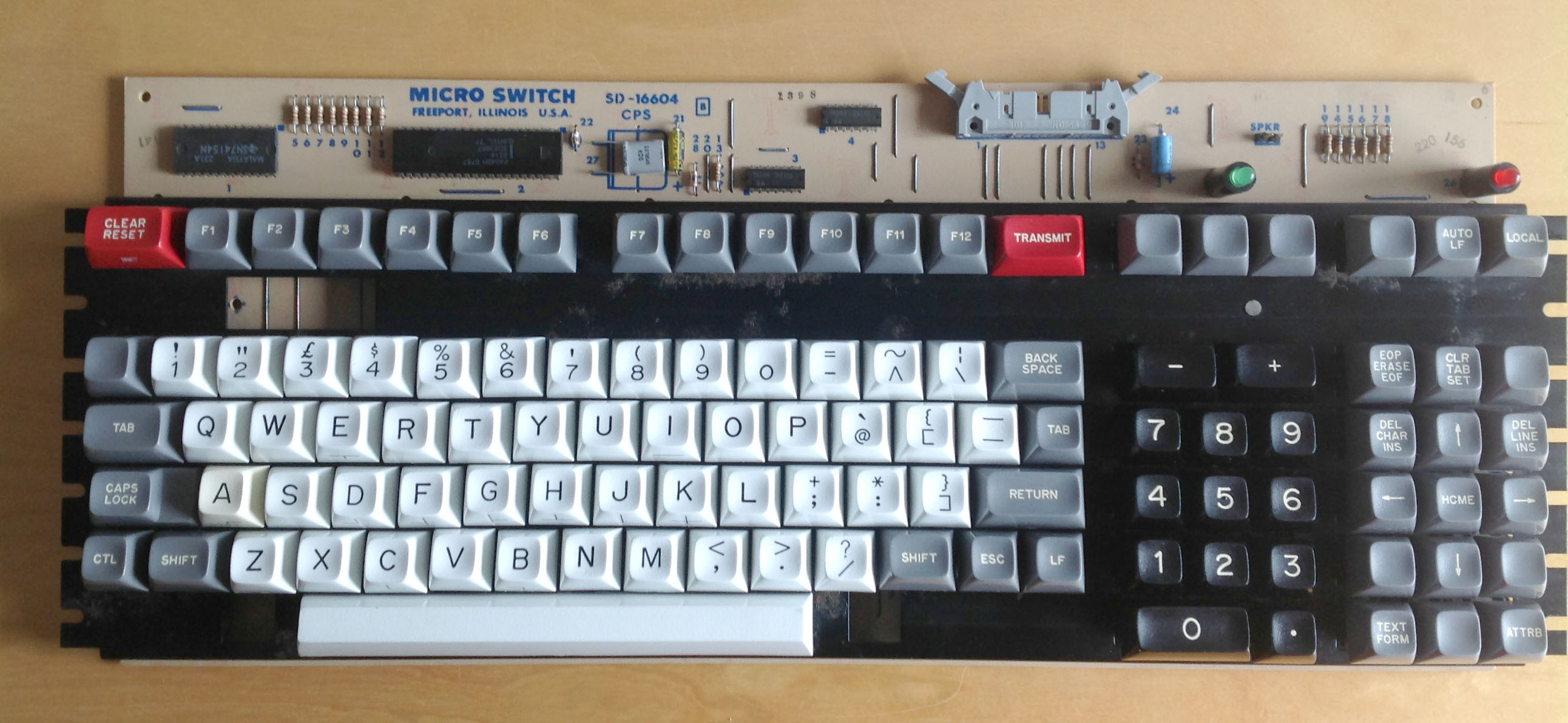
Here's a full system:

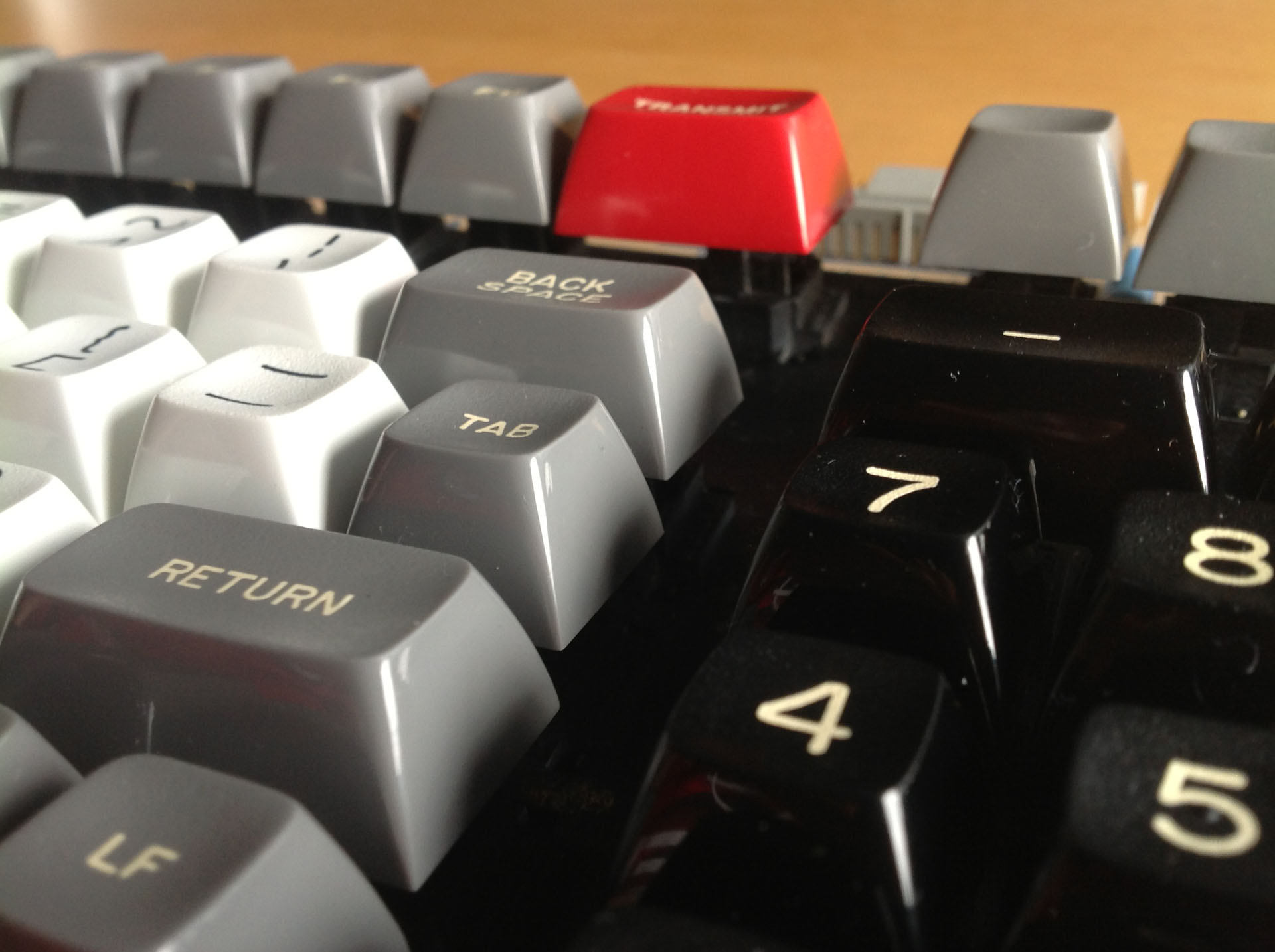
Note the extra red key. Mine just has a blank grey cap there. Grr!
Here's the layout.
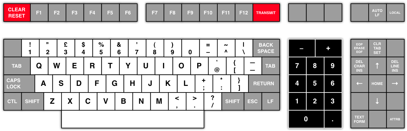
- Honeywell Layout.png (72.54 KiB) Viewed 6854 times
Using
Matteo's keyboard colour chooser, which I highly recommend, I get a combination of these two:
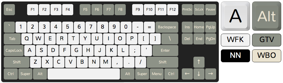
- #WFK,NN,GTV,WBO.png (57.41 KiB) Viewed 6854 times

- #RA,WBO,GB,WBO.png (55.17 KiB) Viewed 6854 times
Warning: without a colour wheel, these are just
rough estimates.
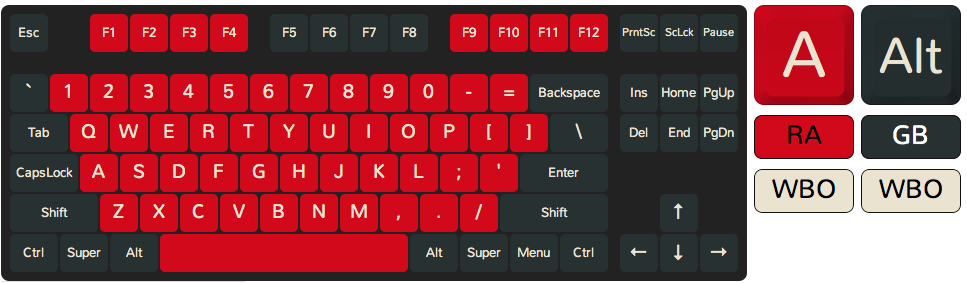
So, like tlt said: how to fit white, grey, black and red caps on a board? I'll mock something up. I'm thinking of a black numpad, which is authentic, and black row 0 mods for those of us who like TKL and smaller. A 60% is easy: red escape and backspace. But what about everyone else?
Posted: 23 Oct 2013, 10:31
by HzFaq
How about using the first colour chooser layout with black nav clusters and red tilde and backspace for a TKL layout? For the fullsized dudes you could offer a nav cluster to match the main colour scheme with a black numpad. No idea about 60% schemes though, would making the right hand keys black look ok? I can't decide...I'm leaning towards "looks a bit shit".
Layout picker doesn't work at work (neither do I seemingly...) but I cobbled together these in paint.
edit - Added another 60% layout, kind of prefer this one to the first.
honeywell 60%.png
honeywell 60%.png
#WFK,NN,GTV,WBO[1].png
Posted: 23 Oct 2013, 10:53
by 7bit
Posted: 23 Oct 2013, 10:54
by forever
7bit wrote:What about something like this:
ORANGE_TKL.png

Awesome. But I guess there should be many people who dont like it.
Posted: 23 Oct 2013, 11:24
by Muirium
7bit wrote:
The grey's too blue, and the legends are too white. Should look like this:
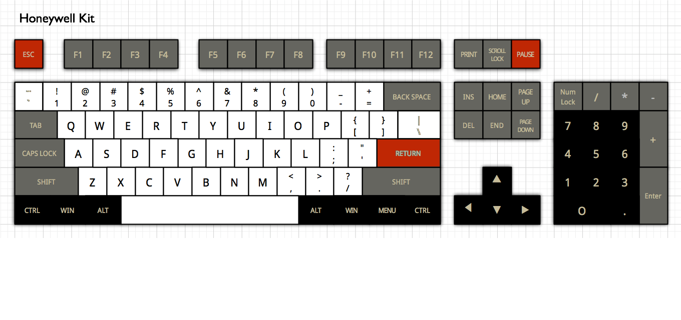
I like where HzFaq is going. Here's my current mockup for a fullsize:
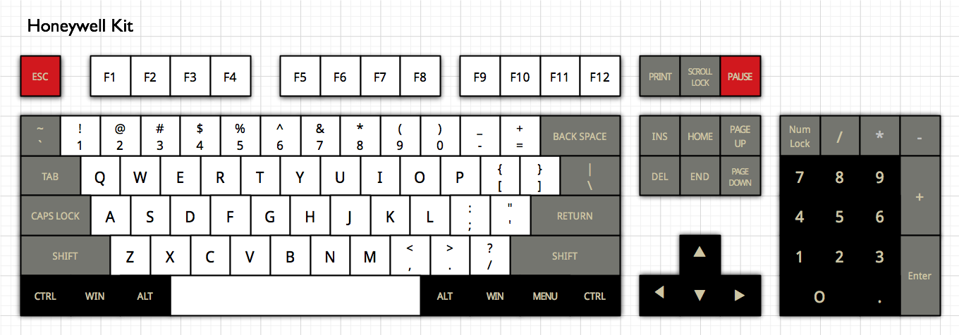
- Honeywell Kit.png (112.37 KiB) Viewed 6822 times
Suggestions?
Edit: here's one, correct the function keys to match the Honeywell's!
- Honeywell Kit.png (112.26 KiB) Viewed 6816 times
Posted: 23 Oct 2013, 11:50
by HzFaq
I suppose you can either copy the colour scheme for the keys and transpose them onto a modern board or you can copy the scheme for the board and just overlay it.
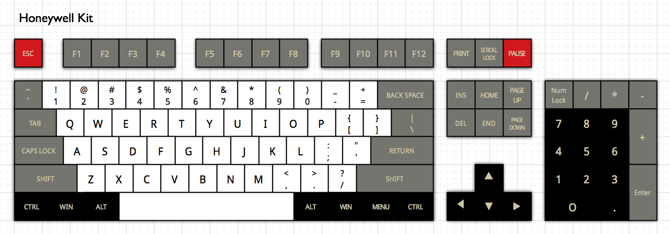
Transposing the keys would give you something like you've got up there, but overlaying the colour scheme exactly would be something a little different and gives the nice block of black in the middle of the board. I like that you've used the black keys on the bottom row for the keys that aren't there on the Honeywell, nice touch that. I've also "fixed" the F row and moved one of the red keys as it's above backspace on the Honeywell. The only problem with this is that the numpad is a bit bland...I guess the bigger keys could be made black or something...Red numlock maybe?
Honeywell%20Kit[1].png
Posted: 23 Oct 2013, 11:57
by Muirium
Red F12 make 7bit mad! Is Pause an important key on a PC? (I'd map it to Eject / Power.) Because there's a good symmetry between top left and top right.
I made the numpad dual tone to match the old IBM style where the number keys themselves are separated visually from the others.
Posted: 23 Oct 2013, 12:15
by HzFaq
Honeywell broke symmetry, I just followed suit

. Pause is pretty usless, I've used it to stop Excel crashing my computer a few times and I think it has some use in the command line world. F12 is only marginally more useful itself, I think it's Save As in MS Office, not sure outside of that (Dev Tools in IE8 too as I just found out).
I'll stop posting now and let someone else suggest something, some good ideas here though.
Posted: 23 Oct 2013, 12:26
by zulios
7bit wrote:What about something like this:
ORANGE_TKL.png
+1 for this one.
It would look awesome combined with R4 keys as well.
Posted: 23 Oct 2013, 12:32
by nourathar
great !
I came to this after round 4 so I would still be very interested in a space cadet scheme, preferably one that included all those funky symbols... It is less spectacular color wise, but i like the symbolics scheme too....
ciao,
J.
Re: [IC] Round 5 / color scheme
Posted: 23 Oct 2013, 12:33
by Broadmonkey
F12 takes screenshot in steam games

Posted: 23 Oct 2013, 12:37
by iAmAhab
Muirium wrote:
Edit: here's one, correct the function keys to match the Honeywell's!
Honeywell Kit.png
If this does not happen I am going to cry a river.
Posted: 23 Oct 2013, 12:49
by Elrick
iAmAhab wrote:Muirium wrote:7bit wrote:
Honeywell Kit.png
If this does not happen I am going to cry a river.
Yep - the both of us will cry together matching the out flow of the amazon, with the sheer power and force of desperate individuals.
Posted: 23 Oct 2013, 12:59
by Muirium
Now imagine what it feels like to already have a set of these, that won't fit on a working keyboard!
7bit: How big are those colour wheels? I'll gladly match up the Honeywell to SP's system and send you back your wheels if required. You've Round 4s to send me already.
Posted: 23 Oct 2013, 14:05
by BimboBB
These are my three favourites. "Black Coffee", "the Dirge Set" and "Commdore PC".
Honeywell looks nice. Just a bit worried about the grey mods....which already the Space Cadet Set had. So best alternative might be dirge sets which comes with white alphas like honeywell, but different mods.
Posted: 23 Oct 2013, 14:10
by Halvar
As for Honeywell, I'd prefer the color distribution to be more PC/MF2 consistent, and less based on the Honeywell original. Kind of like matteo did it in Retro DSA.
For example:
- honey_2.png (73.47 KiB) Viewed 6742 times
or
- honey_1.png (72.72 KiB) Viewed 6742 times
Links:
http://www.keyboard-layout-editor.com/# ... 5cbec58db0
http://www.keyboard-layout-editor.com/# ... de85b8808e
Posted: 23 Oct 2013, 14:20
by Muirium
I'd like black mods (on row 0 anyway) on the Honeywell so that 60%ers like me get all four colours in our layouts. Also: black goes with everything.
Orange chocolate is another promising set, as orange goes very nicely with (Space Cadet) blue. But white caps! That's my favourite thing about the Honeywell. They sparkle.
Re: [IC] Round 5 / color scheme
Posted: 23 Oct 2013, 14:40
by Halverson
Honeywell! Really digging the mockup of the 60%!
Posted: 23 Oct 2013, 14:43
by Greystoke
Another vote for Honeywell with black mods and number pad.
But if you did the Nuclear Green I'd be on that in a millisecond.

Posted: 23 Oct 2013, 14:50
by komar007
I like this one a lot.
@7bit, since GH60 and Hyper are coming soon, what do you think about running dedicated 60% sets? Maybe they could be a bit cheaper than TKL and still provide many layout options.
Posted: 23 Oct 2013, 14:54
by kwago
I'm on Team Dirge for R5
Posted: 23 Oct 2013, 17:29
by vivalarevolución
Muirium wrote:beltet wrote:My idea for a color scheme:

I like the honeywell aswell!
Aha, Honeywell == Nintendo. Same era in fact. And an authentic red Esc for once, too.
The Nintendo idea looks cool to me.
Posted: 23 Oct 2013, 17:51
by mintberryminuscrunch
Muirium wrote:...
Edit: here's one, correct the function keys to match the Honeywell's!
The attachment Honeywell Kit.png is no longer available
what about
- Unbenannt.png (106.21 KiB) Viewed 6620 times
Posted: 23 Oct 2013, 17:57
by JSchool
That one looks good.
Honeywell is happening. The time is now.
Posted: 23 Oct 2013, 18:10
by snoopy
mintberryminuscrunch wrote:Muirium wrote:...
Edit: here's one, correct the function keys to match the Honeywell's!
Honeywell Kit.png
what about
Unbenannt.png
that's nice
Posted: 23 Oct 2013, 18:31
by Muirium
I'd go for a grey backslash and red backspace to balance things out (on a 60%) but these are the kinds of details 7bit can work out with secondary colours, like the traditional selection of escape keys.
Say, would it be harder to get SP to make the white alphas dyesub PBT while everything else is doubleshot? I'd love a UV resistant set! (Not to mention a
PBT space bar, which they do now have…)
Posted: 23 Oct 2013, 18:35
by Halvar
Not a big fan of the black bottom row idea, they look fair on a 60% but out of place on anything larger. Take a look at the photo of the Honeywell and imagine there was a bottom row of modifiers. Would Honeywell have made them black? Certainly not.