Page 12 of 17
Posted: 14 Nov 2018, 19:51
by Gampela
I've been thinking about something similar to the above. Also recently came up with this:

Posted: 14 Nov 2018, 19:53
by Muirium
That's a reasonable one. I like the all round consistency.
Posted: 14 Nov 2018, 20:01
by ThePillenwerfer
I'm expecting the arrival of one as featured in Gampela's post any day now. Sadly it'll have dead sea creatures for switches.
Posted: 14 Nov 2018, 20:23
by Big Bricced
Basically just the normal/standard 87-key layout but with the f** row/keys compacted together and just right in front of the row with the number keys.
Posted: 14 Nov 2018, 21:00
by Gampela
Muirium wrote: That's a reasonable one. I like the all round consistency.
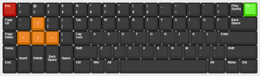
Something like this might very well exist already but my thought process behind this layout:
- I've always thought 60% keyboards look a bit silly with their wide aspect ratio (15u wide / 5u tall = 3), this is even worse for fullsized and 65% keyboards. Tenkeyless' proportions look much more pleasing to my eye (roughly 18.5u / 6.5u = 2.85). For this keyboard it is 16u / 6.25u = 2.56. Now this all can be adjusted with bezels so I'm not sure why I'm rambling here, just wanted to put it out there I guess. Other things, like HHKB's corner blocks also help with this, which makes it look less like a candybar.
- I use function keys quite a lot so the top row is important for me. Numpad not so much.
- Those gaps between every 4th function key are also very important so that I can press them easily without looking. Normal 75% is no for me.
- For the longest time that one gap on the bottom row between arrow keys and mods looked very odd to me. Now I've grown to like it for some reason. That gap also helps finding arrow keys without looking.
- With this layout, all of those horizontal gaps are 0.5u wide so I guess the consistency makes it more aesthetic?
- Still not quite sure if I want normal backspace or similar to HHKB
ThePillenwerfer wrote: I'm expecting the arrival of one as featured in Gampela's post any day now. Sadly it'll have dead sea creatures for switches.
Not sure what you mean. Are you talking about Plum 84?
Posted: 14 Nov 2018, 21:31
by ThePillenwerfer
This what I've bought — sorry about the picture but it's the best I can do until I get hold of it:—
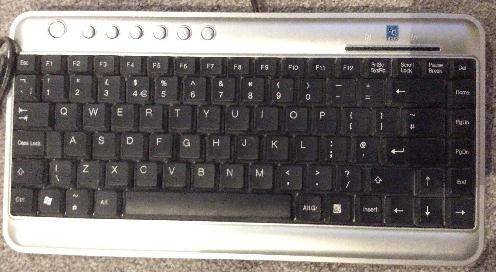
- s-l1600.jpg (282 KiB) Viewed 10780 times
Posted: 14 Nov 2018, 21:34
by Dingster
ThePillenwerfer wrote: This what I've bought — sorry about the picture but it's the best I can do until I get hold of it:—
s-l1600.jpg
Looks like standard 75% (pic for reference, not mine)

Posted: 14 Nov 2018, 21:39
by depletedvespene
Gampela wrote:
………
- I use function keys quite a lot so the top row is important for me. Numpad not so much.
- Those gaps between every 4th function key are also very important so that I can press them easily without looking. Normal 75% is no for me.
- For the longest time that one gap on the bottom row between arrow keys and mods looked very odd to me. Now I've grown to like it for some reason. That gap also helps finding arrow keys without looking.
- With this layout, all of those horizontal gaps are 0.5u wide so I guess the consistency makes it more aesthetic?
- Still not quite sure if I want normal backspace or similar to HHKB
If you choose a HHKB-style backspace key, you should put
Ins the '/* key and Del in the 1U keys right above it (in the space that normally holds the 2U backspace key). This frees the isolated 1U key on the top right corner, which you can make it into an Fn key that will allow you to map PrtSrc, Pause, the Lock keys and other things as well, which in turn frees the Fn you have on the bottom row to be RCtrl again.
Your mileage may vary, so take my comment with a grain of salt and a spoonful of sugar, etcetera.
Posted: 14 Nov 2018, 21:42
by Muirium
Dingster wrote:
Looks like standard 75% (pic for reference, not mine)
True, it's conservative. But separating the F-keys into classic 4 key blocks, like the Model M, does make quite the visual difference; and I bet makes finding F10 (or what have you) much quicker and surer. That was the point of IBM's blocks, after all, even colouring the groups alternately to make them more apparent. I approve. Indeed, if you're going to have F-keys, I insist on it!
Posted: 14 Nov 2018, 22:04
by Gampela
depletedvespene wrote:
If you choose a HHKB-style backspace key, you should put
Ins the #/' key and Del in the 1U keys right above it (in the space that normally holds the 2U backspace key). This frees the isolated 1U key on the top right corner, which you can make it into an Fn key that will allow you to map PrtSrc, Pause, the Lock keys and other things as well.
Your mileage may vary, so take my comment with a grain of salt and a spoonful of sugar, etcetera.
I dunno, personally I feel like the Delete key deserves its placement in the top most right corner. I've already got used to Fn key being on the bottom row next to arrow keys. In that location it can easily be pressed with either thumb. AltGr is really the the only mod I need right of spacebar. Media keys can be accessed from F5-F12 keys within function layer. Insert would probably go under Fn + Del. Rest as you said would probably go to the right most column behind Fn layer, PrintScr really being the only one I use. No idea what I want to be put to the key above backspace, maybe CapsLock key (as you can see I've got two control keys on the left

my muscle memory not being very precise.
Edit. On second thought CapsLock key there might not be the best solution, I still sometimes hit those keys when I want to use backspace. I probably should just stick to the original backspace location. But I can't help myself, I just love the symmetry that HHKB layout brings

Posted: 14 Nov 2018, 22:39
by Menuhin
@Gampela
That is about right in how I want my 75% to be!
Posted: 14 Nov 2018, 22:43
by Gampela
A bit of iteration.. Can't decide on bottom row.

Posted: 14 Nov 2018, 22:52
by davkol
derp
Posted: 15 Nov 2018, 02:38
by Twidget
This is what I think the ideal gaming keyboard would be like. I am still working on the layout so suggestions would be helpful.
Posted: 15 Nov 2018, 09:09
by Lanrefni
My BFO-9000 layout-

Works very well for me,pretty sure others would find it a problem.
Posted: 15 Nov 2018, 09:49
by Elrick
Gampela wrote: A bit of iteration.. Can't decide on bottom row.
Onya

.
Not a bad layout for a small keyboard (ignoring the 60% stuff - way too small for me).
Posted: 15 Nov 2018, 10:34
by Findecanor
ThePillenwerfer wrote: This what I've bought — sorry about the picture but it's the best I can do until I get hold of it:—
s-l1600.jpg
Hmm.. ISO left Shift and \, but ANSI Enter.
(I
do recognise that it is UK layout and not US English)
Twidget wrote: This is what I think the ideal gaming keyboard would be like. I am still working on the layout so suggestions would be helpful.
Interesting... Unlike many "left-handed" keyboards, you also have Backspace close to the arrow-keys, which I think is a good idea for editing. I'm not sure that 1×2 keys are actually necessary: you would use those as thumbkeys, right?
I think I would have chosen home/end/pgup/pgdn in corners around the arrows like on a numeric keypad with Num Lock off.
Posted: 15 Nov 2018, 11:03
by andrea-i
I'm obsessed with a variation of the F77 layout, compatible with any standard TKL keycap set.
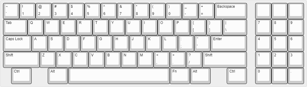
- industrial-standard-2.png (37.24 KiB) Viewed 10633 times
Posted: 15 Nov 2018, 17:02
by Scarpia
Gampela wrote: A bit of iteration.. Can't decide on bottom row.
That is a lovely layout, really - and I love that there are solid reasons for every design choice. The only thing that would potentially bother me is that the enter and backspace keys are harder to locate without looking since they are ‘behind’ the column of 1u nav keys on the right.
Mind you, I don’t have a nice and clean solution that combines all the benefits of your layout with easy locations of those keys, and I think you’ve probably made a wise compromise (which looks great). Plus, this choice makes it a great keyboard for easily hitting Home or PgUp, but most of the time I’d like to have Enter and Backspace handy instead.
Posted: 15 Nov 2018, 18:44
by Gampela
Scarpia wrote:
That is a lovely layout, really - and I love that there are solid reasons for every design choice. The only thing that would potentially bother me is that the enter and backspace keys are harder to locate without looking since they are ‘behind’ the column of 1u nav keys on the right.
Mind you, I don’t have a nice and clean solution that combines all the benefits of your layout with easy locations of those keys, and I think you’ve probably made a wise compromise (which looks great). Plus, this choice makes it a great keyboard for easily hitting Home or PgUp, but most of the time I’d like to have Enter and Backspace handy instead.
Thanks man! I'm really not doing anything special here, just utilizing design choices smarter people have come up with and combining them to something I would personally like.
Maybe this is something you would prefer. That additional gap might help you with finding the enter and backspace keys. Looks like CA66 with function row.

Posted: 16 Nov 2018, 00:21
by PlacaFromHell
I'm not an expert but, what about this thing? I always wanted to know how is living with an alpha lock.

Posted: 09 Dec 2018, 18:42
by davkol
derp
Posted: 10 Dec 2018, 00:59
by ThePillenwerfer
This is my fantasy:—
- Dream Keyb.png (31.71 KiB) Viewed 10438 times
Posted: 10 Dec 2018, 03:18
by sh1
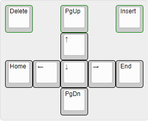
Borrowing from an earlier fellow's image, which matches what I did with my own navigation block, the ideal keyboard would emphasize that it's about the journey, not the destination:
- Ideal keyboard.png (62.61 KiB) Viewed 10447 times
Posted: 10 Dec 2018, 13:38
by depletedvespene
sh1 wrote: Borrowing from an earlier fellow's image, which matches what I did with my own navigation block, the ideal keyboard would emphasize that it's about the journey, not the destination:
The attachment Ideal keyboard.png is no longer available
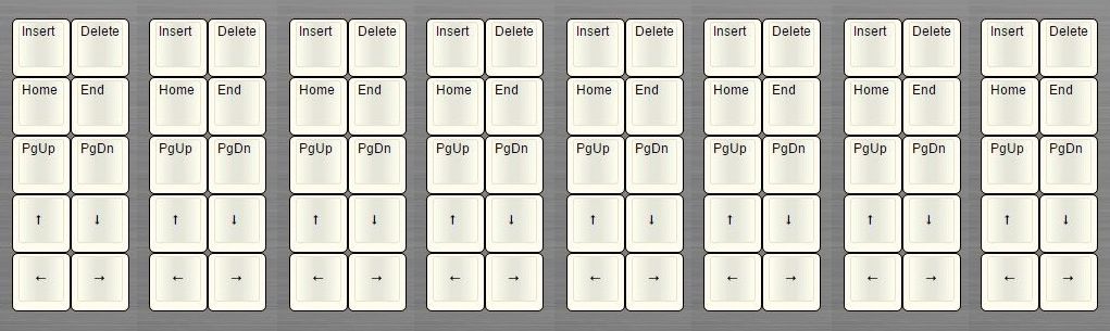
If you're emphasizing the journey, you should make it clear what the ways of going about it are, and show what the distinct qualitative steps are, and how the quantitative steps are similar to each other. This jnav cluster shows it best:
- Jnav cluster.
- xnav-cluster.png (3.97 KiB) Viewed 10399 times
Posted: 10 Dec 2018, 18:59
by rsaavedra
Tuntematon wrote: rsbseb wrote: //gainsborough wrote: 
Does a layout like this exist? It should! =)
I have no use for a number pad myself but I absolutely agree that a left hand nav cluster should exist and am including one on my current project
I prefer left-hand nav as well. It makes for a more intuitive mousing/navigating experience. If you must use a full-size layout, I would go a step further and put the numpad on the left as well. This full-blown left-handed layout is actually ideal for right-handed users! (if you can get used to using a numpad with your left hand)
Seconding this layout, if anything, for one of the same main reasons there are TKLs: alphabetical cluster would remain centered with monitor, and right mouse (or even a left mouse) would remain at an ergonomic distance from that center.
Still I would not like that unused space on the top right of the layout though, probably could simply have additional F13-F16.
Posted: 10 Dec 2018, 19:04
by depletedvespene
I might be going back to a nav/alpha/num order on my Folly115 design. It will certainly NOT leave unused space on the top right!

Posted: 10 Dec 2018, 19:19
by davkol
derp
Re: Post a picture of your ideal keyboard layout!
Posted: 18 Feb 2019, 15:33
by Shifty
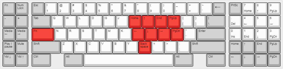
Here's what I want to do with my AT, once the new caps from ellipse arrive. This will be pretty close to the perfect layout for me.
Note the compact nav cluster in the bottom right, I've been using that layout for ages on the home row using a function layer, something I will continue to do, but it can be nice to navigate one handed when you're feeling lazy

I can't recommend this nav cluster enough, it's really handy having it on the home row, and the layout is super intuitive. I also put the backspace nearby as I was getting some wrist pain from reaching over to the backspace key.
Re: Post a picture of your ideal keyboard layout!
Posted: 18 Feb 2019, 15:39
by Muirium
The fix for an uncomfortable Backspace is to put it where it really belongs: right above Return!
The HHKB got this right, and Model F sure can too.