Page 3 of 142
Posted: 16 Feb 2016, 15:28
by andrewjoy
Blaise170 wrote: I'm going to have several AEK II with Japanese legends coming to me soon. Once I get them cleaned up I'll probably sell to the community since I won't need them all. I also got a Sharp X68000 which is what I've been trying to get for months but unfortunately I didn't get the black one I was bidding on because I accidentally used my deposits on a different item, so I couldn't increase bid.

I'm still going to try to get a black one though.
There is a nice video showing the black one
https://www.youtube.com/watch?v=W40qGkp-mEU
Dont let me get my hands on it , i would gut it and put a modern system i it

Posted: 16 Feb 2016, 15:32
by Chyros
ReleaseCandidate wrote: fohat wrote: bocahgundul wrote: The best caps by far are the PBT found on AEK2
You misspelled 'SGI'.
You misspelled "AT101" :p .
Posted: 16 Feb 2016, 15:39
by seebart
Written in awful grammar, and worse sentence structure!

Posted: 16 Feb 2016, 15:46
by ohaimark
seebart wrote: Written in awful grammar, and worse sentence structure!

Posted: 16 Feb 2016, 15:57
by Muirium
Give that man a thorough handbagging!

Posted: 16 Feb 2016, 16:09
by hammelgammler
Redmaus wrote: Oh man that is so nice now that I see it on the wiki page.
Anything alps with ANSI is pure gold to me.
Like this one?


- Packard Bell Blue Alps.jpg (908.25 KiB) Viewed 14167 times
Posted: 16 Feb 2016, 16:12
by Blaise170
I really like the layout on my Focus FK-8000, it has a really usable layout even with a BA enter.
Posted: 16 Feb 2016, 18:26
by Redmaus
hammelgammler wrote: Redmaus wrote: Oh man that is so nice now that I see it on the wiki page.
Anything alps with ANSI is pure gold to me.
Like this one?
Yes
What switches?
Posted: 16 Feb 2016, 19:26
by Tuntematon
bocahgundul wrote: What is the best caps that is available with alps? cause I have a doubleshot and still they are really bad
The best overall that I've seen, for doubleshots anyway, are the Tai Hao caps on my Tai Hao Aruz board. They resemble Cherry in profile and thickness and even have scooped F/J. The profile is huge. Most Alps keycaps are too tall. Aruz is also the best clicky switch I've tried (still haven't tried blue Alps though, despite my enthusiasm for it). But Aruz beats Cherry, SMK, KPT, other Alps and Alps clones, Buckling Spring (membrane).
Posted: 16 Feb 2016, 19:40
by Chyros
Blaise170 wrote: I really like the layout on my Focus FK-8000, it has a really usable layout even with a BA enter.
I know right, the Focus layout is really good

. I wish it was more popular - but then again, it's just one of many things that makes Focuses unique xD .
Posted: 16 Feb 2016, 21:19
by hammelgammler
Redmaus wrote:
Yes
What switches?
Blue Alps.

Posted: 16 Feb 2016, 21:55
by seaworthy
Guy in this video
https://www.youtube.com/watch?v=1wlgvgu3Jnc says he's putting o-rings on his Matias clicky switches...
Anyone done this? Sure, I've seen dampeners on the side of the sliders but never an o-ring--where would an o-ring go on an Alps-style slider?
Posted: 16 Feb 2016, 22:00
by amospalla
I did on a Matias Quiet, just to test. The difference was so, so, so subtle than there was no real difference besides shortening the key travel.
Posted: 16 Feb 2016, 22:45
by Redmaus
hammelgammler wrote: Redmaus wrote:
Yes
What switches?
Blue Alps.
Gimme!

Posted: 17 Feb 2016, 00:17
by seaworthy
Though the size is still a little larger than my preferred 60% layout, my favorite “stock” keyboard outside the HHKB is the Apple M0116 that shipped with the Macintosh SE 30. The power button at the top still works in the current OS, and it’s got the Control key in the right place and wonderful tactile orange switches.
But I can’t stand the ocean of Apple “platinum” beige, so I came at the keycaps like Jackson Pollock on a paint-thinner induced color binge. The inspiration is the kingfisher plumage.

- dye_caps_00.png (223.61 KiB) Viewed 14046 times
It was my third attempt at dying caps—the first two weren’t great. This round I switched from iDye-Poly to Dylon Multi-purpose dye. Dylon is very hard to find in the US so I ordered it from Canadian web site Fabricville.com. I also switched from an induction stove-top to a gas stove, and I used a quasi-double boiler setup by putting the dye into mason jars inside of a canning pot.
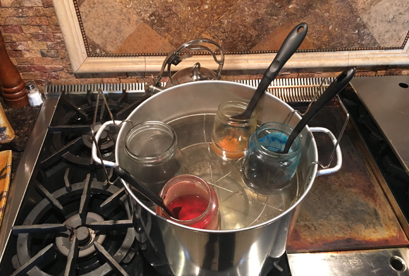
- dye_caps_01.png (762.25 KiB) Viewed 14046 times
The colors on this board are: Kingfisher Blue, Elephant Gray, Emerald Green, and Tangerine Orange. The tangerine took the longest at nearly two hours. The other dyes took about one hour. I’m told this is longer than normal dying times. I added the salt the instructions call for—maybe I didn’t keep it hot enough; maybe it’s my elevation (4,600 ft).

- Dye_caps_02.png (783.35 KiB) Viewed 14046 times
I’ve got the HHKB arrow keys highlighted in orange (using Karabiner to get this functionality, but will convert to a Teensy later), and because Apple had the homing dots on D and K previously, I accented F and J to help me find the home row.

- dye_caps_03.png (832.93 KiB) Viewed 14046 times

- dye_caps_04.png (869.71 KiB) Viewed 14046 times
I really enjoy the color, but the work of restoring a board (deep cleaning, retrobriting, cap dying) was much more effort than I estimated at the outset—which was compounded by my stupidity of trying to refurbish 11 boards at the same time. Damn Alps virus is crippling when it gets ahold of you.
Posted: 17 Feb 2016, 00:25
by mastermachetier
Blaise170 wrote: I'm going to have several AEK II with Japanese legends coming to me soon. Once I get them cleaned up I'll probably sell to the community since I won't need them all. I also got a Sharp X68000 which is what I've been trying to get for months but unfortunately I didn't get the black one I was bidding on because I accidentally used my deposits on a different item, so I couldn't increase bid.
I'm still going to try to get a black one though.
I am pumped been looking for the Japanese legends love those things. I might have to make an alps plank now.
Posted: 17 Feb 2016, 01:28
by Redmaus
So there is no way to dye the space bar?
Posted: 17 Feb 2016, 01:30
by Chyros
Redmaus wrote: So there is no way to dye the space bar?
Probably ABS innit?
Posted: 17 Feb 2016, 01:31
by Muirium
Goddamn ABS. God. Damn!
Nice job there, Seaworthy. Not the colours I'd use with a case and spacebar beyond dye's reach, but definitely sharp!
Posted: 17 Feb 2016, 01:39
by Halvar
Pity about the space bar. Otherwise, the colors turned out really nice though!
Posted: 17 Feb 2016, 01:54
by seaworthy
Chyros wrote: Redmaus wrote: So there is no way to dye the space bar?
Probably ABS innit?
Yes...ubiquitous, annoying ABS. I've dyed some ABS spacebars, but they always warp...can't take the heat needed to get the dye to penetrate.
Posted: 17 Feb 2016, 02:09
by Muirium
It's actually a good material for many things — switch components like sliders especially — but exteriors and caps are problematic as we all know.
Posted: 17 Feb 2016, 07:54
by jacobolus
(Chyros: you broke your quote syntax and misattributed the quoted comment. Anyway...)
fohat wrote: The best caps by far are the PBT found on AEK2
ReleaseCandidate wrote: You misspelled 'SGI'.
Chyros wrote: You misspelled "AT101" :p .
SGI is the vendor. AT101 is the model number. The Dell AT101 (early versions were the same Alps-made keyboard as the SGI AT101, just with slightly different styling) has IMO inferior keycap legends: they’re low contrast, kinda fuzzy, not all that well aligned, and bleh, Helvetica.
Even other cylindrical Alps dyesubs with Helvetica on them – e.g. on Texas Instruments, Tektronix, IBM, Zenith, Wang, or Xerox keyboards – have nicer legends than the Dell AT101 caps.
But both SGI and especially Apple legends are, objectively, much more carefully designed than the Dell legends. Not surprising, as I don’t think I’ve ever seen a Dell product built with any kind of attention to detail. If you prefer Helvetica to Univers, well, that’s just your own crap taste.
Posted: 17 Feb 2016, 08:07
by ohaimark
You mean Helvetica ISN'T the best font for everything?
Sounds like graphic design courses everywhere need some updating...
Posted: 17 Feb 2016, 08:11
by jacobolus
Helvetica isn’t the best typeface for anything. For most things, it’s not even an acceptable choice, period.
To be fair, I guess keyboards are one of the few places where Helvetica is appropriate. Other appropriate uses are corporate logos and posters.
Helvetica should never be used for setting long blocks of text. It’s not designed for it, and its legibility sucks for body copy. People should stop using Helvetica on websites, except possibly for headlines.
Helvetica is just so played out though, that I don’t really like it in any context, even stuff like keyboards or posters where it’s at least nominally appropriate. Helvetica is the typeface you should use when you want to indicate “1970s corporate America”. It screams “This design was chosen by a half-asleep committee of bureaucrats”.
Obviously even overused typefaces can look good in the hands of brilliant graphic designers; there are designers I respect who do great work with Helvetica. I just think they’d do even better work with something else.
YMMV, etc.
Posted: 17 Feb 2016, 08:16
by ohaimark
I've enjoyed working with Georgia lately. Some people think it's tacky, but I find it to be a comfortable font.
Posted: 17 Feb 2016, 08:45
by itzmeluigi
jacobolus wrote: (Chyros: you broke your quote syntax and misattributed the quoted comment. Anyway...)
fohat wrote: The best caps by far are the PBT found on AEK2
ReleaseCandidate wrote: You misspelled 'SGI'.
Chyros wrote: You misspelled "AT101" :p .
SGI is the vendor. AT101 is the model number. The Dell AT101 (early versions were the same Alps-made keyboard as the SGI AT101, just with slightly different styling) has IMO inferior keycap legends: they’re low contrast, kinda fuzzy, not all that well aligned, and bleh, Helvetica.
Even other cylindrical Alps dyesubs with Helvetica on them – e.g. on Texas Instruments, Tektronix, IBM, Zenith, Wang, or Xerox keyboards – have nicer legends than the Dell AT101 caps.
But both SGI and especially Apple legends are, objectively, much more carefully designed than the Dell legends. Not surprising, as I don’t think I’ve ever seen a Dell product built with any kind of attention to detail. If you prefer Helvetica to Univers, well, that’s just your own crap taste.
The Wang 725 keycaps use Helvetica font on them? I was about to make a post asking what font they used, perfect timing
Posted: 17 Feb 2016, 14:13
by seebart
Awesome M0116 mod seaworthy! Looks great, nice job. Thanks for sharing.
Posted: 17 Feb 2016, 21:32
by mastermachetier
@seaworthy looks awesome man!
Posted: 17 Feb 2016, 22:31
by XMIT
jacobolus wrote: Helvetica isn’t the best typeface for anything...
Tell that to the graphics designers over at the MTA in New York, it's used on all the signs there.
seaworthy: Beautiful work, thanks for sharing. Anything with keyboards takes forever. Just lubing a TKL board of Cherry MX switches takes about six hours. This hobby requires discipline, patience, and time.
