Page 21 of 43
Posted: 26 Feb 2017, 09:56
by matt3o
might be still nice to print some legends (mods?) in different colors (as an option), but I still have to check on the manufacturer's skill on that regards. Of course black would be the easiest.
Posted: 27 Feb 2017, 18:37
by pdc
I would suggest using the Granite legends since Matt3o has already put the effort in to refine them in some detail, and they have centred legends which seems very appropriate for a spherical profile.
For colour scheme I like the idea black or very dark legends on ivory or pale cream base colour. Like an old piano keyboard

Posted: 03 Mar 2017, 11:29
by evoman
matt3o wrote: any thoughts on the color scheme?
I realise there have already been a lot of comments and some decisions made, but I would add another voice to support a scheme that maximises contrast or at least visibility. I had/have a few keyboards with lower contrast and they drove me mad - so while I like pretty colours, I love something that maximises utility! The dullest I would go is along the lines of the scheme on my M13 in the industrial colour scheme (sort of beige and khaki), and I like bold legends.
This set looks great by the way - (closest to my ideal!)
Re: Hi-Profile PBT Dye-sub (the time has come)
Posted: 03 Mar 2017, 13:05
by Phenix
I like BIG BOLD legends..
Posted: 09 Mar 2017, 09:05
by niomosy
Rocketeer would be an interesting colorway, honestly.
Posted: 09 Mar 2017, 09:29
by matt3o
niomosy wrote: Rocketeer would be an interesting colorway, honestly.
that would be a little too extreme
Posted: 09 Mar 2017, 11:05
by pdc
matt3o wrote: that would be a little too extreme
Pity, because I was going to make the same suggestion. It is definitely a design calling out for a high-profile spherical style. Maybe as the 2nd use of this new profile it would make more sense …
Posted: 10 Mar 2017, 00:34
by niomosy
matt3o wrote: niomosy wrote: Rocketeer would be an interesting colorway, honestly.
that would be a little too extreme
Hopefully we get there. Things like black text on gray/white/beige caps don't really intrigue me much.
Posted: 10 Mar 2017, 00:43
by Laser
I wouldn't say no to this:


Posted: 10 Mar 2017, 08:37
by matt3o
oooh I like that stool!
Posted: 10 Mar 2017, 10:18
by Laser
Heh heh
Posted: 10 Mar 2017, 13:28
by Shihatsu
I would prefer something truly classic for the first batch, a colorway which has proven to be not to "special" - the classic black on beige, white on black or Dolch comes to my mind.
Re: Hi-Profile PBT Dye-sub (the time has come)
Posted: 10 Mar 2017, 15:43
by Phenix
I for myself like the look of the GMK Ceresia red modifer set.. Combined with BoW alphas its stunning!
Posted: 10 Mar 2017, 16:38
by Laser
Inspirational pic (shape-wise), from
GH (IBM Selectric caps):
Posted: 10 Mar 2017, 16:42
by Ratfink
Shihatsu wrote: I would prefer something truly classic for the first batch, a colorway which has proven to be not to "special" - the classic black on beige, white on black or Dolch comes to my mind.
These being dye-sub, white on black would be very difficult.
Posted: 10 Mar 2017, 16:46
by codemonkeymike
Possibly a Soviet era font for the first run. Ill look through the images to find a good example
Posted: 10 Mar 2017, 16:48
by Shihatsu
Aaaaa your right, ofc, forgotten about this little thingy with dye-sub, thanx! Those PBT doubleshot Selectric caps look quite delicous, though. Maybe later. I do not want to ask to much - high profile PBT in any form will satisfy me (aslong as it is delivered in ISO-DE, verdammte naht!

)
Posted: 10 Mar 2017, 18:52
by niomosy
Ratfink wrote: Shihatsu wrote: I would prefer something truly classic for the first batch, a colorway which has proven to be not to "special" - the classic black on beige, white on black or Dolch comes to my mind.
These being dye-sub, white on black would be very difficult.
Easy. Dyesub the entire cap minus the legend
Posted: 23 Mar 2017, 16:19
by Techno Trousers
Any updates, matt3o? You've been seeking a lot of input, but I don't see too much consensus overall. FWIW, I like the flat bottom row as well, or at least a flat space bar. I recently flipped my space bar (Vortex bi-color PBT cap set) and it's significantly more comfortable when I hit it with the side of my right thumb. Color-wise, I think bold black centered text on white or cream is a safe starting point, but I do hope double shot legends are in the future at some point. To me there are no key cap sets better looking than the white on dark multicolor spherical sets like PulSe. I know DS PBT is very hard to achieve, but it's the ultimate, right?
Posted: 23 Mar 2017, 16:59
by matt3o
I'm doing my best to include both versions (angled and flat bottom row). It's all down to pricing of course but so far it seems it would be possible to have both options (crossing fingers). I'll know better in a week or so.
Posted: 28 Mar 2017, 09:33
by matt3o
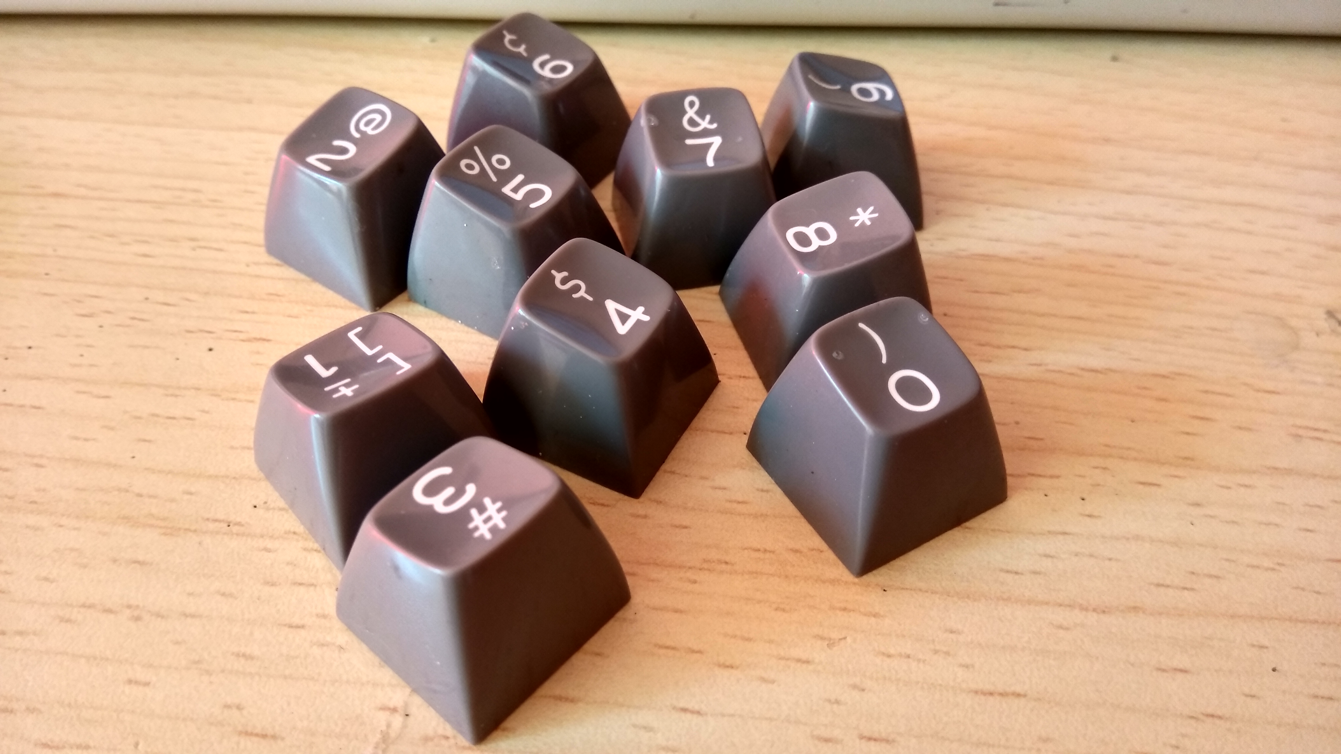
So. The set is really close to completion.
We'll go very light beige with some color accents (red esc, yellow enter and esc, RGB modifiers, ...). I can 99% confirm that we'll go both angled and flat bottom row, so everybody's happy
Now they are asking me to give a name to the keycap set. Not the profile, but the set itself. Ideas? It's a vintage typewriter inspired set... I was thinking something like "Pro Typist" or the like.
I'll soon have 3d renders
Posted: 28 Mar 2017, 09:58
by Wodan
Still convinced M3 would be a great profile name
Posted: 28 Mar 2017, 10:41
by pdc
How about ‘Wordsmith’?
Posted: 28 Mar 2017, 13:12
by Shihatsu
M3 Typist. Followed by M3 Skydolch. Which will be followed by M3 Skidata. One can only dream...
Posted: 28 Mar 2017, 13:47
by Laser
'Back to the future' keyset :p
Posted: 28 Mar 2017, 15:48
by matt3o
"M3" is already taken
I'll probably go MT3, but it's a good idea to call it "MT3 something" to identify the profile
Posted: 28 Mar 2017, 16:11
by Wodan
matt3o wrote: "M3" is already taken
I'll probably go MT3, but it's a good idea to call it "MT3 something" to identify the profile
Following your nick spelling, i would like mt3
Small letters.
But love the idea!
Re: Hi-Profile PBT Dye-sub (the time has come)
Posted: 28 Mar 2017, 17:12
by Techno Trousers
I was thinking about the parts of a typewriter. What about "MT3 Platen?"
Posted: 28 Mar 2017, 18:01
by codemonkeymike
If typewriters are the theme then I think the golden years of the typewriter should be a reference for the name (1950's 1960's). There was a big thing for Greek names for things so maybe a Greek god or character from a greek myth.
https://en.wikipedia.org/wiki/List_of_G ... al_figures
Posted: 28 Mar 2017, 18:42
by zslane
I'd have to see the renders first.
What about this (light) beige set will remind me of a typewriter?