Page 22 of 76
Posted: 09 Jun 2014, 01:57
by Muirium
Note to self: more space invaders. I may have just the board on the way for a bit of that…
Posted: 09 Jun 2014, 02:39
by mr_a500
It's not the space invaders themselves that offend me (though I was never a fan of that video game), it's the colours - hot pink and bright cyan. Oh how I hate those colours.
Posted: 09 Jun 2014, 02:46
by 002
That's my pic - some fridge magnets from a friend.
The colours remind me of a T-shirt I got in Japan:

Posted: 09 Jun 2014, 03:31
by webwit
You don't like the 80ties???
Posted: 09 Jun 2014, 04:01
by mr_a500
Sure I like the 80's - up until 1984 - coincidentally when Miami Vice came out. I curse Miami Vice for ruining colour schemes for nearly a decade.
Posted: 09 Jun 2014, 04:08
by Dubsgalore
I have two - that's got me super happy
Posted: 09 Jun 2014, 04:14
by 002
mr_a500 wrote:nearly a decade.
Enter the 90s where we came to our senses and went to a single colour to streamline everything - faded denim
Posted: 09 Jun 2014, 04:28
by webwit
There was no Amiga before 1984.
Posted: 09 Jun 2014, 04:44
by mr_a500
Yeah, but the Amiga project started in 1983. I take consolation in that. It's the only thing keeping me sane.
Posted: 10 Jun 2014, 17:06
by JotaCe
Quick one of me typing on my KBT Pure Pro:
- typing.jpg (91.46 KiB) Viewed 5764 times
Posted: 10 Jun 2014, 17:10
by Muirium
Works pretty nicely. At least they kept the ENJOY YOUR FEELING on the underside for that model!
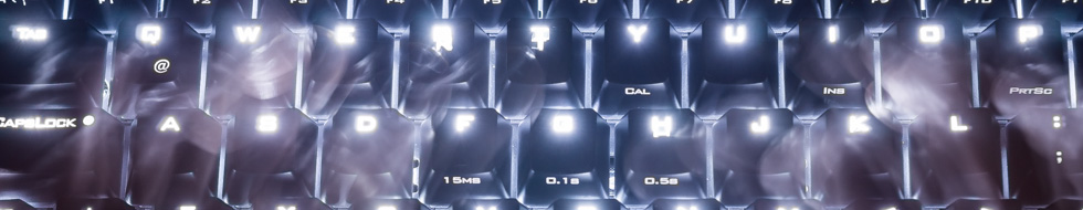
Posted: 20 Jun 2014, 17:19
by matt3o
couldn't resist
- quack.jpg (51.22 KiB) Viewed 5671 times
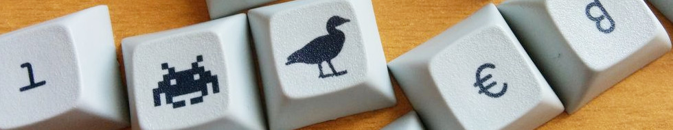
Posted: 24 Jun 2014, 16:08
by matt3o
tuxy
- tux.JPG (75.01 KiB) Viewed 5638 times
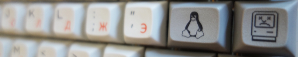
wall of cyrillic
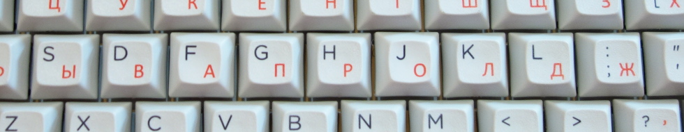
- cyr.JPG (98.44 KiB) Viewed 5634 times
Posted: 24 Jun 2014, 16:19
by Muirium
Nice images, but the DT logo is illegible on all but the Tux and Mac; which is a bit blurry…
Whenever I do a new header, I have to trial and error my way around the logo, too. It's hard to predict if you're going with light colours.
Posted: 24 Jun 2014, 16:43
by matt3o
honestly I just push them here and see what happens
Posted: 24 Jun 2014, 17:29
by Dubsgalore
cyrillic looks really good Matt3o

Posted: 24 Jun 2014, 17:41
by Muirium
It does. Maybe a bit closer to the keys, so you can align the logo to fit in the shadow between rows.
Posted: 24 Jun 2014, 17:57
by matt3o
let's try this
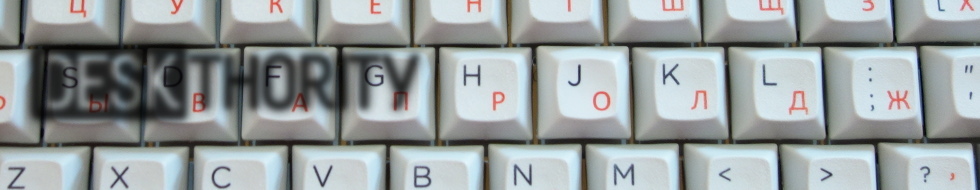
- cyr.JPG (98.47 KiB) Viewed 5608 times
Posted: 24 Jun 2014, 18:00
by Muirium
Cheat!
Gah, everyone's going to start doing that if Webwit lets them…
Posted: 24 Jun 2014, 18:04
by matt3o
making things easier for everyone


- shade.png (19.2 KiB) Viewed 5607 times
Posted: 24 Jun 2014, 18:13
by Muirium
Actually, as we're talking about change, how about retina resolution banners? The header is the one part of the site's layout that looks poor on high dpi screens: while the logo on top of it is tack sharp. Won't be long until most screens are high dpi, and low res graphics like that go from obsolescent to obsolete.
My suggestion is to go straight to quad resolution (double each dimension). Everyone's photo attachments look great on retina as the layout simply provides the native image for the browser to handle in place. That, please!
Posted: 25 Jul 2014, 00:10
by blackvan
K70 with Clears that I took a few months ago.
Posted: 25 Jul 2014, 01:05
by Daniel Beardsmore
Grrrr when do ISO Kul keyboards come out? :(
Posted: 25 Jul 2014, 04:46
by Muirium
Posted: 28 Jul 2014, 09:01
by Madhias
Testing an image. Have to shoot it again with some other content than the Spy (to avoid two DT logos).
Posted: 28 Aug 2014, 23:37
by Muirium
Just testing…
given it's not really our photo to use anyway.

- UNIVAC 3760.png (438.59 KiB) Viewed 5168 times
Now a shuffle to the right…
Bugger. The image runs out on the left too soon. So I've two options. One is to fake a bit of extra floorspace…
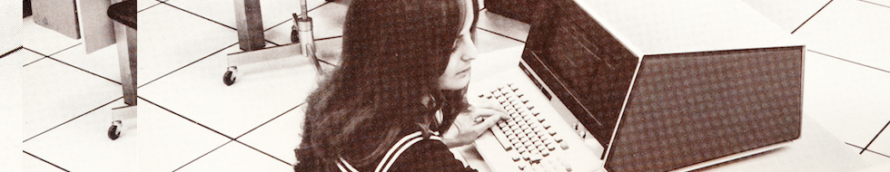
- UNIVAC 3760.png (419.63 KiB) Viewed 5161 times
Just a dirty hack! Can do better fakery if it works.
And the other is the easiest cheat of them all.
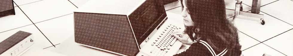
- UNIVAC 3760.png (415.6 KiB) Viewed 5159 times
But flipped keyboard! And a mess of the logo. Gah. I'd be better off staging the picture myself…
Posted: 29 Aug 2014, 00:57
by scottc
I really like the Univac picture. Very classy!
Posted: 29 Aug 2014, 23:18
by Muirium
Which one? They still need some work.
Also: fresh off the beam spring.
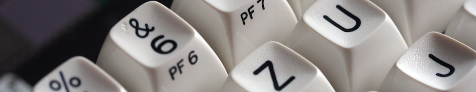
- 6zuj.png (249.37 KiB) Viewed 5078 times
Posted: 30 Aug 2014, 01:01
by scottc
PictureS! Silly me for replying via mobile...
Posted: 22 Sep 2014, 18:50
by bpiphany
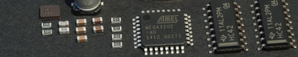
- Everything you need for a keyboard...
- components_header.JPG (48.93 KiB) Viewed 5424 times