Page 25 of 76
Posted: 01 Oct 2014, 21:40
by chzel
And that could upset our Hawaiian users!
CONUS....pffff....
Posted: 01 Oct 2014, 23:17
by Muirium
After much fiddling around, I couldn't get any of them to work well with the header. Snoopy needs to shoot details on the right side of his pictures, not the left. (Take note, would-be header photographers!) The DT logo needs space, and without the right kind of photo, cropping can't save the shot.
Posted: 01 Oct 2014, 23:28
by Nuum
I actually quite like the third crop of the golden skull. To me it fits quite well with the DT logo. It nicely splits the header into a bright part where the logo is and a dark part where stuff like spy and IRC is.
Posted: 01 Oct 2014, 23:40
by Muirium
Hmm… it kinda works. I'd prefer to be more zoomed out, where the detail is still sharp, but going close was the only way to get him out from behind the title.
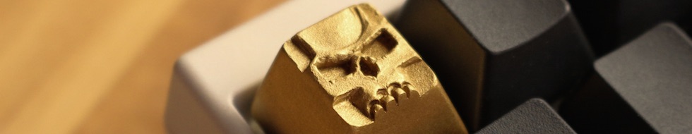
I'm guessing Snoopy's got a good proxy to get his hands on an array of clacks like that. And perhaps some shares in a goldmine.
Posted: 02 Oct 2014, 00:06
by webwit
Or you must cheat. I'm not really good at this, but you get the idea.

Posted: 02 Oct 2014, 12:15
by snoopy
I can try to take different pictures with another angle. Always happy to see when stuff from me appears here.
But I'm not a photo expert... currently learning how to get some good pics out of my dslr.
PS: I really like the gold cc header.

Posted: 02 Oct 2014, 13:06
by Muirium
Which version?
One simple rule to improve your photos for header cropping: put the good stuff towards the right of the picture, so you include more space on the left. That's where the DT logo goes!
Posted: 02 Oct 2014, 13:11
by snoopy
webwits cheated version is cool. the transition to black is a bit rough, but looks good together with the white dt logo.
Posted: 02 Oct 2014, 13:15
by Muirium
All right, when I'm next in Photoshop, I'll try a few gradients. They're not as bad a cheat as Matteo's!
Brilliant caps. But that picture came straight out of rotation when I took over. Bad Bad BAD!
Posted: 02 Oct 2014, 14:14
by mr_a500
I'm glad it did. That one always made me cringe when I saw it. It just didn't work.
My APL header looks like a cheat, with it fading darker on the left, but that was done with actual lighting. Same with the Selectric ball.
I think I'll reshoot that APL one though. It was taken with a crap camera before I got the DSLR. It's not as crisp as I'd like.
Posted: 02 Oct 2014, 20:52
by 7bit
Yes, thanks for removing it.

Posted: 02 Oct 2014, 21:00
by Compgeke
How does this look for the gold skull?
Posted: 07 Oct 2014, 00:26
by Muirium
Posted: 07 Oct 2014, 00:32
by mr_a500
Oh sure - copy my idea from last year:

vt1001.JPG
Posted: 07 Oct 2014, 00:38
by Muirium
Ah, of course, you were the first guy to ever point a camera at caps. I forgot about that! Hell of an invention, sir. I was just shooting again along the same lines as this:
But this time with emphatic ducks!

Posted: 08 Oct 2014, 21:49
by Madhias
Testing two pictures.
Posted: 08 Oct 2014, 22:14
by Muirium
The second one, sand coloured one is quite nice. What keyboard's membrane is that?
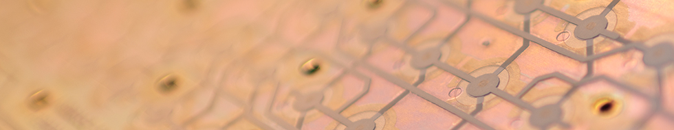
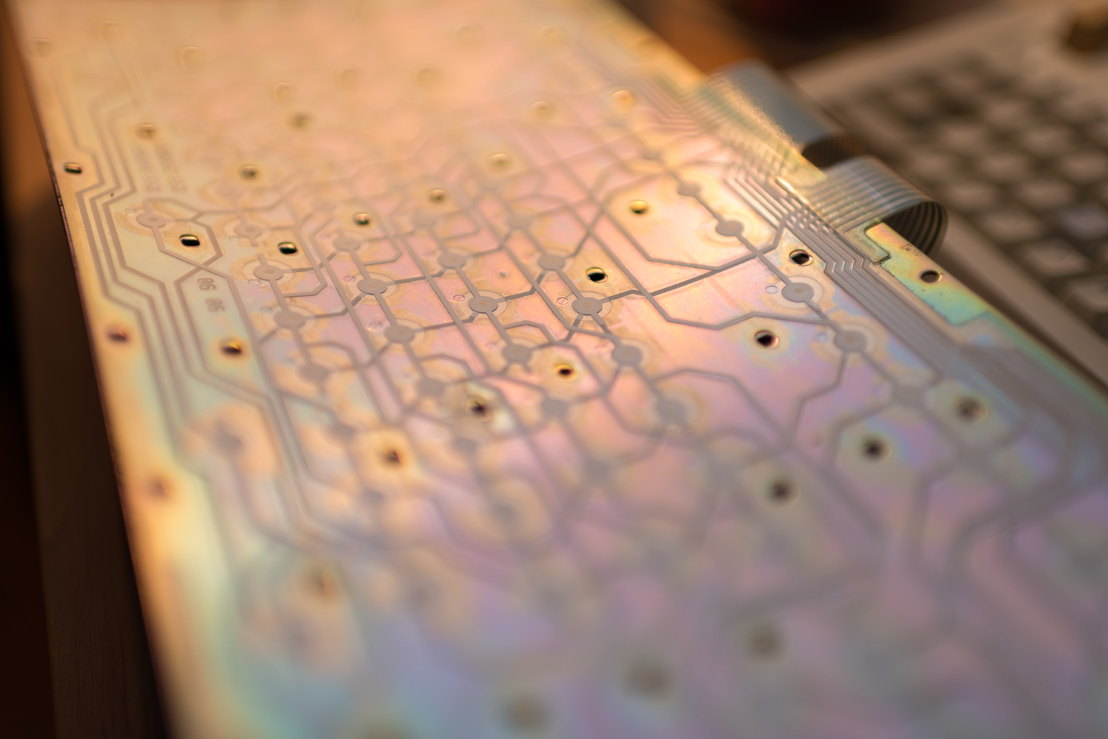
Posted: 08 Oct 2014, 22:18
by Madhias
It's from a '86 Model M i recently got from Cindy, with glued membranes (or at least i can't really separate them). The colors are even in reality funky! That's the whole shot:
Posted: 08 Oct 2014, 23:20
by Laser
"In the shadow of our pale companion" (title of a piece by
Agalloch)
- 005.JPG (36.97 KiB) Viewed 4281 times
- 009.JPG (159.29 KiB) Viewed 4259 times
Posted: 08 Oct 2014, 23:48
by Muirium
Nice title. But the lighting isn't up to much. Fancy trying again in daylight or with something softer?
Posted: 08 Oct 2014, 23:55
by Laser
Muirium wrote: Nice title. But the lighting isn't up to much. Fancy trying again in daylight or with something softer?
I have zero photo skills, so i'm just testing ...
(and the camera is borrowed for a few days)
Posted: 09 Oct 2014, 00:09
by Muirium
Practice is how we all get there. "Seek the light!"
Posted: 15 Oct 2014, 13:57
by snoopy
Compgeke wrote: How does this look for the gold skull?
transition is nice, but a bit too much zoom for my taste. Still prefer webwits version.
Sadly I personally suck with photoshop stuff.
Posted: 13 Nov 2014, 19:58
by Prelim
Posted: 13 Nov 2014, 21:13
by Daniel Beardsmore
That last one is funky!
Posted: 13 Nov 2014, 21:16
by Prelim
retrobright session! :p
Posted: 13 Nov 2014, 21:16
by Madhias
I like the last one!
Posted: 13 Nov 2014, 21:26
by Muirium
Me too. It's live!
Posted: 13 Nov 2014, 21:33
by Prelim
personally I do prefer the CMYK as I gives space to DESKthority logo pop-up more, but the retrobright is more "far out" indeed man

Posted: 13 Nov 2014, 21:38
by Muirium
I don't like the lighting on the CMYK. Do it again in daylight! Your retrobrighting one is essentially perfect. Nice job.


