Page 30 of 76
Posted: 06 Feb 2015, 22:25
by Muirium
Maybe. But to be honest, gradients are a big fat cheat, and when Webwit made me the boss of the headers, the rest of you knew just what to expect:
Shoot again!
Posted: 06 Feb 2015, 22:56
by seebart
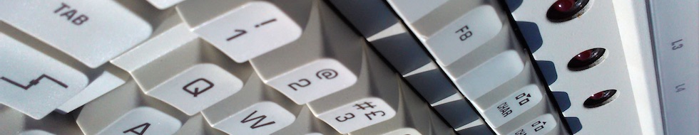
I got plenty of shots of that Fujitsu leaf spring PCB but its tough because there´s no free space for the DT logo! There´s one area where the controller chip is instead of the leaf springs but it still looks lousy:
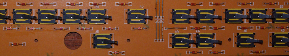
- leaf_test2.jpg (281.47 KiB) Viewed 5579 times
Posted: 07 Feb 2015, 14:20
by Muirium
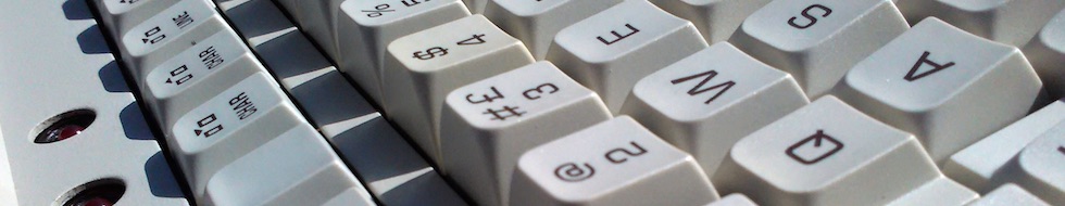
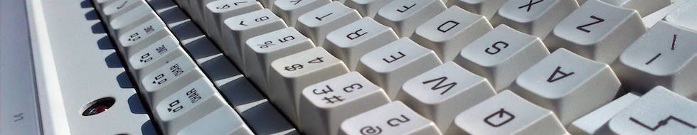
Yup. That's the challenge in DT headers. Speaking of which, here's a couple of crops I made of
Vsev's Phillips:
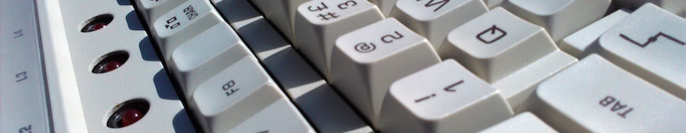
- Philips_detail2-1.jpg (51.17 KiB) Viewed 5564 times
- Philips_detail2-2.jpg (59.16 KiB) Viewed 5564 times
- Philips_detail2-3.jpg (69.75 KiB) Viewed 5563 times
Tricky!
- Philips_detail2-4.jpg (55.6 KiB) Viewed 5561 times
Thinking outside the box… nope. I need to free rotate these in Photoshop sometime.
Posted: 07 Feb 2015, 16:03
by ramnes
The third is the best.
Posted: 07 Feb 2015, 20:25
by seebart
Muirium wrote: Speaking of which, here's a couple of crops I made of Vsev's Phillips:
crazy angles! Yes the third from the top is the best of those.
Posted: 07 Feb 2015, 20:53
by Muirium
I ain't done with the crazy angles quite yet…
- Philips_detail1-5.jpg (46.84 KiB) Viewed 5517 times
- Philips_detail1-6.jpg (46.25 KiB) Viewed 5514 times
Note they all have different names for convenience.
And yes, I'm all about that squiggle on Caps Lock. The best!
Posted: 14 Feb 2015, 18:39
by Spikebolt
Stabilized wrote: Maybe it would be beneficial to add a gradient to the left hand side to not interfere with the DT logo; something like this:

Really cool! Would be cooler with MX reds, though

Posted: 22 Feb 2015, 12:31
by idollar
what about a 1390120 moding picture ?
Posted: 22 Feb 2015, 12:32
by Stabilized
idollar wrote: what about a 1390120 moding picture ?
That's really pretty, hope that gets added into the rotation

Posted: 22 Feb 2015, 12:37
by idollar
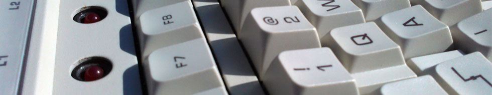
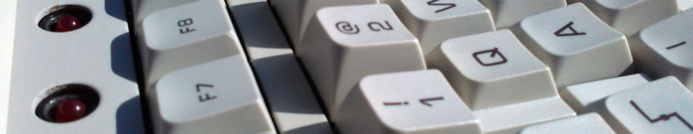
I like this one more:
The screw ends in a better place in the heading.
Posted: 22 Feb 2015, 12:38
by idollar
If I click on the first image with the screw I get the heading updated.
If I do the same thing with the second, I see the image only.
Why ?
Posted: 22 Feb 2015, 12:41
by webwit
Wrong size.
Posted: 22 Feb 2015, 12:42
by idollar
thanks
Posted: 22 Feb 2015, 12:48
by Muirium
Hmm. I must say I don't like the darkness on the right. Did you slap a gradient on it in Photoshop? I'm considering taking all gradient pictures out of rotation, now we have a big library with a queue of new entries ready to join.
Posted: 22 Feb 2015, 12:54
by idollar
Photowhat ? Do you mean THE GIMP ?

Posted: 22 Feb 2015, 12:54
by idollar
Lets try this one
Posted: 22 Feb 2015, 13:01
by Muirium
A little further back… it's not quite tack sharp that large.
Re: "Photoshop", I have a friend who still uses Paint Shop Pro. I always call it Photoshopping just to annoy him! It's essentially a generic term anyway, as we don't have a good phrase for "photo manipulation software" that drives home the point that Photoshop can tweak and lie and all too often ruin everything!
Posted: 22 Feb 2015, 13:06
by idollar
I have moved the screw and sharpen
Posted: 22 Feb 2015, 13:11
by Halvar
Very nice! Even the mirrored shadow of the membrane is still there.
Posted: 22 Feb 2015, 13:12
by Stabilized
The colours seem a bit over saturated that close and you can see quite a bit of digital distortion as well.
I personally like the second one, even if you have committed the sin of gradient, it looks like lens vignette.
Posted: 22 Feb 2015, 13:12
by Muirium
idollar wrote: I have moved the screw and sharpen
So I see. Rejected! Shoot again. And keep your software tricks quiet, in the hope I don't spot them!
Ideally, I want headers that are only scaled, cropped and edited for levels. Nothing else.
Posted: 22 Feb 2015, 13:14
by idollar
I like this one ...
Posted: 22 Feb 2015, 13:18
by idollar
I like this one ...
I have open the keyboard, set the tripod, light the back and set everything to fit the format of the header
Honesly, if you what nice pictures with this format, one has to shoot just for this or be very lucky. I will not shoot just for this. This is not the purpose of my pictures. Instead I prefer to show something nice.
Aso, why gradients are allowed ? Why exposure adaptations ?
You should ask to stop using photoshop at all if you what to be coherent. And perhaps shoot with a analog camera in BW. If you shoot with velvia the colors would be oversaturated by the developing.
Anyhow I do not have to like nor understand your rules as this seems to be a dictatorships
Posted: 22 Feb 2015, 13:24
by Muirium
Yeah, it's a challenge. I only start making header sized crops out of a tiny fraction of the pictures I shoot. The constraints are tight. But worth it, when you see how often they show up for everyone using the site.
I'm still not convinced that picture's sharp. There's a place for blur in these images, but not on the focal point!
Posted: 22 Feb 2015, 13:32
by idollar
Muirium wrote: Yeah, it's a challenge. I only start making header sized crops out of a tiny fraction of the pictures I shoot. The constraints are tight. But worth it, when you see how often they show up for everyone using the site.
I'm still not convinced that picture's sharp. There's a place for blur in these images, but not on the focal point!
My friend, this was shoot with a f9 at more than 8sec. The depht of field is +10cm. All the image is in focus. You may want to
read this.
Regarding sharpnes ... it depends on the light also.
I have no problems with your statements nor decisions. Honestly, but they do not make sense to me. Anyhow ... it seems that you decide so why shall I worry ?
Posted: 22 Feb 2015, 13:35
by Muirium
Exactly. I'm not dictator of much in life, but these headers are my tyranny! I'll give your pictures a consideration when I'm next adding a batch to the rotation.
Even mentioning sharpness tools in Photoshop makes me wary!
Posted: 22 Feb 2015, 13:41
by idollar
Photoshop ... again.
This picture was done with a +3kg manfrotto tripod, a remote shutter and a +1000 eur lens at f9 with no filters, mounted in a professional camera. The next step is natural sharpening is a Leica S2. And this equipment is to expensive to fulfill your requirements.
Please read the link above ... you may learn something.
Posted: 22 Feb 2015, 13:42
by Stabilized
Hasselblad/Phase One or GTFO!
Posted: 22 Feb 2015, 13:47
by idollar
Stabilized wrote: Hasselblad/Phase One or GTFO!
Or my
Fujifilm GX680 III S Professional. But why shall we worry? It will not be sharp enough. And for sure out of focus at f22.

After this post, I guess that the users of the forum has lost their last change to see one of my pictures in the header.

Posted: 22 Feb 2015, 13:48
by Muirium
I'm just going by what I see in the image. The result! Maybe I shouldn't judge from my murky old matte PowerBook here… I'll take another look with a modern screen later.
Stabilised, the camera doesn't make the picture. The photographer's skill with the camera does. A lot of the best looking headers are from low end kit that's been used well. Close up stuff is the hardest, of course. I can tell you that from many a fight with my dinky macro lens!