Page 4 of 4
Posted: 24 Oct 2013, 13:03
by spaceburge
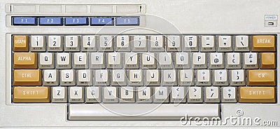
Definitely BBC Micro or Commodore 64 colours. Shiny all around for the finish and that would be perfection!
The beige with grey legends and either burgundy or red modifiers.
Posted: 24 Oct 2013, 14:40
by Muirium
What spacebars can we make? Very interested in everything below 6 units, especially between 2 and 5 wide.
Posted: 24 Oct 2013, 14:57
by Laser
Isn't it possible for the basic set to have by default the ESC and RETURN keys (for TKL) and also PAUSE etc. (for TK) in RED? Is there anyone who wants a grey ESC?
Posted: 24 Oct 2013, 15:03
by Muirium
Usually I do go for a subtle Esc key, even on Space Cadet SPH, but this is one colour scheme where I'm there with you on red. It's authentic. Like grey Return (which I want).
The red extras kit can be Transmit, Backspace and Delete. I'd still buy it. Ain't a Honeywell without Transmit.
Posted: 24 Oct 2013, 15:20
by matt3o
Posted: 24 Oct 2013, 15:28
by dirge
That bottom one's smart matty
Posted: 24 Oct 2013, 15:28
by Laser
Muirium wrote:Usually I do go for a subtle Esc key, even on Space Cadet SPH, but this is one colour scheme where I'm there with you on red. It's authentic. Like grey Return (which I want).
The red extras kit can be Transmit, Backspace and Delete. I'd still buy it. Ain't a Honeywell without Transmit.
Yes, and - I'd be quite ok with only a red ESC in the default set.
Posted: 24 Oct 2013, 15:34
by Muirium
Like the 0 and 00 on a roulette wheel, all of 7bit's profits* come from red escape! That's where the money is.
*Not necessarily > zero.
Posted: 25 Oct 2013, 18:39
by damorgue
Could we perchance get that new SPH JRET you spoke of in the same coloursheme as the old wonky one from R4 to replace it?
Posted: 25 Oct 2013, 18:47
by 7bit
Yes!
I plan these keys:
R1U200
BACK SPACE
R3U225
RETURN
R3U225
SHIFT
R3U275
SHIFT
JRET
RETURN

I'm not 100% sure, but maybe I give them away for free to anybody who ordered kits containing these in Round 4 and participates also in Round 5.
Posted: 25 Oct 2013, 19:25
by Muirium
Very happy to see the whole set already. That's my wish list right there.
Posted: 25 Oct 2013, 22:20
by Kurk
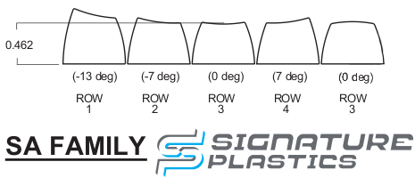
7bit wrote:Not sure if the function row should be row 1 profile.
row 1 !1 @2 #3 $4....
row 2 Q W E R T Y
row 3 A S D F G
row 4 Z X C V B (1.25, 2.25 and 2.75 units keys are row 3 only)
row 3 ALT SUPER CONTROL SPACE ...
I might add an extra kit for row 2-bottom row with 1.5 and 1 unit keys. I use LEFT DOWN RIGHT from row 2 right now, which is much better than row 3 or row 4, because I tend to type these keys with my thumb. If they are row 4, I hit the edge, not the surface as I do with row 2 keys.
IMHO, SA row 1 is too high for putting on Cherry switches and still being "typable", especially on tactile/clicky switches. I would suggest this scheme:
Row 1: Esc, F1, F2 ...
Row 2: ~, 1, 2, 3 ...
Row 3: Tab, Q, W, E, R, T ...
Row 3: Caps, A, S, D, F ...
Row 4: Shift, Z, X, C, V ...
Row 3: modifiers, space.
Another advantage is that more of the alphas have the same profile which makes language kits cheaper.
Posted: 25 Oct 2013, 22:26
by Muirium
I have to disagree. Row 1 looks and feels very nice indeed along the top of my 60%. With MX greens no less. (Though I am a heavy typist.)
Actually, the whole Honeywell keyboard feels like row 1 with its towering caps and angled stems. For what it's worth.
I will buy a flat row 3 set, too. In red, for my matrix boards.
Posted: 26 Dec 2013, 23:14
by modology
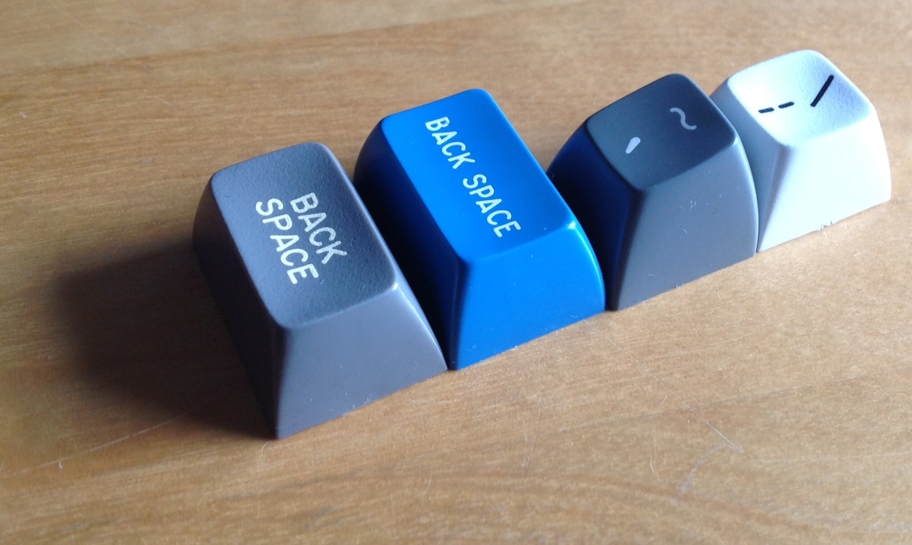
Just wondering if you guys know what font were used for Honeywell or Round5 keycaps? I really like the old school terminal font printed on the keycaps
Posted: 27 Dec 2013, 19:00
by Muirium
I don't know the name, but it's quite similar to the font that Round 4 SPH came in, as made by Signature Plastics. Here they are for comparison:
Maybe 7bit or Matt3o (who have both been SP customers while running group buys) know the answer or could ask.
Posted: 27 Dec 2013, 22:49
by Muirium
Thanks. Indeed it does: "Gorton Modified."
Signature Plastics’ font is somewhat unique but is very similar to Arial or Helvetica. It’s origin dates back to the 1970’s when IBM set the standard for double shot keycaps and legend plates were produced using a Gorton engraving machine. To offer a unique look, Signature’s original company, Comptec, modified the font slightly. Thus the font became known as Gorton Modified and was used to produce millions of keycaps for years for keyboard companies like Wyse, Wang, Oak Industries, Maxi Switch, Beehive and Honeywell, among others.
Seeing as Google can't find it mentioned anywhere else on the web, I assume it belongs to Signature Plastics alone. They claim it's very similar to Helvetica, but it's not. It's a
sans, but an old timey one. More like what IBM did indeed use on beam springs and typewriters, *before* switching to Helvetica at the same time it did to cylindrical caps with the Model F.
Posted: 28 Dec 2013, 09:22
by matt3o
Posted: 28 Dec 2013, 17:54
by Muirium
Price per legend is $25 each
They're really missing a money making idea. They should charge us $25 per legend *not* to use these!

- Screen Shot 2013-12-28 at 04.52.11 pm.png (174.54 KiB) Viewed 4858 times
I'm figuring actual Helvetica, Futura, Gotham and so on are a little bit beyond them…
Posted: 28 Dec 2013, 18:00
by matt3o
Isotherm has its own charm... kind of...
Posted: 28 Dec 2013, 18:07
by scottc
Isotherm is sort of cool, but I think that Zbig is the clear winner for Round 5. Either that or Comic Sans.