Page 32 of 76
Posted: 22 Feb 2015, 17:52
by 7bit
Replace the baby by a beamspring and we talk again.

Re: Post your deskthority header images here
Posted: 22 Feb 2015, 17:53
by seebart
Aww 7bit nuked that nice idollar header! A bit harsh![emoji14]
What movie is that from mr_a500? Top Secret again?
Posted: 22 Feb 2015, 18:00
by mr_a500
Airplane! (1980)
Ted Striker is in the mental hospital painting that with a model posing exactly the same way.
Posted: 23 Feb 2015, 20:23
by chzel
I had promised Muirium an Apple M0110 pic after it got out of the box!

- M0110_2.jpg (67.69 KiB) Viewed 3967 times
Posted: 23 Feb 2015, 20:39
by Muirium
Approved! Nice shot.
Re: Post your deskthority header images here
Posted: 23 Feb 2015, 20:44
by seebart
Very nice chzel! A lot of good headers lately.
Posted: 23 Feb 2015, 20:50
by chzel
Thank you!

Posted: 23 Feb 2015, 23:36
by idollar
Nice !!! Very nice
Posted: 24 Feb 2015, 22:16
by idollar
What about this one ?
Posted: 26 Feb 2015, 01:25
by Daniel Beardsmore
Bland, but it might inspire someone to do better …
- Lotsa SKCCAF002A.jpg (31.24 KiB) Viewed 3887 times
Posted: 28 Feb 2015, 22:45
by chzel
From my (Daniel's) K110 (probably too bright behind the logo)
- K110.jpg (72.07 KiB) Viewed 3863 times
Posted: 28 Feb 2015, 22:55
by Daniel Beardsmore
The logo still stands out clearly to me.
Posted: 28 Feb 2015, 22:59
by chzel
Yeah, it does!
I don't like how the top "boxes" hide the slider, I'll re-crop in a bit!
Edit:
- K110-2.jpg (72.52 KiB) Viewed 3848 times
Posted: 28 Feb 2015, 23:12
by Muirium
The logo's fine. The bokeh is a bit too strong for my taste, though. How about shooting it again a stop or two slower? I'd like the whole of the front Alps slider to be in focus at least! You'll see what I mean.
Posted: 28 Feb 2015, 23:12
by Daniel Beardsmore
It's curious to see Alps clone switches in a header image — especially considering how much I hate the switches in that K110. I guess my little muscles aren't strong enough.
Posted: 28 Feb 2015, 23:16
by Muirium
So the blur is to hide their true identity!
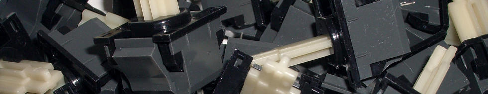
Meanwhile, I like i$'s latest one. (A Model F leg assembly?) It'll go in when there's a good batch.
Daniel's is indeed bland, but we could use a few more switch shots. I'd go for a bit of sunlight on them to liven them up a bit. If we had such a thing up here before spring…
Posted: 28 Feb 2015, 23:22
by chzel
Muirium wrote: The logo's fine. The bokeh is a bit too strong for my taste, though. How about shooting it again a stop or two slower? I'd like the whole of the front Alps slider to be in focus at least! You'll see what I mean.
Yeah, the DoF is a bit on the short side! Reshooting will have to wait a couple of weeks, I have reassembled the board trying to decide on switches!
Daniel Beardsmore wrote: It's curious to see Alps clone switches in a header image — especially considering how much I hate the switches in that K110. I guess my little muscles aren't strong enough.
They are definitely heavy, but that click...I love it. I am also testing Matias Clicky, Quiet and all combinations!
Clicky with Quiet slider (I like it a lot), Quiet Linearized (too wobbly but smooth), Hua-jie with Matias spring (not light enough)...too many options!
Posted: 28 Feb 2015, 23:32
by Daniel Beardsmore
Alps clone switches do generate a really nice click. The switches in my KPT-84 are a better balance to me — good sound, and good feel too (and slightly better than the OA4 switches in my old NTC KB-6153EN).
I don't know if the feeble click in the Tactile Pro 4 is down to the switch, or down to changes made to the keyboard to reduce noise levels in the Quiet Pro, that ended up dampening the Tactile Pro's sound also. I've yet to hear how Matias switches sound in another keyboard.
Posted: 28 Feb 2015, 23:39
by chzel
The weak click of the Matias is, i think, due to the different click leaf. It's not as springy and I'd think the extra weight of the leaf also affects the "snap".
I have put in 10 clicky on the fghjkl;' row and 10 quiet on the rtyuiop[] row, and the difference in the click is night and day...
Posted: 28 Feb 2015, 23:50
by Muirium
These headers have a long shelf life. It can wait!
chzel wrote: I am also testing Matias Clicky, Quiet and all combinations! Clicky with Quiet slider (I like it a lot)
That's the one I'm most interested in. How is the tactility compared to standard Matias Clicky and other switches generally?
Posted: 01 Mar 2015, 00:07
by chzel
The tactility is exactly the same as the stock clicky, but the damped bottom and top-out make it feel less "busy" and more defined. Just the bump and the click. Which honestly is not much of a click...the bump is nice though, crisp and just enough (feels better than the Quiets)!
Posted: 01 Mar 2015, 00:49
by Daniel Beardsmore
chzel wrote: The weak click of the Matias is, i think, due to the different click leaf.
I had a loose OA2 variant B to hand, so I swapped the click leaf into a Matias click switch, and it definitely improved the click. Not by a huge amount, but the difference was there. (I was only able to test by gripping two switches—one modified and one unmodified—in a pair of pliers and resting it on my desk, with both fitted with old Alps uniform spherical keycaps.)
The feel wasn't affected to any degree that I could define reliably.
OA2 is found in many Alps clone keyboards from the early 90s. I'm guessing 1995 was the switchover point from OA2 (wide steel leaf) to T1 (narrow copper leaf), though reduced-metal narrow copper leaf switches go further back. A previous e-mail from Sandy also confirmed a year of 1993 for two FK-2001 keyboards with OA2 switches, so that's another positive data point.
Posted: 01 Mar 2015, 19:08
by mr_a500
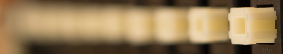
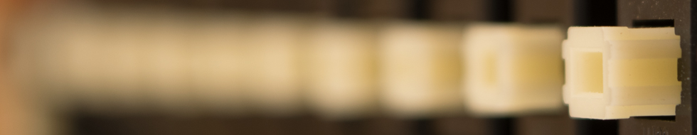
Clip from Burroughs keyboard.
Burroughs1.JPG
Posted: 01 Mar 2015, 19:11
by Muirium
Delicious caps. If you've got more shots, up them and we can try a few alternate crops. It's most of the way there.
Care to describe your lighting, for people looking for advice? Looks like a window out on cloudy daylight somewhere above the keyboard to me. Which is my usual, too. Find the reflections and shoot!
Posted: 01 Mar 2015, 19:17
by mr_a500
You're exactly right - window above, with cloudy daylight (and plenty of snow to reflect the daylight).
I have no other shots and dark clouds have moved in (even more snow), so I won't be taking more.
Posted: 01 Mar 2015, 19:23
by Muirium
I know that feeling. The only half decent light we have here is between big, low, fast moving rain and sleet clouds too.
Posted: 10 Mar 2015, 14:19
by seebart
just playing around here. I don´t think it works at this point.
The attachment capreflection2.png is no longer available
Posted: 10 Mar 2015, 14:36
by Stabilized
Love that one personally; really enjoy the muted colours, helps perpetuate the vintage appeal

Posted: 10 Mar 2015, 14:40
by seebart
Stabilized wrote: Love that one personally; really enjoy the muted colours, helps perpetuate the vintage appeal
thanks, the cap reflections are nice but it´s a little on the "soft focus" side! I guess it´s got a vintage look to it.
Posted: 10 Mar 2015, 14:42
by Muirium
I agree with both of you. Refused! Well, unless you can tweak the alignment a bit so it works better with the logo in front. The colours and overall mood is very nice though.