Page 1 of 1
Planned maintenance
Posted: 27 Jul 2011, 20:24
by webwit
Thursday at 00:00 UCT (Thursday 02:00 CET, Wednesday 20:00 EST), the site will be briefly down for maintenance.
This is not a good time to hit submit on that post you have been preparing all day.
This concerns a phpbb upgrade. If you notice anything funny afterwards, please let me know.
Posted: 27 Jul 2011, 22:29
by 7bit
webwit wrote:Thursday at 00:00 UCT (Thursday 02:00 CET, Wednesday 20:00 EST), the site will be briefly down for maintenance.
This is not a good time to hit submit on that post you have been preparing all day.
This concerns a phpbb upgrade. If you notice anything funny afterwards, please let me know.
Can't you clone the installation and then do the update and testing and if everything is OK, you direct us to the new version?
Posted: 27 Jul 2011, 22:54
by daedalus
I assume this will have no effect on the Wiki?
Posted: 27 Jul 2011, 22:56
by webwit
Already cloned and updated on our test environment, but it needs to copy the files from test to live instead of redirect and do a few database updates. It's trivial.
No effect on wiki. That one is next though!
Posted: 27 Jul 2011, 22:59
by 7bit
webwit wrote:Already cloned and updated on our test environment, but it needs to copy the files from test to live instead of redirect and do a few database updates. It's trivial.
No effect on wiki. That one is next though!
I just was kidding. We surely don't need a 24/7 uptime:-)
Posted: 27 Jul 2011, 23:14
by webwit
Ha, but we don't need GH update drama as well.
Posted: 28 Jul 2011, 01:33
by The Solutor
Any hope for an optional darker theme ?
I'm already tanned by the default one...

Posted: 28 Jul 2011, 07:05
by kbdfr
The Solutor wrote:Any hope for an optional darker theme ?
I'm already tanned by the default one...
Please do NOT change the default theme.
I hate those ugly, gloomy tomb-like environments now to be found everywhere
Posted: 28 Jul 2011, 07:46
by sordna
Haha, I liked Solutor's joke
Also I agree with him, the bright white is very tiring on the eyes, especially at night. Maybe we can have a choice of 2 themes in our personal options to choose from. The default can be the current white one.
Posted: 28 Jul 2011, 13:05
by The Solutor
kbdfr wrote:
Please do NOT change the default theme.
I wrote "optional" for a reason.
I hate those ugly, gloomy tomb-like environments now to be found everywhere
I wrote "darker", and not dark or black for another...

Posted: 28 Jul 2011, 13:38
by Jim66
I agree. A darker theme would be nice.

Posted: 28 Jul 2011, 14:03
by xbb
phpBB upgrade doesn't mean theme change. If you have to discuss about themes you should use the suggestions thread / deskthority related forum.
Don't take me bad but if you do it there it's easier for the devs to read all your suggestions.
Posted: 28 Jul 2011, 15:05
by webwit
- dark.jpg (68.55 KiB) Viewed 4121 times
Posted: 28 Jul 2011, 15:23
by 7bit
A bit lighter,please!
What about Edit, Reply,Quote and whatever in the upper left corner and with text intead of symbols?
Posted: 28 Jul 2011, 16:05
by kbdfr
NOT white letters on a dark background, please!

If the background really has to be darker, please choose a grey tone light enough to allow black letters. Or would you read a book or newspaper with white text printed on black paper?
Posted: 28 Jul 2011, 16:17
by The Solutor
kbdfr wrote: Or would you read a book or newspaper with white text printed on black paper?
On printed newspaper the ink is a cost, and often clear letters on dark background aren't definite as the black on white.
Also the paper is just reflective, so the with level depends on the environment light.
Most of the above is applicable also to the e-paper
instead on LCDs every aspect is changed, characters are definite no matter if white on black or black on white, and a large white background emits a good amount of light, which is fatiguing for the eyes.
I read ebooks since the year 2002 and I've never read them in black on white.
I usually chose yellow on black amber on black or light gray on black, white on black could be too much contrasted especially using a recent LCD display.
Posted: 28 Jul 2011, 16:23
by webwit
Well, actually usability research shows dark on light is best. The contrast works the best for the human eye to quickly process information. In any case, not much news compared to last time this came up. We want to provide an extra option at one point for a dark theme, but didn't have time so far. Of course, contributions are welcome.
Posted: 28 Jul 2011, 16:24
by The Solutor
@webwit
Really not bad, although I noticed that people tend to feel more relaxed on forums who use a shade a brownish gray, a color that initially looks not so good, but in the long time gives a more "friendly" sensation.
Is hard to describe but i hope i gave the idea
Posted: 28 Jul 2011, 16:29
by webwit
Do you have an example of such a forum?
Posted: 28 Jul 2011, 16:40
by The Solutor
webwit wrote:Well, actually usability research shows dark on light is best.
It really depends on the media. Reflective or transmissive display matters a lot.
Try to read the whole LOTR or the whole Asimov foundation on an LCD display with black on white and then tellme if it's better...

(I did it
)
Do you have an example of such a forum?
http://forum.telefonino.net/ in italy used that brownish gray (in various shades) in the past.
Now they made the theme lighter (and people is not so pleased) but that shade is still used for the background, and some forum elements.
Posted: 28 Jul 2011, 16:47
by 7bit
The Solutor wrote:...
Do you have an example of such a forum?
http://forum.telefonino.net/ in italy used that brownish gray (in various shades) in the past.
Now they made the theme lighter (and people is not so pleased) but that shade is still used for the background, and some forum elements.
Posted: 28 Jul 2011, 16:51
by webwit
I do all my programming light on dark for anti-glare reasons. But:
http://web.mst.edu/~rhall/web_design/co ... ility.html
Funny, I just finished Foundation on my PRS650. You should get an ereader!
Posted: 28 Jul 2011, 16:55
by 7bit
What about using the background of the quotes as normal background for the posts, etc.
A bit less contrast would be better in my opinion.
But brownish gray?

Posted: 28 Jul 2011, 16:57
by webwit
I guess the problem of providing a second theme choice would be that it would not please all dark theme seekers. We need some dial
like this.
Posted: 28 Jul 2011, 17:17
by The Solutor
Funny, I just finished Foundation on my PRS650.
You should get an ereader!
I like a lot the e paper, but the ereaders doesn't meet my needs.
Firstly they are too big, which is a very nice thing to read technical manuals, magazines, comics and so on, but not so nice to read plain text only books.
On newspapers text is spitted in columns for a reason, and a smartphone is large, more or less like a newspaper's column.
On a smartphones you have also the advantage of having it always with you, so is easier to spend some spare time (on bus on trains station and so on) reading something.
Matter of personal habits obviously, but hardly I'll buy a proper ereader anytime soon.
Posted: 28 Jul 2011, 17:21
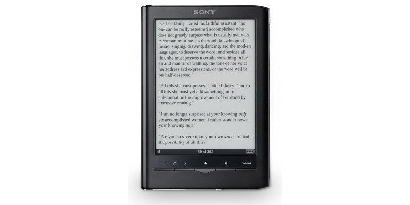
by webwit
I have the reverse problem. My ereader is pocket size, and thin, so it's less weight than an ordinary book. But it's too small for tech books with stuff like code or diagrams. It has a nice zoom, but you don't want to zoom your way through a whole book.
Size:

Posted: 28 Jul 2011, 17:29
by The Solutor
Clear, I believe that 9/10" is the minimal size to read something tat contains pictures, graphs, complex math and so on.
For that purpose I use my old tc1000

(With the keyboard detached)
The universal device has still to be invented..