Page 1 of 1
Helvetica Über Alles
Posted: 05 Sep 2018, 15:20
by Muirium
Naturally, I did this quiz the
moment I heard about it:
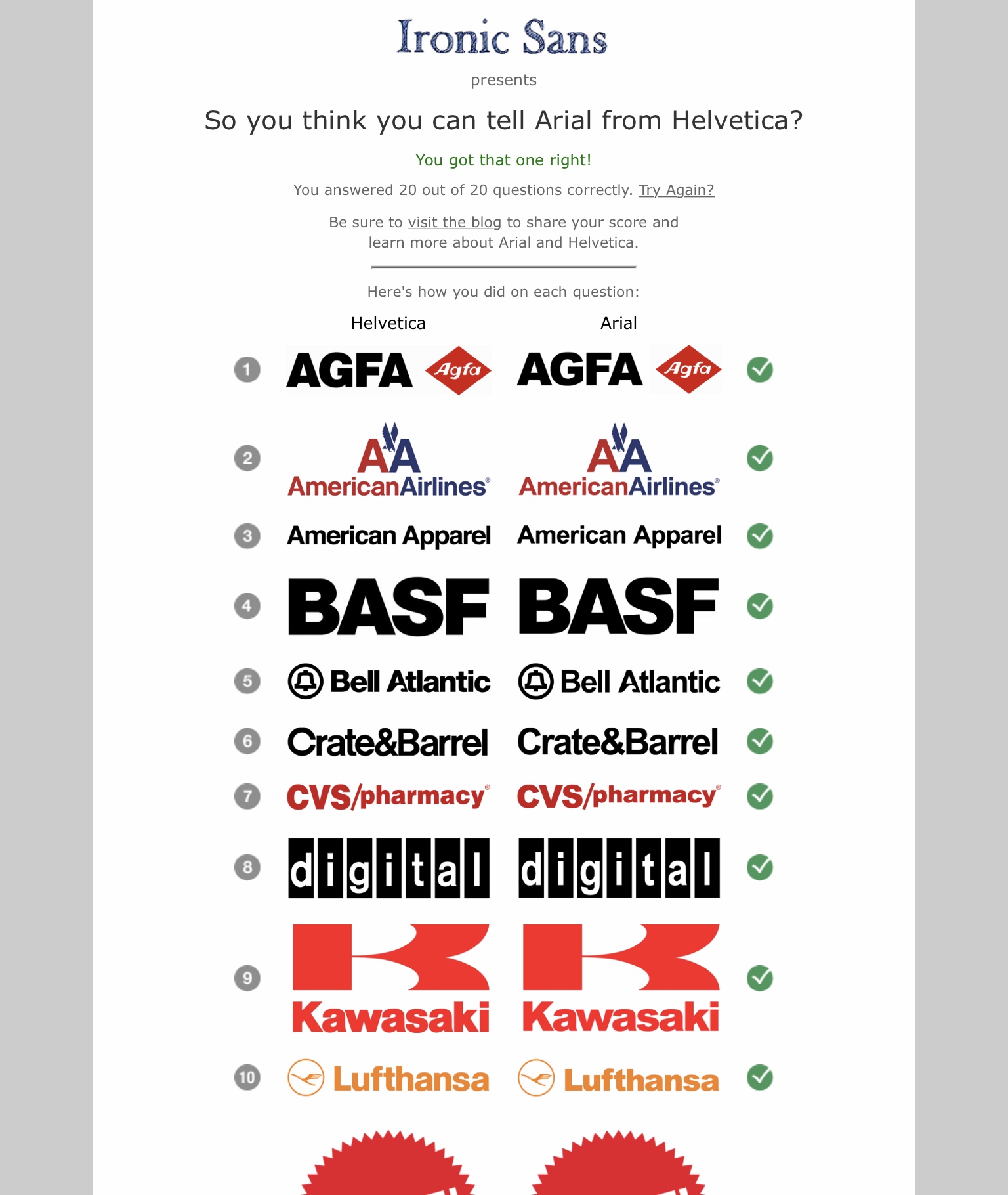
- 20A44C21-7790-480E-BB9C-2745D06A1B72.jpeg (348.82 KiB) Viewed 4872 times
http://www.ironicsans.com/helvarialquiz/
There’s some real trick shots in there, after the warmup rounds you see above. Well pleased I achieved a perfect score.
Helvetica, accept no substitute. On keyboards most of all. Topre / IBM lifestyle!
Posted: 05 Sep 2018, 16:07
by hansichen
I'd put the picture in a spoiler

Interesting comparison, I guesss my ocd isn't strong enough to go wild on these fonts

Posted: 05 Sep 2018, 17:21
by andrewjoy
I got 20 out of 20 of them, but i put 18 as 2 where a guess . Lower case its a joke its that easy to tell.
Upper case not so much but G S and O give it away if you look close.
Posted: 05 Sep 2018, 20:12
by depletedvespene
20/20 here, but only after I got a refresher on what the differences are. As for the score on the first attempt... I'm glad the 5th ammendment exists.
Posted: 05 Sep 2018, 21:42
by Khers
andrewjoy wrote: I got 20 out of 20 of them, but i put 18 as 2 where a guess . Lower case its a joke its that easy to tell.
Upper case not so much but G S and O give it away if you look close.
I had a similar experience, ended up with 20/20, but two of them, Toyota and Mattel, were just lucky guesses.
Posted: 05 Sep 2018, 22:29
by Muirium
Yes, those are the hard ones. The lowercases are just to make sure you’ve your eyes open! More fun doing the test this way, with full handmade logos, than simple text. You can tell there’s effort in there, even if it is betrayed by shitty Arial.
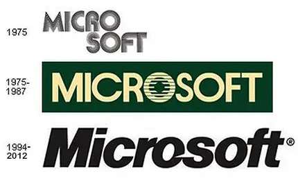
One that’s missing is Microsoft. Those same bastards who popularised Arial instead of paying Helvetica’s distribution royalties still went with the authentic article for themselves!
After a few attempts…
Posted: 06 Sep 2018, 01:16
by Hypersphere
I get a Helvetica refresher course every day simply by looking at my HHKB keycaps.
Whenever I see a non-Helvetica R or G on a keyboard, my gut winces.
Nevertheless, are there any newcomer typefaces that people here appreciate?
Posted: 06 Sep 2018, 01:42
by depletedvespene
I actually like Adobe's Source Sans Pro.
(there's certainly not enough too choose from when it comes to monospaced, screen-oriented fonts)
Posted: 06 Sep 2018, 02:31
by Muirium
Avenir is a wonderful font. Not exactly a newcomer, but it’s the one I write in, the occasional time I’m not in the mood for Helvetica.

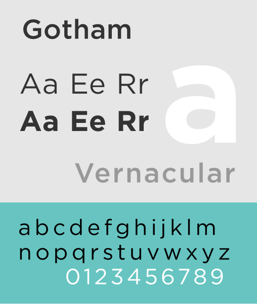
A little newer is, of course, Granite’s fantastic pick of Gotham.
Speaking of mid-century inspired Americana: this set currently has my eye. Especially Lionel Text.
https://www.fontdiner.com/fonts/in-flight-meal-font-set
Beware the whimsy!
Posted: 06 Sep 2018, 12:14
by andrewjoy
I don't know why but i have a soft spot for Accidental Presidency
Posted: 06 Sep 2018, 16:22
by Muirium
Great name, but the kerning could use a lot of work:
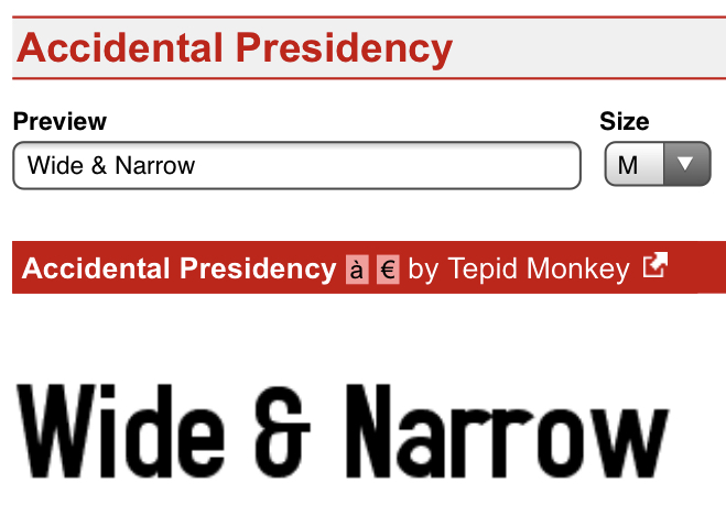
- 3C80CA00-4925-4BD7-8257-F1E430D6B02B.jpeg (137.9 KiB) Viewed 4716 times
https://www.dafont.com/accidental-presiden.font
Posted: 06 Sep 2018, 18:04
by andrewjoy
I know , but i think its to save space more than anything else.
It works well for UI elements i would not use it in print. It has a modern flair to it without all the gamer font nastyness.
Something that both crowds can accept .
What do you think of
https://github.com/rbanffy/3270font
Posted: 06 Sep 2018, 18:48
by Hypersphere
@Muirium,
I suppose you are using the original Avenir typeface and not a derivative such as Avenir Next W04 (?).
As a practical matter, I do quite a lot of work with colleagues collaborating on the writing of documents and presentations. Most of my colleagues use MS Windows and MS Office, a few use Macs, and a very few (myself included) use Linux and LibreOffice. Given these and other constraints (such as font embedding not always working, e.g., on PPTX files between Mac and Windows), it is usually easier to use font families that are normally installed on most people's computers. With all this in mind, and not wanting to precipitate a flame war, what do think of members of the Microsoft "C font" families, such as Calibri?
Posted: 06 Sep 2018, 19:17
by depletedvespene
Gee, font composing has gotten so much more sophisticated than what was the norm in my time. Sometimes I wonder if I should make the effort of converting my screen "readable" fonts (from 1993!) to a modern format. I've seen it done with other old screen fonts, so I know it can be done.
Posted: 06 Sep 2018, 19:34
by Hypersphere
depletedvespene wrote: I actually like Adobe's Source Sans Pro.
(there's certainly not enough too choose from when it comes to monospaced, screen-oriented fonts)
You raise an important point. In general, typefaces suit various needs (e.g., web pages, presentations, street signs, airport signs, billboards, word processing documents, scientific journal articles, screen fonts, or programming). There is no single typeface that can perform all these functions extremely well.
Regarding programming and terminal fonts, indeed, there are not many choices, especially when narrowing the field to those containing slashed or dotted zeros. If it were not for the lack of dotted or slashed zeros, I like Lucida Console as a terminal typeface, but to get slashed zeros, I use Consolas. Source Code Pro looks good as well, and it has dotted zeros to make it easier to distinguish between uppercase "O" and zero.
Posted: 06 Sep 2018, 19:41
by Blaise170
My favorite font for programming is PragmataPro, but I don't support the author of it (I got a copyright infringement notice on a GitHub repo that I had forked and had forgotten about).