Page 1 of 2
Keycaps poster
Posted: 28 Dec 2013, 12:32
by matt3o
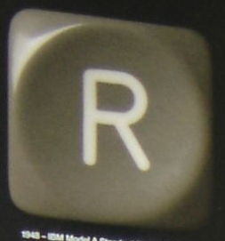
it's some time that I'm thinking about recreating (rebooting actually) a very nice IBM keycaps poster

I'd like to make it very high quality. 2880dpi at least on thick quality paper and UV coating. A 50x70 poster might go in the €50 range. The 70x100 should be around €80.
Wondering if there's interest in such a thing, in which case I would need help finding the right keycaps (not necessarily the same ones as in the poster above). I will have to take professional photographs of them with high quality camera, design the background, print a proof, etc...
Also to be decided what the keycaps would say (definitely not "remarkable").
Posted: 28 Dec 2013, 12:49
by Muirium
One more letter and you could spell DESKTHORITY. Might as well open the design up to more makers caps, and write the note under each one about what makes it notable. I have a Honeywell in mind, of course! But an APL beam spring cap, a Model M's, some classic Cherries…
Posted: 28 Dec 2013, 12:56
by matt3o
I would make a 3x4 matrix, so we would have a 12 letters word. But we could skip the last (or the first) if needed.
A couple of lines of text under each caps would be nice. The main problem I see is that I would need all the caps in my hands to take the pictures with the same light environment. Unless we set a standard for lighting as see what happens
Posted: 28 Dec 2013, 13:45
by Muirium
I doubt IBM was as careful in the original!
It's probably better each cap is tweaked to look its best anyway. Otherwise the boldest and brightest will dominate the rest, as they do in reality when put side by side.
Speaking of which: oh no! No blanks! But my yellow PBT Duckies!
Posted: 28 Dec 2013, 14:04
by matt3o
color tweaking can be done in post production. looking at the original poster, all caps seem to have the same light setup. Or at least very close (N-W-W)
Posted: 29 Dec 2013, 01:54
by Compgeke
How about flatbed scanners? They tend to work well enough and provide even lighting.
I just threw this together in about 15 minutes with keycaps I had here. Scanned them all. Scanning does work a bit better if you position them at least somewhat straight, I didn't bother doing that. My scanner doesn't do so well around the edges, however my scanner is also 17 years old, the school scanner does a bit better than mine does.

Posted: 29 Dec 2013, 09:16
by matt3o
yes, flatbed is an option, but the lighting comes out very... flat, boring. I think we need something more romantic like
- keycap.png (66.05 KiB) Viewed 6623 times
Posted: 29 Dec 2013, 13:26
by photekq
This is a really great idea matt3o!
Posted: 29 Dec 2013, 13:31
by matt3o
as I said, the only problem is to source nice, retro keycaps to take the pictures. I can start collecting them, but it will take time. Or we could tune up with the ones who have them and also have some photography skill. I'll think about something.
Posted: 29 Dec 2013, 15:02
by Muirium
Got a preferred image size? (Wait, I'm thinking of your other project: the
mosaic. For this one, obviously the bigger the better.)
Posted: 29 Dec 2013, 15:05
by matt3o
I'd say 10MP or more, but of course depends on the quality/size of the CCD.
edit: regarding the mosic... min 100x100
Posted: 29 Dec 2013, 15:30
by mr_a500
I'd be happy to take photographs of any keycaps I have: Selectric, beam spring, TRS-80, NeXT, Kaypros, Victor, TI-99 and others. HaaTa probably has enough beautiful keycaps to make a poster 3km long.
Posted: 29 Dec 2013, 15:45
by matt3o
can you make a test picture? Solid background. Light at 10.
Posted: 29 Dec 2013, 15:53
by mr_a500
matt3o wrote:Light at 10.
News at 11.
You want to test my photographic skills? OK, I'll audition - but not right now. I've got to charge my battery.
Posted: 29 Dec 2013, 15:54
by photekq
I'm guessing you only want photos of really old, retro style keycaps? If you're happy with photos of any original Cherry doubleshots/dyesubs then let me know and I'll take a few.
Posted: 29 Dec 2013, 16:02
by matt3o
mr_a500 wrote:matt3o wrote:Light at 10.
News at 11.
You want to test my photographic skills? OK, I'll audition - but not right now. I've got to charge my battery.
no, I bet your photo skills are way better than mine. I just want to see if we can work on a distance.
photekq wrote:If you're happy with photos of any original Cherry doubleshots/dyesubs then let me know and I'll take a few.
sure! why not. let's decide what to write first.
Posted: 29 Dec 2013, 16:26
by photekq
matt3o wrote:let's decide what to write first.
How about 'enthusiasm' (same number of letters as the IBM poster) written in keycaps, then the deskthority logo with a short paragraph of text where the 'Entering the workplace...' is on the IBM poster.
Posted: 29 Dec 2013, 17:42
by matt3o
what do you think of a more on topic: "MECHANICAL"?
Posted: 29 Dec 2013, 17:50
by mr_a500
Would you split that word like in the original poster? "MEC HAN ICA L"?
I don't like split words. How about a poster in landscape with 3 words, 1 word on each line: "MECHANICAL INTERFACE TECHNOLOGY"
More letters = more lovely keycap photos.
Posted: 29 Dec 2013, 17:53
by Muirium
I like it. Portait posters are cool but readability is better.
MECHNICAL
KEYBOARD
CLUB
With the overall description in the bottom right, like IBM's.
Posted: 29 Dec 2013, 17:56
by matt3o
mh... dunno I don't want to make the caps too small. I would have to make some tests. If we agree on at least "Mechanical" everyone could take a pictures of
M E C H A N I C L
caps, so we have the entire word in each style and we can later cherry pick the best cap to use for each letter.
Posted: 29 Dec 2013, 18:07
by mr_a500
It's a pity there are no numbers. There are nice numpad keycaps on the Kaypro II and Victor. Maybe we should take photos of the all the best keycaps, then come up with something afterwards.
Posted: 30 Dec 2013, 01:56
by Dubsgalore
A poster with cherry legends from different sets would be really cool

Nice idea Matt3o (again lol)
Posted: 31 Dec 2013, 19:59
by mr_a500
Here's a quick test of lighting:
h.JPG
The problem is that the bigger the image, the more lint and dust you can see. I wiped that keyboard many times and blew dust off like a maniac, but I can't stop that damn static-charged lint from showing up.
Posted: 31 Dec 2013, 20:03
by matt3o
great shot! and lovely keycap.
can you try to take the picture of the cap out of the keyboard?
regarding the dust and scratches, we can try to photoshop small imperfections.
Posted: 31 Dec 2013, 20:12
by mr_a500
I thought it would be better to leave keys in the keyboard. Some keyboards have keys that are a pain to remove and others have keycaps that don't sit straight on their base when removed.
If the lighting is OK, I can take shots of my other keyboards.
Posted: 31 Dec 2013, 20:40
by mr_a500
The "A" came out slightly whiter. (damn auto white balance)
a.JPG
I took a few DEC keycap photos that came out badly, then my battery died again. What the hell is wrong with these Canon batteries?
Posted: 31 Dec 2013, 22:59
by mr_a500
002.JPG
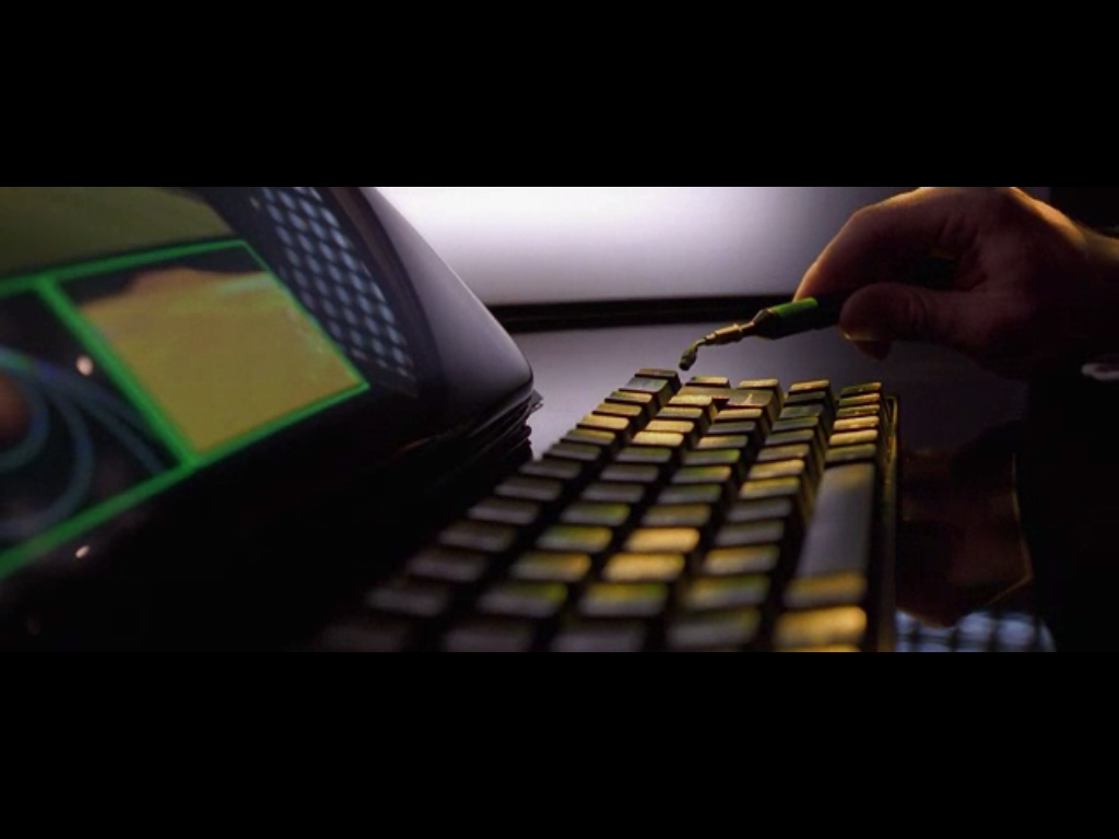
I took a whole bunch of pictures and they turned out like crap. I need a tripod, macro lens, lighting setup and micro vacuum...like the kind in the movie Gattaca:
Posted: 01 Jan 2014, 09:10
by matt3o
That "A" with the little red fish is lovely

We are getting there. Today I'll make some tests myself even though I don't have very interesting caps around.
I'd try to use a white background, let's see what comes out.
mr_a500 wrote:I took a whole bunch of pictures and they turned out like crap. I need a tripod, macro lens, lighting setup and micro vacuum...like the kind in the movie Gattaca:
I know. It's no easy task!
Posted: 01 Jan 2014, 11:36
by Muirium
No function row: I must watch Gattaca again and watch the keyboards!
The little red α is called Alpha and is the reason why I want Greek legends. Make it happen Matt, for the sake of μ!