Page 1 of 2
Vector Deskthority Logo
Posted: 11 Jan 2014, 16:24
by matt3o
Is it available?
(asking it as an official club member

)
Posted: 11 Jan 2014, 16:55
by webwit
I'm afraid not. Although it should be easy to recreate in Illustrator and export as svg or whatever you need. Font is Melbourne. Any volunteers? Sixty made the original, I think in Photoshop, but I only have the png.
Posted: 11 Jan 2014, 17:39
by matt3o
this would be it, but it's not a 1:1 replica. The original seems to be bold, variant that I wasn't able to find. So I added a thin border to the text losing a bit of character (you can see it from the Y).

- deskthority.png (7.74 KiB) Viewed 14193 times
Apart from that, it's pretty close. I'll review letter spacing a bit more and post the SVG
Posted: 11 Jan 2014, 17:42
by Muirium
I actually prefer this one. That jaggy Y has been nagging me ever since I showed up…
Posted: 11 Jan 2014, 17:42
by scottc
Muirium wrote:I actually prefer this one. That jaggy Y has been nagging me ever since I showed up…
+1 to this (though it looks strange to me in inverted colours!)
Posted: 11 Jan 2014, 17:46
by matt3o
sorry, here it is. Original vs new.

- deskthority.png (22.46 KiB) Viewed 14178 times
Posted: 11 Jan 2014, 17:51
by Muirium
Nice. I like the S and the R more now too. And being a very subtle difference, I doubt anyone would notice if this one started showing up in their browser!
Posted: 11 Jan 2014, 17:54
by matt3o
I believe this last one has a better kerning, too. I might just reduce the border a subpixel to give some character back to the typeface
Posted: 11 Jan 2014, 18:05
by Muirium
If this does become the actual site banner logo (as we're all going to virtual pixels anyway with high DPI displays, so really need vector graphics), what do you think of a super thin black outline around the white, so that it's readable on a wider variety of backgrounds? Because right now, banner photography is as much about making sure the white logo is still readable on your photo as it is about the content.
Posted: 11 Jan 2014, 18:09
by matt3o
there's a very simple code I use on other projects that basically detects the contrast of a background and returns "black" or "white" as color to be used as foreground. Maybe that would be a nice touch.
Also a very very light drop shadow around the logo might help in readability.
Posted: 11 Jan 2014, 18:14
by scottc
Looks great.
Posted: 11 Jan 2014, 18:21
by matt3o
Stop the press! I found the bold version! updating...
Posted: 11 Jan 2014, 18:31
by Soarer
I found the unicorn vomit version! upthrowing...

- dtuv.png (36.5 KiB) Viewed 14136 times

Posted: 11 Jan 2014, 18:36
by matt3o
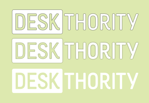
Test on light background
- deskthority.png (35.89 KiB) Viewed 14133 times
hairline
drop shadow
flat
Posted: 11 Jan 2014, 18:58
by 7bit
Erhem:
melbourne/licensing

Maybe we should better use a free font.

Posted: 11 Jan 2014, 19:02
by matt3o
· Create and print documents, as well as static images (.jpeg, .tiff, .png), even if the images are used on the web or in a mobile app.
pretty much covered
Posted: 11 Jan 2014, 20:19
by mtl
Awesome work, matt3o.

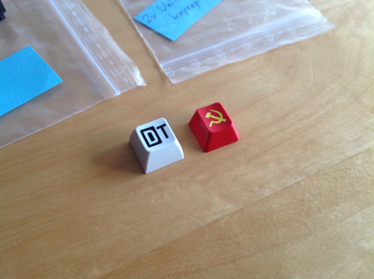
Can you create a vector DT legend like the one used on the key cap below? Maybe at some point we can have SP make a doubleshot SA key with it.

Posted: 11 Jan 2014, 20:43
by Muirium
If it ever did come down to a replacement font, here's some promising open ones, via the
Google Fonts repo, which catch my eye.
Heavy:

- Anton.png (13.02 KiB) Viewed 14076 times

- Squada One.png (10.68 KiB) Viewed 14076 times

- Jockey One.png (12.77 KiB) Viewed 14076 times

- Oswald.png (15.08 KiB) Viewed 14076 times
Narrow:

- Crushed.png (17.76 KiB) Viewed 14076 times

- Bench Nine.png (13.99 KiB) Viewed 14076 times
Really Narrow:

- Six Caps.png (8.64 KiB) Viewed 14076 times
Light:

- Overclock.png (20.68 KiB) Viewed 14076 times

- Anaheim.png (14.65 KiB) Viewed 14076 times
And then perhaps the most fitting of our image:

- Smythe.png (19.5 KiB) Viewed 14076 times
For comparison's sake:

- Rum Raisin.png (18.02 KiB) Viewed 14076 times
Posted: 11 Jan 2014, 20:57
by matt3o
There you go:

- deskthority.png (24.4 KiB) Viewed 14070 times
Please
see this for final version.
Posted: 11 Jan 2014, 21:03
by 7bit
Now, should I add a DT key to Round 5?

Posted: 11 Jan 2014, 21:06
by Muirium
Go on, go on go on GO ON!
Make sure to put it inside something I already ordered…
Posted: 11 Jan 2014, 21:45
by scottc
7bit wrote:Now, should I add a DT key to Round 5?

Make it so!
Posted: 11 Jan 2014, 21:47
by rindorbrot
7bit wrote:Now, should I add a DT key to Round 5?

Yes!
Posted: 11 Jan 2014, 21:53
by webwit
It's almost identical except the letter spacing of the original is more compressed.
I tried a lower case version once, which I think looks more friendly, but I didn't like Melbourne's lower case e.
Posted: 11 Jan 2014, 22:20
by 7bit
These kits contain a row 1 and a row 3 key:
HONEY/DT/GREY
HONEY/DT/WHITE
HONEY/DT/RED
HONEY/DT/BLACK
But someone must make the SVG and discuss with SP the details of that key. I can't do it.


Re: Vector Deskthority Logo
Posted: 11 Jan 2014, 22:35
by mtl
Awesome. You guys rock. I can work it out with SP if it can wait until Wednesday. Been through the process once before and it wasn't hard. If anyone else wants to make a go for it, that's cool too.
Posted: 11 Jan 2014, 23:09
by Muirium
I think I've seen your prior work:

Posted: 11 Jan 2014, 23:39
by matt3o
webwit wrote:It's almost identical except the letter spacing of the original is more compressed.
I tried a lower case version once, which I think looks more friendly, but I didn't like Melbourne's lower case e.
my version is more readable

well anyway at least it's svg now, compressing shouldn't be a problem
Posted: 11 Jan 2014, 23:40
by kint
Muirium wrote:I think I've seen your prior work:
nope. Those are engraved QWERkeys caps. IC thread here:
http://deskthority.net/deskthority-rela ... t3209.html
poll here:
http://deskthority.net/deskthority-rela ... t3233.html
hashbaz did the svg here:
http://deskthority.net/deskthority-rela ... tml#p68615
then the whole thing got stuck over a group buy organizer and then Sleabo/ Qwerkeys just started production on their own:
http://deskthority.net/deskthority-rela ... tml#p74819
Posted: 12 Jan 2014, 00:34
by mtl
Muirium wrote:I think I've seen your prior work
I rendered the vim logo as a key cap SVG. I tried to follow their rules but in the end, Melissa from SP said it was too big overall. They scaled it down 20% and said it would be fine, even though I think that would have made some of the lines too narrow.
Here are the instructions. They were posted on GH a while ago but may not have survived the big hack.
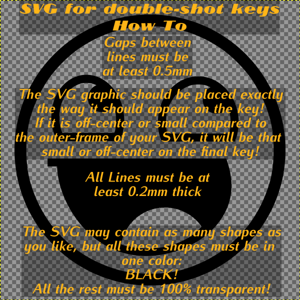
- instructions.png (195 KiB) Viewed 13972 times
Edit: I found the
original thread. Of course it was from 7bit!

 )
)


