Playing with layouts in Dia

User avatar
bhtooefr

26 Aug 2013, 15:19

So I'm playing with keyboard layouts, especially smaller ones, using Dia, and thought I'd go ahead and post them up.

If you want to play along at home, set your grid spacing to 1.875x1.875, turn off dynamic grid, enable snap to grid, and use flowchart boxes as keys. Minimum key size is 4 grid units by 4 grid units - this is a 1x1 key. Can't really do an ISO enter that way, or an L-shaped ANSI enter, but those can be done using two keys.

All of the layouts I'm drawing are ANSI, but are sized so that an ISO enter will work in the same layout, with one exception (1 unit for the lower part of the ISO enter).

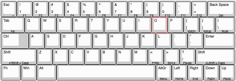
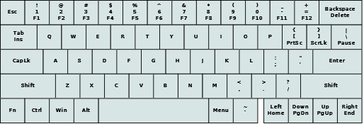
Let's start with a layout we're all familiar with:

Image
I don't need to explain that at all.

Let's chop some off of it:

Image
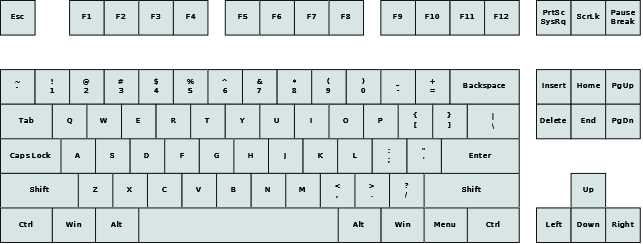
Better, but some people actually like having a numpad. And, everyone's done this.

Image
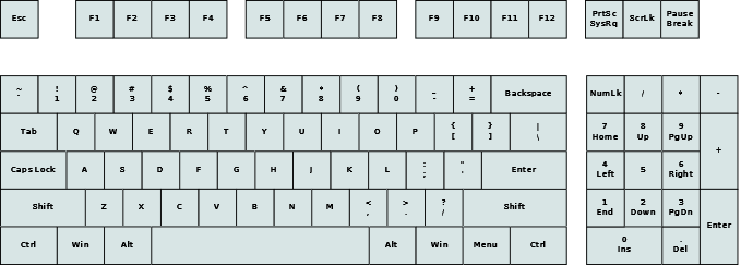
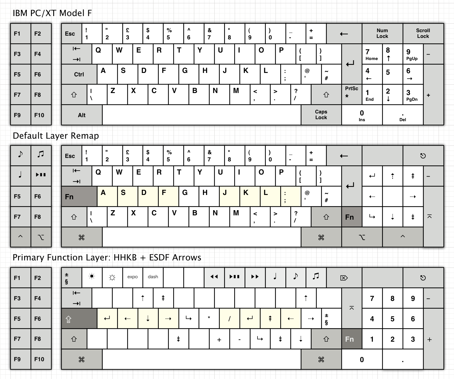
Stealing some ideas from ye olde XT and AT. Cooler Master's actually done a variation on this, the QuickFire TK, which rearranges the keys when Num Lock is off, and also has a Fn layer (to move the Print Screen, Scroll Lock, and Pause keys out of real keys).

But, what if you want something smaller?

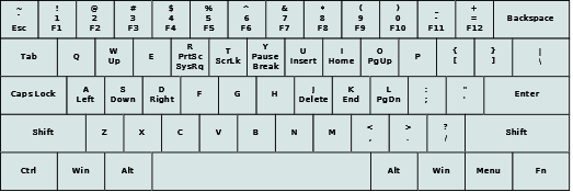
Let's steal some ideas from older ThinkPads and Latitudes, but tweaked to fit with 1x1 keys being the minimum size:

Image
You might notice a subtle tweak I did to the width. See, you can pull 1/4 unit out of the right side of the keyboard, without losing anything, not even ISO compatibility.

That is rather tall, though... how about we give ourselves a Fn layer to play with?

Image
Much better! Not much is hidden under the Fn layer, and the only commonly used keys under it are Home and End, and many laptops do that. This is actually inspired by most modern laptops. There is still the problem that the arrow keys are jutting down, but if you have a TrackPoint on this board, you'd need the TrackPoint buttons jutting down anyway, so it works.

But, what if you want something smaller?

Well, there's always standard 60% layouts:
Image
This is how I'd probably map a standard 60%'s Fn layer, but you get the idea. And, I left the free 1/4 unit in, because that's what most keyboard designers doing a 60% do.

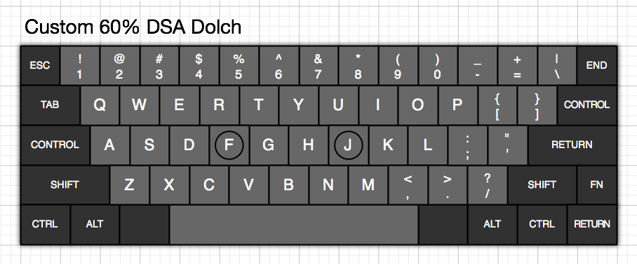
However, let's take a break to look at what I consider one of the greatest 60% layouts, the Apple //c's layout:

Image
This pulled 1/4 unit more than I just did out of the normal layouts. Apple actually spun different PCBs for ANSI vs. ISO, I believe. I did JUST figure out a way to pull another 1/4 unit out of the right side of the keyboard and still work with ISO (would need remapping, though), even with a 3/4 unit wide bottom half of the ISO enter - use the ANSI backslash switch for ISO enter, use the ANSI enter switch for ISO backslash, and have a stabilizer that both enters use to the right of ANSI enter, bottom of ISO enter. But, I'll continue with the way I did it, it gives more room for stabilizers anyway.

In any case, this layout has arrow keys, and is generally competent. I'd change around the order of the arrow keys if I were doing such a layout, though. Later keyboards (the IIc Plus, IIe Platinum, IIGS, and Apple Keyboard) changed things around, and went to an L-shaped enter (causing some issues in the bottom of the keyboard that I really hate), and then another one (Apple Keyboard II) got things better (but put Esc down to the left of left arrow, where I would put `~, and was an absolutely atrocious rubber dome).

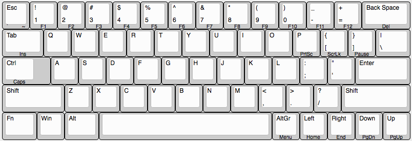
Now, for how I'd do a 60% layout:

Image
And, you can see, there's plenty of room to pull out another 1/4 unit, without even losing spacebar width (although losing arrow key segregation) if you can get the key mounting right. It has every key you need, Fn use is minimized, yet it's slightly more compact than most current 60% layouts. Downside is the linear arrow keys, but at least they're there, and are in vi order, instead of the Apple //c order (which I find a bit awkward.)

Edit: And, this was completely accidental... all the keys necessary to make the 65US, or an equivalent 66ISO, exist, as standard DCS-profile keys. 4.5 unit spacebar, 1.25x2x1x1 ISO enter are the tricky ones.
Last edited by bhtooefr on 26 Aug 2013, 15:52, edited 1 time in total.

User avatar
Muirium
µ

26 Aug 2013, 15:51

Playing with layout designs is an interest we share, all right! I have a 60% build in the works which uses a lightly modified basic 60% (Poker) layout, mainly so I can find caps. It adds a whole bunch of stuff in the layers, with a touch of HHKB.
Image
http://deskthority.net/keyboards-f2/a-w ... t5899.html

I reckon my non-1.0 unit multi-purpose arrow cluster is quite cunning. These days I think I might have it on the default layer 0 instead of the right hand mods. Depends on how I work the logic.

As for the XT: an awkward layout with plenty of potential for creative remaps.
Image

User avatar
bhtooefr

26 Aug 2013, 15:54

That arrow cluster is quite clever, on the 6.1 layout. Looks like your layout is .25 units wider than mine, though.

User avatar
Muirium
µ

26 Aug 2013, 16:00

Yeah, it is just a plain jane 15x5 unit 60%. Designed to work with these caps:
Image
They should be a better fit now, actually, as the group buy wound up making more of the caps that I wanted. Not a perfect match for every legend, but a dashing look. For steel!

When it comes to thinking outside the box, I think you are on to something. The trouble is getting the caps to match.

User avatar
bhtooefr

26 Aug 2013, 16:05

And, like I said in my edit, my 65-key layout, SP has standard (DCS, but still) caps that match everything, even when doing it ISO. Stabilizers would be the tricky part.

User avatar
Muirium
µ

26 Aug 2013, 16:15

bhtooefr wrote:Edit: And, this was completely accidental... all the keys necessary to make the 65US, or an equivalent 66ISO, exist, as standard DCS-profile keys. 4.5 unit spacebar, 1.25x2x1x1 ISO enter are the tricky ones.
I would rate the difficulty of finding a 4.5 unit space bar as a job for Indiana Jones! But if you find a 5 unit, do tell. I am still so used to those thanks to my Apple stuff.

User avatar
bhtooefr

26 Aug 2013, 16:21

http://www.solutionsinplastic.com/pdfs/DCSFamily.pdf

4.5, 5, 6.2, 6.75, 7, 8, 9, 9.75, and 10 unit spacebars.

Oddly, they don't have a 5.75 unit spacebar in DCS, which would make sense for a standard board with Windows keys. That said, they have stock of 6 unit DCS spacebars, which don't exist on that datasheet...

User avatar
Muirium
µ

26 Aug 2013, 16:27

Good point. If only I were not so prejudiced against DCS! I always forget to look.

Have you priced up your layout as an individual (non-group) buy?

User avatar
bhtooefr

26 Aug 2013, 16:33

I have not.

And I just figured out why they don't have 5.75 unit. Because Cherry used 1.25 unit Ctrl keys on boards with Windows keys, freeing up half a unit versus Unicomp's old layout (which used 1.5 unit Ctrl keys, but 1.25 unit everything else). Whereas all my layouts above follow Unicomp standard. Now I'm wondering what Microsoft's standards for the first Win95 keyboards were... it looks like the original Natural used 1.5 unit keys on the left side for all three, 1.25 on the right for all four, but it's an ergo layout, so weirdness is to be expected.

Apple, OTOH, on Extended boards, simply did what Unicomp's doing for their 103-key layout - 1.5 unit modifiers, except for Option being 1 unit stuck between Ctrl and Cmd.

Edit: Unfortunately, DSA is a lot harder, it seems. No 1x2.5, which I need for right shift, no 1x4.5 space bar (or anything less than 1x6) - which, I can get to 1x5 by widening the layout and removing segregation, and then 1x6 by taking the widened layout and going to Apple ///-style arrows, but that's just awkward, and ugly, IMO.

Edit 2: Of course, DSA also prohibits an ISO layout. But, if we're willing to lose ISO, that means that only 1x4.5 needs to be custom-made (or stolen from DCS) - pull the remaining 1/4 unit out, right shift then only needs to be 1x2.25, everything else is available, and it's even more compact. And, I think my layout can only be done as a group buy.

Edit 3: Besides, I want 1Z mount, not 4U mount.

User avatar
bhtooefr

16 Dec 2013, 12:53

So, time for a little more creativity here. This time I'm no longer using Dia, but rather Ian Prest's Keyboard Layout Editor.

Here's what I've come up with right now, by removing Caps Lock from the layout:

Image

I'm undecided on where the PrtSc/ScrLk/Pause block should start. P has a certain logic to it, and means that everything stays in a line when the layout goes ISO, but it conflicts with Ctrl-P.

The bottom row is greatly improved by pulling Caps Lock out and moving Ctrl up. Now, for the real party trick. Cherry uses 1.25 U for everything in the bottom row on a keyboard with Windows keys, and 1.5 U without, so I'll follow their spacing. Alps is inconsistent here, but 1.25 U isn't unheard of.

1.25 U Fn, 1 U Windows, 1.25 U Alt, 6.25 U spacebar, 1 U right Alt, 1 U arrow keys. 14.75 U total width, and using 100% standard size keys (if not standard applications of those sizes).

I did switch arrow keys to Apple standard as I've gotten used to it again, rather than Vi standard, but really, with a keycap puller and a DIP switch, that could all be fixed.

Edit: And now I'm not sure about caps lock being underneath Ctrl. It means that Fn can't be used alongside Ctrl, which is a problem.

Fn-Shift for Caps Lock can't work either, because that blocks ~ and some useful key combos.

Maybe LShift-RShift...

User avatar
bhtooefr

17 Dec 2013, 12:50

And now I start adding media keys in:

Image

Not fully convinced that's the best location for them, but I don't want to overlap Ctrl-U or Ctrl-I, so it's not bad.

User avatar
Muirium
µ

17 Dec 2013, 13:02

Media keys are best along the top of the keyboard, I find. (Or so I've been trained by Apple laptops over the years, and seems to work well on my custom keyboards, too.) The minus and plus keys — as I think of them, really hyphen and equals — are my favourites for volume control, with the numbers to the left of them in charge of playback. But if I wasn't as keen on HHKB arrows, I'd probably use [ and ] as rewind and fast forward.

User avatar
bhtooefr

17 Dec 2013, 13:20

Hmm. And playing with things, the entire top row letter row has decent ergonomics. (Z and X are the worst, for what it's worth.)

Really, PrtSc, ScrLk, and Pause could go anywhere. They need to be in the layout, but I'm certainly not married to that being their location, and the media keys would be used more.

I want to have the F keys on the top number row for consistency.

I think volume keys are more useful than track keys, and I can't find a good place for the track keys. So, here's v4 (going back to clearing P, even though it's a little more awkward on ISO (Mute being pushed down a row):

Image

Here's the list of keys I don't want on the FN layer:

Q (quit (critical on Macs, unimportant on Windows due to Alt-F4 being preferred))
W (close window/tab)
R (refresh (critical on Macs, unimportant on Windows due to F5 being preferred))
T (open tab)
U (underline)
I (italic)
O (open, although I'm not married to that one)
P (print, although I'm not married to that one)
A (select all)
S (save)
F (find)
G (find next)
Z (undo, and it sucks ergonomically anyway)
X (cut, and it sucks ergonomically anyway)
C (copy, and it's mediocre ergonomically anyway)
V (paste)
B (bold)
N (new, although I'm not married to that one)

That rules out a lot of good keys, really.
Last edited by bhtooefr on 17 Dec 2013, 13:25, edited 1 time in total.

User avatar
Muirium
µ

17 Dec 2013, 13:24

Looking good. Might as well give oversized ANSI backslash something important!

I also use the same f-keys on numbers system as you do, all the way up to F12, but they're on a second layer for me. (A trick which requires more than one function key to work, or perhaps there are ways more cunning besides.) It's likely I lean towards over compressing my layouts, obviously…

User avatar
bhtooefr

17 Dec 2013, 13:34

A few other things I just thought of:

By default, special-case Ctrl-Alt-Backspace as Ctrl-Alt-Del. Makes things easier for Windows users, and safer for *nix/X11 users (if you really REALLY want Ctrl-Alt-Backspace, Fn is there).

I could stick the media playback keys on L, ;, and ". I don't think there's anything that uses Ctrl-L, Alt-L, or Cmd-L typically.

User avatar
Muirium
µ

17 Dec 2013, 14:06

Command+L is the shortcut to enter a web browser's address bar. (Think it's Ctrl+L on Windows.) I'm fairly addicted to that one!

User avatar
bhtooefr

17 Dec 2013, 14:09

Screw it, I'm going without media playback keys then. With only one Fn layer...

Then there's the consideration of... How to handle the function keys in Mac OS... I think they'll work as function keys and not special/media keys unless it pulls a Matias and pretends to be an Apple keyboard though, and I think that's the best way.

User avatar
Muirium
µ

17 Dec 2013, 14:29

Media keys are just USB HID codes like regular keys. Check out Soarer's list of them from the documentation of his famed converter. I find them just as easy to implement, with complete compatibility with any OS. So long as it knows USB…

User avatar
bhtooefr

17 Dec 2013, 14:33

Muirium wrote:Media keys are just USB HID codes like regular keys. Check out Soarer's list of them from the documentation of his famed converter. I find them just as easy to implement, with complete compatibility with any OS. So long as it knows USB…
I'm more meaning how Apple keyboards treat the Fn key and the top row. IIRC, that is not standard USB HID.

User avatar
Muirium
µ

17 Dec 2013, 14:44

Indeed not, as the Mac can even see the status of that Fn key. This is achieved with a bit of a hack!

http://deskthority.net/workshop-f7/host ... t5768.html

But media keys are perfectly suited to going on layers, in any case. They're optional, of course, but get a lot of use these days I think.

Post Reply

Return to “Workshop”