The wiki thread

User avatar
webwit
Wild Duck

16 Apr 2012, 04:00

ripster wrote:Yeah, I really like that Capslock page format so I think I'll do something like that.

Thanks!

And Squint if you see a watermark since it's not Wikipedia here!
I'll squint, despite the weight of the subject matter, although I agree with others that neutral pictures are preferred in a wiki.

My subliminal watermark is better though. Ugly plastic floor and background cat.

User avatar
002
Topre Enthusiast

16 Apr 2012, 22:56

So a post in another thread got me thinking, Is it possible to author a page in another language and have the link on the left similar to wikipedia? I'm guessing it is, but I was wondering how much effort is involved?

User avatar
webwit
Wild Duck

16 Apr 2012, 23:08

There's this, but I don't have experience with it.
http://www.mediawiki.org/wiki/Template:Languages

User avatar
7bit

16 Apr 2012, 23:15

webwit wrote:There's this, but I don't have experience with it.
http://www.mediawiki.org/wiki/Template:Languages
We can't use it because there is no Swedish option!
:roll:

User avatar
webwit
Wild Duck

16 Apr 2012, 23:17

There is: sv.

User avatar
fruktstund

16 Apr 2012, 23:21

7bit wrote:
webwit wrote:There's this, but I don't have experience with it.
http://www.mediawiki.org/wiki/Template:Languages
We can't use it because there is no Swedish option!
:roll:
There are no Swedish people on this forum anyway.

:lol:

User avatar
7bit

16 Apr 2012, 23:22

webwit wrote:There is: sv.
Ahh, I see.
There is even Kölsch!!!
:lol:

User avatar
7bit

19 Apr 2012, 23:58

Because I don't like the dpkeydingens info box and prefer to have a picture at the top of the page, I've created something new:

Template:Infobox_kbd.

Sample: G80-1000.

I hope you like it.

:-)

JBert

20 Apr 2012, 14:48

Pictures is something we need to get some consensus on.

Your info-box template is somewhat nice, but it suffers from one problem: the picture appears be too small to be useful, but it can't be bigger or it messes up the infobox and text on the page. We might need a "Lightbox" extension for Mediawiki so that the image enlarges when you click on it.

On a related note, I've also noticed that you edit out gallery tags (as in http://deskthority.net/w/index.php?titl ... oldid=5957 ). I would prefer that you didn't, as the new gallery tag actually floats the images one next to each other and makes them look more uniform, a bit like the main page.

I believe we discussed the size before though, but I'm too lazy to look it up right now. Maybe we need to look it up and put it in the http://deskthority.net/wiki/Help:Conten ... g_the_wiki.

User avatar
webwit
Wild Duck

20 Apr 2012, 14:59

My vote is that photos should use this style (gallery) or this style (right or left thumb float) or a combination of both (a few thumbs on the side, the bulk in the gallery).

User avatar
7bit

20 Apr 2012, 15:33

I don't see a problem with the size. It is large enough to see what type of keyboard layout it has.
Also, I've followed the example of key caps and keyboard brands, so the new kbd template fits more into the general layout of other pages.

About galery vs. full-size images (half-size actually):
I don't like to click on every image to see some details.

BTW: These have been edited in before, so I just changed them back to what they where before.


Image
vs.
Image

What is the point in making them smaller?

Also, nothing is floating. All images are on the left side with a lot of space to the right!

On one note you all have larger monitors and don't care about browser widths and on the other you want it to make iphone compatible!

User avatar
webwit
Wild Duck

20 Apr 2012, 16:18

LET THE EDITING WARS COMMENCE! ;)
Wiki are not full-size photo albums, I don't think it looks very good with that format. You get all photos big whether you're interested in that detail or not. And your bigger size photos are optimized for your particular teeny-weeny window width!

User avatar
7bit

20 Apr 2012, 16:23

webwit wrote:LET THE EDITING WARS COMMENCE!
Wiki are not full-size photo albums, I don't think it looks very good with that format. You get all photos big whether you're interested in that detail or not. And your bigger size photos are optimized for your particular teeny-weeny window width!
No editig war necessary! Also, stop shouting or I call the moderators!
Photos that small look not very good.

Also, 1280px width is more than enough for printing them on A4 paper.

But I can upload them bigger, just thought we want to save some bytes, thought 1280 is a good compromise.

You also contradicting yourself: you complain about my little monitor and in the sentance before you say my wiki-images are too large!
:roll:

JBert

20 Apr 2012, 21:56

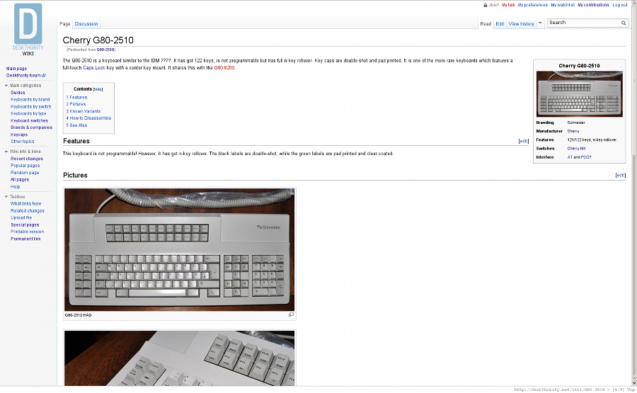
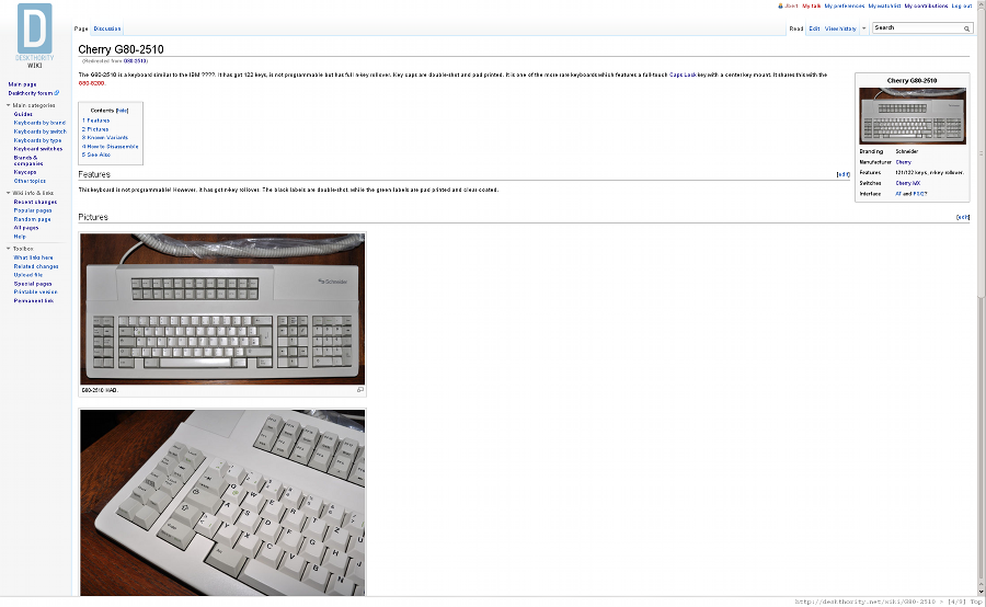
7bit wrote:I don't see a problem with the size. It is large enough to see what type of keyboard layout it has.
Also, I've followed the example of key caps and keyboard brands, so the new kbd template fits more into the general layout of other pages.
You are quite correct sir, which means I'll drop the subject and eat my words.

If you think the width of the picture is fine then for me the keyboard infobox is good to go.

Thanks for the suggestion and getting it to work out.
7bit wrote:About galery vs. full-size images (half-size actually):
I don't like to click on every image to see some details.

BTW: These have been edited in before, so I just changed them back to what they where before.
Now this is something which annoys me to no extent: I have to zoom out with my browser or abuse my scroll wheel if I want to have an overview of the whole dang page!

(BTW: the previous ones were yours to begin with, so just changing them back to what they were before is silly.)
7bit wrote: [obnoxiously large image]
vs.
[beareable image]

What is the point in making them smaller?
Pictures are a great addition to an article, but I don't believe they should be that much on the foreground. If you don't want to click too much, shouldn't we be looking at a pop-up gallery or some Image Zoom solution?

(The last one might be interesting, but it does have the side effect that you might get unintended pop-ups when a user is simply moving his mouse pointer across the page.)
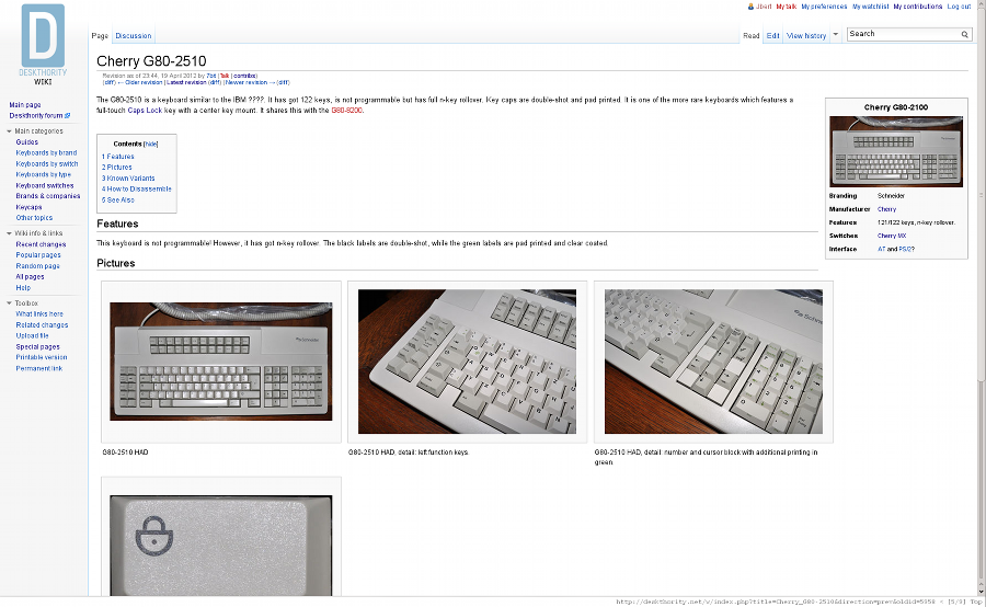
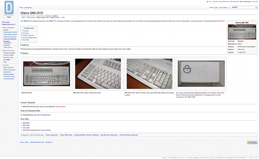
7bit wrote:Also, nothing is floating. All images are on the left side with a lot of space to the right!

On one note you all have larger monitors and don't care about browser widths and on the other you want it to make iphone compatible!
But don't you see that you can have both if you let the images float instead of sticking them all on the left side?

Compare these:
g802510-images-thumb.png
g802510-images-thumb.png (257.34 KiB) Viewed 4282 times
g802511-gallery-thumb.png
g802511-gallery-thumb.png (306.54 KiB) Viewed 4282 times
The first one is the current state of the article, the second is how the page looked using the gallery style. The page flows automatically, and if you take a look at the scrollbar you'll see that the page is a whole lot shorter for the same content.


Here's how it looks if I scale the page to about 80% using Firefox's zoom:
g802510-images-80%-thumb.png
g802510-images-80%-thumb.png (219.21 KiB) Viewed 4282 times
g802512-gallery-80%-thumb.png
g802512-gallery-80%-thumb.png (242.72 KiB) Viewed 4282 times
See that? The separate pictures still take up more than one screen whereas the second at least fills a complete page.


Now make no mistake, I'm thankful for your contributions to the wiki. I would just like you to consider my point, as I really believe that it could look better if the page flowed more naturally similar to the pages Webwit linked to.

User avatar
7bit

20 Apr 2012, 22:23

Well, first you complain my images are too large and then you show me a browser window which is so large, I could change them from 640 to 1280 pixel!

I don't get the point with the scroll-wheel, but I see you like them side by side at your 480x16386, pamorama-vision monitor.

OK, before we kill each other, and because webwit wats the images even larger than I could ever view them on my early 2000s monitor, what about a gallery page to every keyboard page?

ps: get yourself a RollerMouseFree2 and the unpleasantness of scrolling goes away!

User avatar
webwit
Wild Duck

20 Apr 2012, 22:26

Votes so far: thumbs vs large 2:1 :evilgeek:

User avatar
7bit

20 Apr 2012, 22:39

webwit wrote:Votes so far: thumbs vs large 2:1 :evilgeek:
What about this:
Cherry_G80-1000
Cherry_G80-1000_gal

User avatar
off

20 Apr 2012, 23:19

7bit wrote:
webwit wrote:Votes so far: thumbs vs large 2:1 :evilgeek:
What about this:
Cherry_G80-1000
Cherry_G80-1000_gal
Looks quite good, gallery not so sure.
And why do I have to click twice on pics to go to the fullsize (once to single pic page, next to fullsize pic), is there a setting for that?
*edit, love the IBM Adjustable layout, though with lots of pics perhaps not; and the Buckling Spring is very nice too, though I'd prefer slightly larger pics (which in turn would interfere with paragraphlengths I guess, unless the text is moved to the side of the pics)

User avatar
7bit

20 Apr 2012, 23:27

off wrote:
7bit wrote:
webwit wrote:Votes so far: thumbs vs large 2:1 :evilgeek:
What about this:
Cherry_G80-1000
Cherry_G80-1000_gal
Looks quite good, gallery not so sure.
And why do I have to click twice on pics to go to the fullsize (once to single pic page, next to fullsize pic), is there a setting for that?
*edit, love the IBM Adjustable layout, though with lots of pics perhaps not; and the Buckling Spring is very nice too, though I'd prefer slightly larger pics (which in turn would interfere with paragraphlengths I guess, unless the text is moved to the side of the pics)
That is exactly my complaint. I think it is an X11 vs. Microschrott problem.

They love to tripple-click and browse always in full-screen more. :roll:

User avatar
webwit
Wild Duck

20 Apr 2012, 23:41

You shouldn't create a gallery page, but rather add the images to a category so you get automated thumbnail overviews like this. :mrgreen: I still vote for the standard wikipedia way, which is overall best for text flow for a wide variety of window sizes and most in the nature of wiki style articles. What I like most is if you have 10 pictures, you use a couple in the wiki, make a photo topic on the forum with the complete keyboard photo porn, and add it as a forum or external link to the wiki page. There are indeed some lightbox/lightbox clone extensions for mediawiki, I'll look into these.

User avatar
7bit

20 Apr 2012, 23:54

webwit wrote:You shouldn't create a gallery page, but rather add the images to a category so you get automated thumbnail overviews like this. :mrgreen: I still vote for the standard wikipedia way, which is overall best for text flow for a wide variety of window sizes and most in the nature of wiki style articles. What I like most is if you have 10 pictures, you use a couple in the wiki, make a photo topic on the forum with the complete keyboard photo porn, and add it as a forum or external link to the wiki page. There are indeed some lightbox/lightbox clone extensions for mediawiki, I'll look into these.
In the Photos & videos section, it is quite hard to find anything. I don't see much harm in an additional pictures article.

And I still don't understand (trolling mode switched off and troll module unplugged) why one would browse in full-screen mode && complain about too large pictures, if they are even viewable on a classic 768x1024 monitor.

User avatar
off

21 Apr 2012, 00:15

webwit wrote:if you have 10 pictures, you use a couple in the wiki, make a photo topic on the forum with the complete keyboard photo porn, and add it as a forum or external link to the wiki page.
Linking topics from wiki's (as 'go here for ..'), could be very nice; although there would need to be quite a few- one that's meant purely for pics (to keep it as clean as a gallery 'should' be) and one to spew opinions/amazement/questions/randomlinks+knowledgepartiallyrelated
7bit wrote:I think it is an X11 vs. Microschrott problem.
They love to tripple-click and browse always in full-screen more. :roll:
ufnubutnu?

User avatar
7bit

21 Apr 2012, 00:19

off wrote:ufnubutnu?
Pah!

Debian rulez teh world!
:ugeek:

User avatar
graboy

21 Apr 2012, 00:31

Not to interrupt the image layout debate, but I recently stumbled across this list of WYSE keyboards for sale, some of them even NIB. If anyone wanted to do some research, someone might be interested in ordering a few of these -- I would love to see them on the wiki. By the way, most of them don't have AT connectors, so unless anyone was going to do a DIY project I don't think these boards will see any use.

http://wyse.vecmar.com/keyboard_cross_reference.htm

User avatar
7bit

21 Apr 2012, 00:55

graboy wrote:Not to interrupt the image layout debate, but I recently stumbled across this list of WYSE keyboards for sale, some of them even NIB. If anyone wanted to do some research, someone might be interested in ordering a few of these -- I would love to see them on the wiki. By the way, most of them don't have AT connectors, so unless anyone was going to do a DIY project I don't think these boards will see any use.

http://wyse.vecmar.com/keyboard_cross_reference.htm
I already found this. Quite a valuabe resource. But shipping kills these kebaords for me. But maybe you could get these, take decent photos and put them in the wiki (640px width minimum! :evil: ) and win some coll stuff in the contest!

User avatar
daedalus
Buckler Of Springs

21 Apr 2012, 01:09

At the risk of sounding biased, whichever scheme posed above that is closest to the one I use is right... I think that would the thumbnail one, the big picture one just break the thing up too much, and makes it look unprofessional. Ideally you want to break up text with picture as much as possible though.

User avatar
off

21 Apr 2012, 02:19

In cloud of boobs wiki, reds are noted there as linear, but the topres mentioned aren't noted as tactile- I mean they're rubberdomes :? though seemingly (30cn) very light? No experience with either, so not sure if edit should be made, but seems off to note cloud of boobs = linear, while from what I've encountered cloud of boobs is used for topres a *lot*..?

Re return key wiki, "m-shape = ANSI" how does that work :?:
And I'd think it's better if the images presented there are named differently, at least having the corresponding correct designation added (iso/ansi/biiiiigass); and just a pic of the naked bottom of the BigAss? :lol:

yand wiki help rule #1 'Use singular (when possible) phrase style titles' doesn't mesh with the matrices page I started; though I feel a multiple in the title there is *edit: will be* appropriate, opinions?

and anybody thinking having 'wiki' in the bar at the top with spy etc might be useful (as reminder to anyone browsing and for quick access)?

User avatar
webwit
Wild Duck

21 Apr 2012, 02:32

daedalus wrote:At the risk of sounding biased, whichever scheme posed above that is closest to the one I use is right... I think that would the thumbnail one, the big picture one just break the thing up too much, and makes it look unprofessional. Ideally you want to break up text with picture as much as possible though.
3:1 !
off wrote:In cloud of boobs wiki, reds are noted there as linear, but the topres mentioned aren't noted as tactile- I mean they're rubberdomes :? though seemingly (30cn) very light? No experience with either, so not sure if edit should be made, but seems off to note cloud of boobs = linear, while from what I've encountered cloud of boobs is used for topres a *lot*..?
I don't have those light Topres either, but I agree it is a priority to get this right. We don't want to give people the wrong idea about clouds of linear and/or tactile boobs.

User avatar
off

21 Apr 2012, 02:59

webwit wrote:I agree it is a priority to get this right. We don't want to give people the wrong idea about clouds of linear and/or tactile boobs.
They make the world go round.

xbb

21 Apr 2012, 03:12

thumbnail… keyboard pictures don't need to be large to catch attention.
I can compare thumbnails easily if needed and I'm free to click on the one that interest me to see it zoomed, without being forced to scroll them all in big.

Post Reply

Return to “Deskthority wiki talk”